On this page
If you run an ecommerce store and need a promotion idea, start with the problem you're trying to fix. A first-order discount, free shipping, a bundle, and a loyalty reward can all increase sales, but they do it in very different ways.
This guide compares 25 sales promotion examples for ecommerce stores, with real campaign examples, 13 OnVoard template previews, and original illustrations. You'll see what the shopper gets, when we'd use the offer, and what to check before paying for it.
Our default is simple: use the least complicated promotion that solves the problem. A plain offer that already works doesn't need a game bolted on, and a product shoppers already want doesn't need an automatic discount either. Match the mechanic to the problem. When the real problem is that people can't choose, a recommendation may be more useful than money off.
Which sales promotion should you use?
If you only need a starting point, use this table.
What you want to change | Promotions we'd consider first | What to watch |
|---|---|---|
Win a first order | First-order discount, fixed amount off, free shipping, early access | Giving an incentive to someone who was already going to buy |
Increase basket value | Minimum-spend offer, bundle, spend-more-save-more, free gift | The extra discount or product cost can be larger than the extra revenue |
Move selected stock | Category sale, BOGO, clearance | Discounting products that did not need help |
Get more attention | Scratch card, spin to win, pick a gift, mystery discount | Extra steps and a louder experience |
Recover a visit | Exit-intent offer, flash sale, seasonal sale | Fake urgency, repeat exposure, and unnecessary discounting |
Bring customers back | SMS signup, birthday club, referral, loyalty reward, store credit | Future reward cost and whether you have a real follow-up plan |
Our rule: if you can't explain what you want the promotion to change, don't run it yet. “Increase sales” is too vague. “Get more first orders,” “move this collection,” and “lift baskets above $60” are decisions you can actually design around.
What is a sales promotion?
A sales promotion adds an incentive to a purchase or another action, such as joining a list. It might lower the price, remove a shipping charge, add a gift, or offer access that other shoppers don't get.
Many promotions have a deadline. Others are conditional: a first-order discount stays available to new customers, but each shopper qualifies only once. Either way, make the qualifying condition clear. A sale that never ends becomes hard to distinguish from your regular price.
A discount is therefore only one kind of sales promotion. In many stores, the better promotion is the one that changes behavior without cutting every order by the same percentage.
OnVoard template previews show existing designs, not customer results. Images labeled original illustrations show sample offers, not live brand campaigns or installed templates. Archived brand examples are credited separately. Worked calculations use hypothetical figures.
Promotions for winning a first order
1. First-order percentage discount
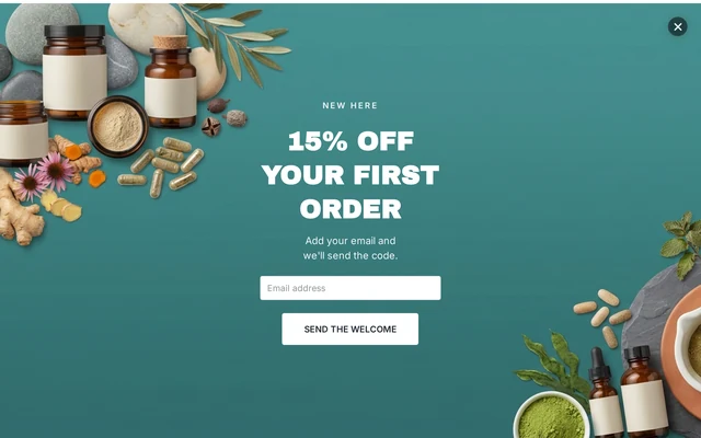
OnVoard template preview: the first step offers 15% off if you hand over an email address.
This is the familiar welcome offer: give a new shopper a percentage off the first purchase, usually in exchange for an email address or other contact detail.
We'd use it when a large share of traffic is new and the first purchase is the obvious hurdle. We'd not show the same offer indiscriminately to returning customers. If someone was already coming back to buy, paying them a first-order incentive makes no sense.
The current Supplements Welcome Offer uses a multi-step flow and asks for both email and phone. If email is all you need for the follow-up, we'd remove the phone field before making the discount larger. A bigger ask should earn its place.
2. Fixed amount off
“$10 off” is easier to budget than “10% off” because the maximum discount is obvious. The catch is that the effective discount changes with the basket.
The same $10 reward means something different at each basket size, because a fixed amount is a shrinking percentage as the basket grows:
Basket before discount | $10 off costs you | Effective discount |
|---|---|---|
$50 | $10 | 20% |
$100 | $10 | 10% |
$150 | $10 | 6.7% |
That makes fixed-amount offers easier to plan when order values sit in a fairly tight range. On a catalog that spans $20 accessories and $500 products, the same reward can feel huge on one order and irrelevant on another.
We prefer fixed amounts when cost control matters more than headline generosity. Pick the basket range first, then decide the amount.
3. Free shipping
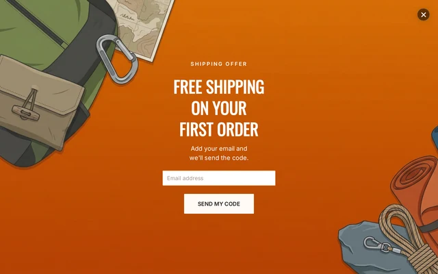
OnVoard template preview: the shipping benefit and first-order condition appear in the headline.
Free shipping sounds safer than a discount because the product price stays intact, though that safety is not guaranteed on every order.
Suppose shipping costs you $6. On a $40 order, a 10% discount costs only $4, under that $6 shipping cost, so giving away free shipping is the pricier move. Run the same 10% against a $100 order and the discount reaches $10, above the $6 subsidy, so free shipping costs less than the discount would.
That's why we'd price both options before choosing, using your own baskets rather than a rule of thumb. Price it properly.
For a ready-made presentation, adapt the Outdoor Free Shipping template, then make sure the matching shipping rule actually exists in your store.
4. Minimum-spend discount
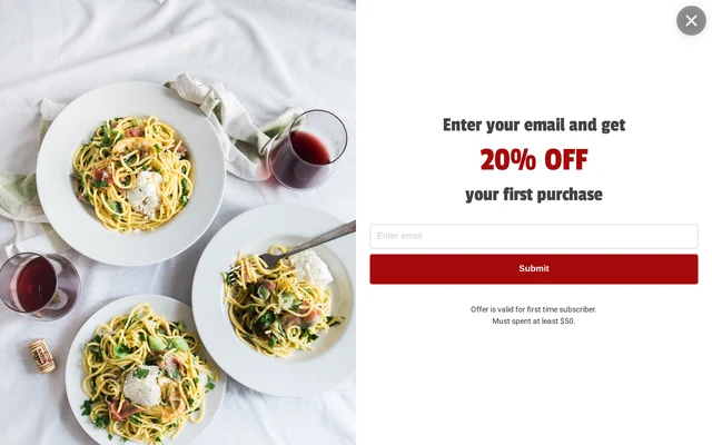
OnVoard template preview: 20% off for orders of at least $50, shown beneath the form.
A spend threshold is meant to give someone a reason to add more to the basket. The mistake is choosing a nice round threshold without checking what happens to the order after the discount.
Suppose the offer is 20% off a basket of at least $50. A shopper sitting just under that line, with $46 in the cart, adds an $8 item to qualify.
Order economics | Original basket | After adding an item |
|---|---|---|
Basket before discount | $46 | $54 |
Discount | $0 | $10.80 |
Customer pays | $46 | $43.20 |
The basket got bigger, but the cash collected got smaller. You also have an extra item to supply. These figures exclude shipping and taxes.
That can still be worthwhile if the promotion wins an order you would otherwise lose. It's a poor trade if the shopper was already going to pay $46.
Before launching a threshold offer, test a few real baskets just below the threshold. The Email Capture Full Screen gives you the presentation. Your store still needs the actual qualifying discount.
5. Early access
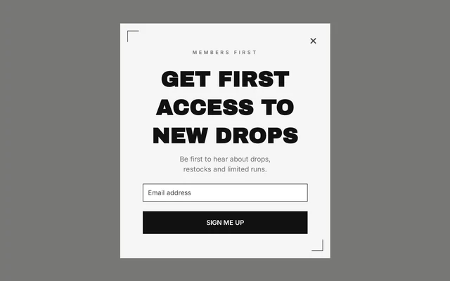
OnVoard template preview: access to new drops is the lead benefit, rather than a lower price.
Early access is useful when the thing people value is access, not a cheaper price. Think limited drops, products that sell out, or member-only releases.
We like this mechanic because it can protect your price. But it only works when the access is real. If the product is available to everyone at the same time, “early access” is just a newsletter signup with a better label.
One practical detail matters with the Fashion Early Access template: its current flow includes a reward step. For a pure access offer with no discount, remove the coupon instead of describing the campaign as cost-free while still giving money off.
6. Free gift with purchase
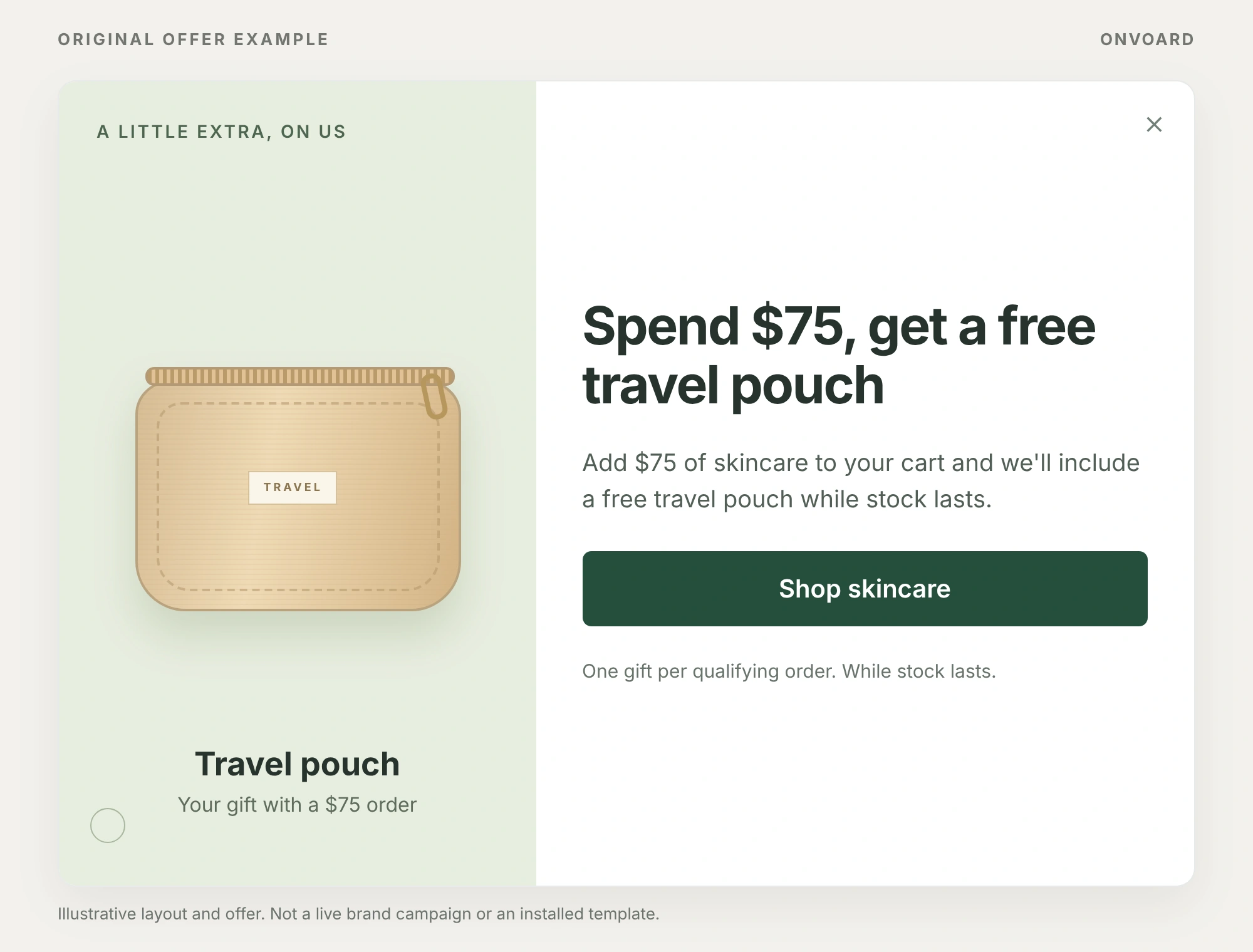
Original OnVoard illustration: name the gift and put the qualifying spend beside it.
Spend $75, get a free travel pouch
Add $75 of skincare to your cart and we'll include a free travel pouch while stock lasts.
Button: Shop skincare
One gift per qualifying order. While stock lasts.
A free gift keeps the main product price intact and replaces a percentage discount with the landed cost of another item.
If a gift costs you $4 and the order is $80, that $4 cost is lower than a 10% discount, which would cost $8 before any fulfillment effects. But the gift has to be something the shopper plausibly wants. Old stock doesn't become valuable because the checkout calls it free.
We'd use this when the gift naturally extends the purchase: a sample with skincare, an accessory with a device, or a small extra that introduces a second product. Decide what happens if the gift sells out before the campaign starts.
The illustrated offer names both the travel pouch and a qualifying spend of at least $75. Keep that condition beside the headline, then decide how your store adds the gift and stops offering it when stock runs out.
Promotions for increasing basket value or moving stock
7. Category or collection sale
A category sale puts the discount exactly where the stock or commercial problem lives. If winter jackets need to move, discount winter jackets. There's no reason to cut the price of products that are selling normally.
We prefer this to a sitewide sale when the problem is concentrated in one part of the catalog. It protects full-price expectations elsewhere and gives the shopper a clear reason for the offer.
Keep the eligible products obvious. Simple sells. If the campaign needs a long paragraph explaining which colors, sizes, brands, and variants are excluded, the promotion is too complicated.
For a store clearing a winter collection, a simple offer could read:
Winter jackets, 25% off
Selected styles only. See the included jackets and available sizes in our winter sale collection.
Shop winter jackets
Original sample copy, not a quoted brand campaign.
Send that button to the eligible collection, not the homepage. The shopper should see which products qualify without opening several product pages.
8. Buy 1, get 1

ColourPop campaign artwork, with the lip BOGO offer documented in its February 2026 email. Image: ColourPop.
ColourPop's lip offer shows the appeal of BOGO: the product category is immediately clear. Its archived February 2026 email also specifies that the free-item discount goes to the lowest-priced eligible items. That rule matters when shoppers mix different prices.
Before copying it, compare what remains after supplying the extra unit:
For an item priced at $30 | 1 at full price | 2 under BOGO free |
|---|---|---|
Revenue | $30 | $30 |
Product cost at $9 each | $9 | $18 |
Left before other costs | $21 | $12 |
This hypothetical order moves an extra unit but gives up $9 before shipping, payment fees and fulfillment, because supplying the second item costs more than the extra unit is worth. More units sold does not automatically mean a better order.
That can be a good trade for consumables, seasonal stock, or products people genuinely use in multiples. We'd skip it for something a household only needs once. A free second unit isn't a reward if it's just another object to store.
9. Product bundle
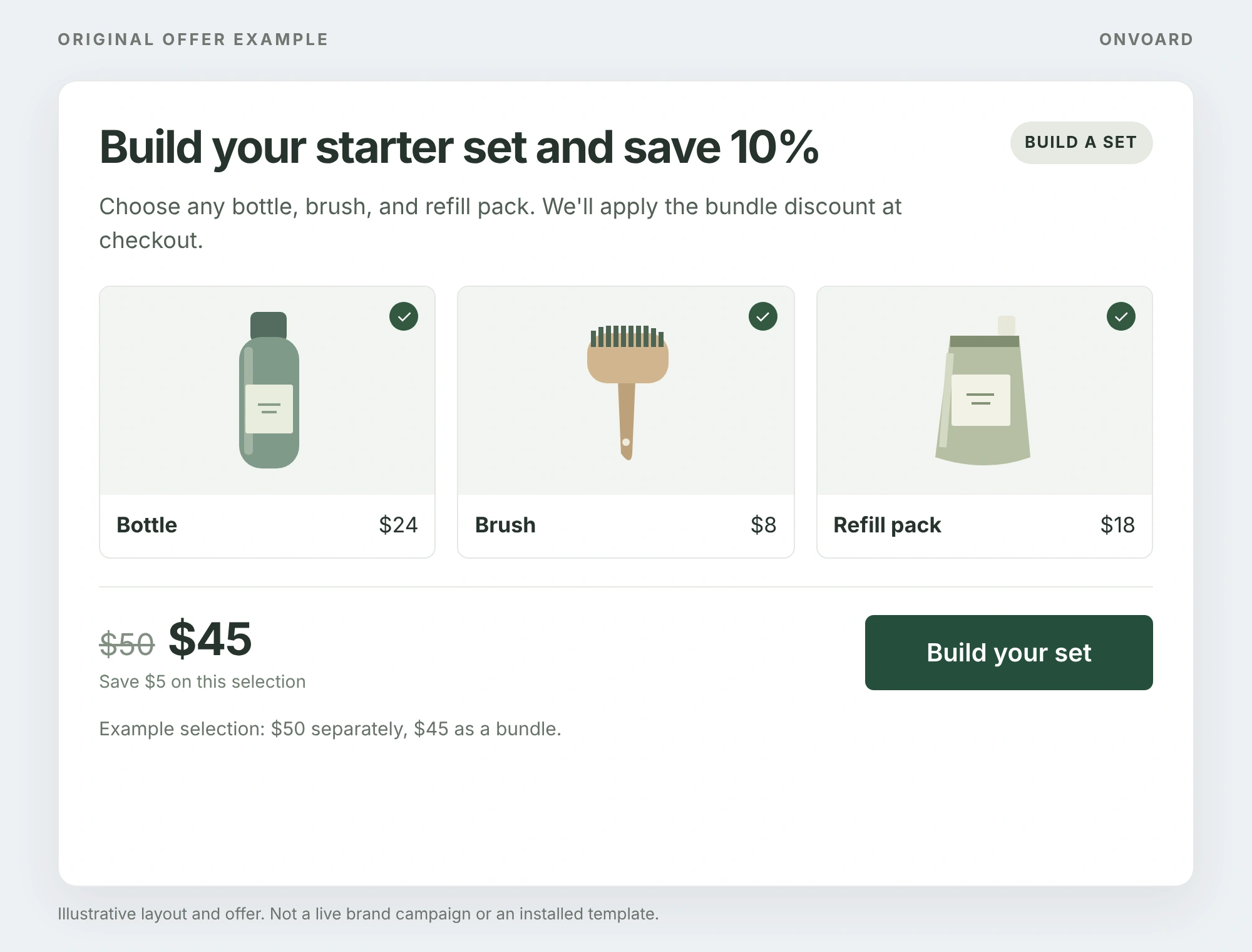
Original OnVoard illustration: the selected $50 set becomes $45 after the 10% bundle discount.
Build your starter set and save 10%
Choose any bottle, brush, and refill pack. We'll apply the bundle discount at checkout.
Button: Build your set
Example selection: $50 separately, $45 as a bundle.
The best bundles solve a job: a starter kit, a refill set, a travel set, or everything needed to use the main product properly.
The weak version is a few slow sellers tied together with a discount. Shoppers can tell when the bundle exists for your inventory rather than for them.
Price the bundle against the normal price of the parts, then check contribution using the actual product mix. Also decide what happens when someone wants to return only 1 item from the set. A bundle that's easy to buy and painful to unwind creates support work later.
In the illustrated bundle, a $24 bottle, an $8 brush and an $18 refill cost $50 separately, compared with $45 as the bundle. The 10% bundle discount takes $5 off because 10% of $50 is $5. Show that comparison only when the individual prices are genuine, and make the checkout total agree with it.
10. Spend more, save more
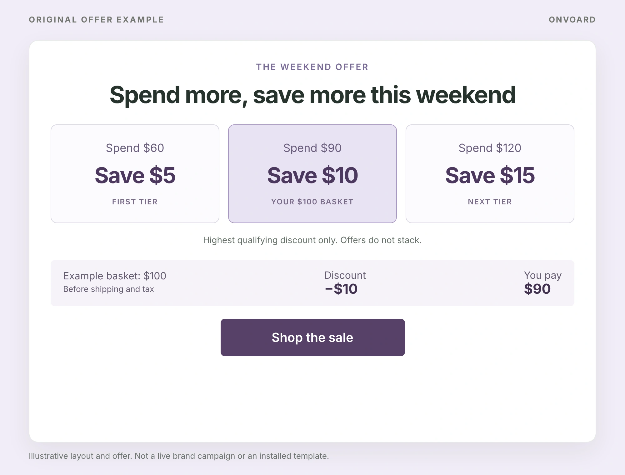
Original OnVoard illustration: a $100 basket qualifies for $10 off, less than the sum of every tier.
Spend more, save more this weekend
Spend $60, save $5. Spend $90, save $10. Spend $120, save $15.
Button: Shop the sale
Highest qualifying discount only. Offers do not stack.
In this example, the thresholds use eligible merchandise value before discounts, shipping and tax. A $100 basket earns $10 off, because that is the highest tier it reaches, so the customer pays $90 before shipping and tax. The rewards do not stack.
Tiered offers give shoppers several targets instead of a single threshold. The important part is clarity: each tier needs an obvious spend threshold and reward, and your store rules need to define whether codes apply automatically or require separate entry.
We'd keep the ladder short. If someone needs to stop shopping and calculate which tier is best, the promotion is now competing with the products for attention.
Check baskets just below every tier. A larger discount can apply to the whole order even when the shopper adds only a small amount. Model the amount collected and product cost on both sides of each threshold.
11. Free sample with an order
A sample makes sense when trying a small amount can lead to a later purchase. Food, beauty, fragrance, and supplements are obvious fits.
The sample should introduce something the shopper has not already bought. Then track whether recipients later buy the sampled product. Without that follow-up, you only know that you paid to put an extra item in the box.
We wouldn't use a sample merely because the item is cheap. The sample needs a second job: reduce uncertainty about a product and create a reason for the next purchase.
Sephora's US sample policy gives shoppers a choice of 2 free samples with an online merchandise order, subject to availability. The choice lets the customer try something that interests them rather than receive an arbitrary extra.
For a fragrance store, we'd connect the sample to a later decision like this:
In the sample order | In the follow-up |
|---|---|
Record the fragrance actually supplied | Link to that fragrance, not every bestseller |
Include a clear product name | Make the full-size version easy to identify |
Keep track of eligible recipients | Compare later full-size purchases, not just email clicks |
Illustrative follow-up plan, not a description of Sephora's automation.
12. Clearance or end-of-line sale
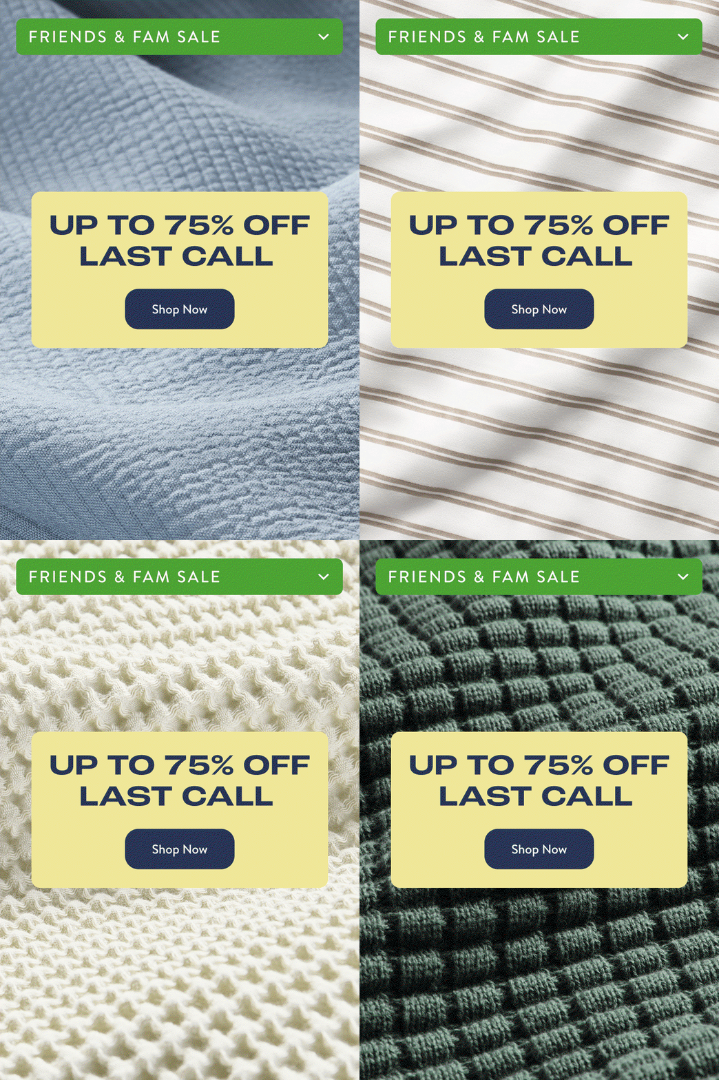
Brooklinen's Last Call email, 8 March 2026, archived by Milled. The larger saving applies to selected products.
Clearance has something most artificial urgency doesn't: a reason shoppers can verify. The stock is leaving the range, quantities are finite, and the sale ends when it's gone.
That makes it a strong place for a deeper discount. Keep clearance visually separate from the core range so the sale doesn't reset expectations for everything else.
We'd never put a resetting countdown on clearance. The inventory already supplies the deadline. Use it.
Brooklinen's March 2026 email advertises up to 75% off Last Call items, with the terms limiting the offer to selected products and marking the sales final. The useful distinction is the separate clearance range: the deepest saving is not presented as the normal price of every product.
Promotions that make the offer more noticeable
13. Scratch-card discount
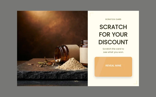
OnVoard template preview: the scratch interaction reveals the reward rather than changing its cost.
A scratch card turns the reveal into part of the offer. The commercial value still comes from the prize underneath, so don't let the animation distract you from the reward economics.
We'd use it in categories where a playful interaction fits the purchase: food, beauty, gifting, supplements, entertainment. We'd avoid it in a serious, expensive, or highly considered purchase where the game makes the brand feel cheaper than the product.
If you use the Supplements Scratch Card, set the prize range before worrying about colors or animation. Every common outcome should be a reward you're comfortable funding.
14. Spin to win
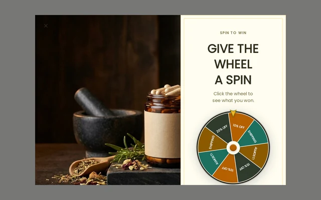
OnVoard template preview: the wheel displays several reward outcomes before the spin.
Spin to win does the same basic job as a coupon popup, but makes the prize set visible before the visitor gets the result.
Our view: don't make the wheel your permanent default. A wheel that has been on the homepage for a year stops being a game and becomes furniture. Retire it. Bring it back for a promotional window, a launch, or a campaign where the larger prize is genuinely worth noticing.
Compare the Supplements Spin Wheel with a plain offer using the same underlying reward. If the game adds complexity without improving the commercial result, remove the game.
15. Pick a gift
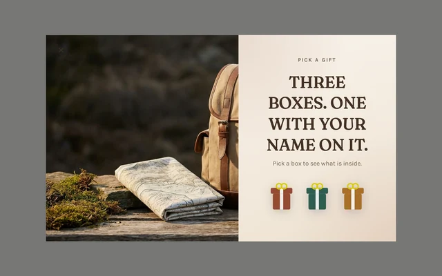
OnVoard template preview: the boxes conceal their rewards. They are not labeled benefit choices.
A pick-a-gift game lets a visitor choose a box before the reward is revealed. In this Outdoor Pick a Gift preview, the boxes are closed. The attraction is the surprise.
Choosing a mystery box does not tell you which benefit a shopper prefers. A visitor cannot express a preference for free shipping over a coupon when they cannot see what either box contains.
Use this as a playful reward reveal, then check the reward, signup steps and checkout redemption. To learn which benefit matters more, show named options in a separate, clearly explained choice instead.
16. Mystery discount on exit
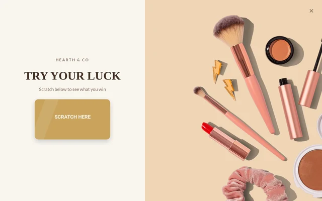
OnVoard template preview: a fullscreen scratch reveal. Exit timing comes from the campaign settings.
This combines 2 ideas: wait until the visitor shows an exit signal, then use a reveal to give them a reason to stay.
We'd only use the game here as the last interruption of the session. If the same visitor already saw a welcome popup, another fullscreen game on the way out is a lot to ask from a single visit.
Keep the reveal fast. Someone whose cursor is already heading out isn't volunteering for a long animation. The Mystery Scratch Takeover is useful when the mystery itself is part of the campaign, not when you simply need to show a code.
Promotions for recovering a visit or creating a real deadline
17. Exit-intent discount
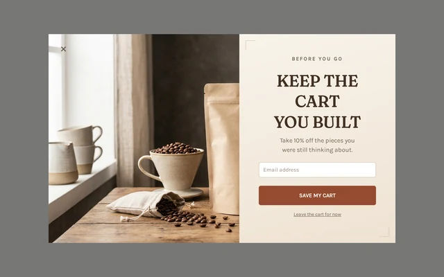
OnVoard template preview: a 10% offer framed around the cart the shopper has already built, because the discount is calculated on what they have already added.
An exit offer waits until the page sees a desktop exit signal instead of handing the incentive to everyone on arrival.
If we were testing whether a store needs a discount at all, we'd usually start here before a sitewide welcome discount. It narrows the incentive to a later moment in the visit and gives you a cleaner comparison against the same offer shown earlier.
Don't treat exit intent as proof that the order was lost. It's only a signal. Compare the Coffee Exit Intent against another timing treatment and watch both sales and dismissals.
18. Flash sale
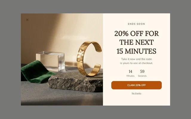
OnVoard template preview: a 15-minute offer. The real discount must honor the promised expiry.
A flash sale is a short sale with a real end. The deadline matters more than whether the offer is 15%, 20%, or something else.
Use it around an actual event: a launch, weekend, inventory push, or calendar window. The countdown, campaign schedule, and checkout rule should all agree on the same end time.
We'd rather run fewer flash sales with credible deadlines than keep a countdown permanently active. Once shoppers learn that “ends tonight” means “starts again tomorrow,” the timer has lost its only job.
The Jewelry Flash Sale preview advertises a 15-minute window. A storewide sale just needs one shared closing time, while a personal offer carries a different burden: confirming the discount actually expires for that specific customer. A timer that restarts on every visit does not enforce either promise.
19. Desktop abandonment offer
This is a targeting variation of the exit offer, not a different kind of discount. The decision is whether to reserve the campaign for desktop visits.
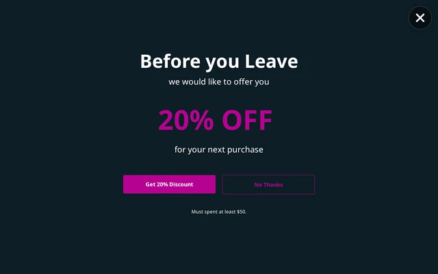
OnVoard template preview: a desktop offer showing 20% off for orders of at least $50.
A desktop-only exit campaign is honest about its reach. There's no cursor-based exit intent on a phone, so “desktop only” isn't a limitation to hide. It's a reminder that mobile needs its own timing rule.
The current Stop Abandonment (Desktop Only) presents a discount message but doesn't itself prove the discount is being delivered at checkout. Create and test the matching reward before you publish the claim.
If desktop represents only a small part of your traffic, we wouldn't build the whole recovery plan around this mechanic.
20. Seasonal or holiday sale
The calendar gives seasonal promotions a reason. Black Friday, an end-of-season event, a brand anniversary, or a genuine holiday window already explains why the offer exists.
The downside is competition for attention. Everyone is promoting at the same time. So the work starts before the sale: build the list, decide the inventory, prepare the offer, and give existing customers a reason to care before the inbox fills up.
We'd avoid inventing a “special event” every month. A calendar promotion works because the date means something. If the reason is fake, the discount has to do all the work.
Allbirds' 29 November 2025 Black Friday email focused on popular styles at up to 40% off and gave a 1 December closing date. The example combines a familiar shopping event with a finite sale window.
For your own seasonal sale, settle these details before the first email:
Campaign decision | What must match |
|---|---|
Eligible collection | Email links, sale page and checkout discount |
Final deadline | Store timezone, banners, emails and discount expiry |
Stock available | What is advertised and what customers can still buy |
Delivery promise | Dispatch capacity and any published order cutoff |
Promotions for building the next purchase
21. SMS signup incentive
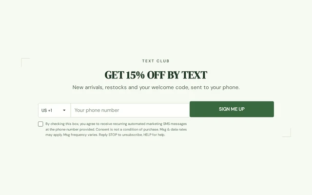
OnVoard template preview: 15% off by text, with an explicit SMS signup and disclosure.
A phone number is a bigger ask than an email address because the channel is more immediate. The offer should therefore say what the shopper is signing up for, not merely promise “updates.”
The Home Decor SMS Signup names arrivals and restocks. That's the right level of specificity. If you don't have a message plan for the phone number, we wouldn't collect it yet.
Keep the consent and disclosure requirements for the countries and channels you use. The promotion isn't worth much if the list can't be messaged properly afterwards.
22. Birthday club
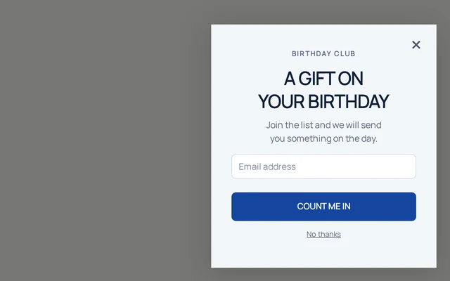
OnVoard template preview: the first email-capture step promises a birthday gift later.
A birthday club is different from most offers here because the reward comes later. You collect the date now so you have a legitimate reason to contact the customer at a future moment that matters to them.
We'd use it only where the occasion fits the category: gifts, children, beauty, food, experiences. If the date has no relationship to what you sell, it's just another form field.
The Baby Birthday Club provides a signup flow. Before running it, verify where the relevant birthday is stored and which follow-up issues the reward. A signup template alone does not complete the birthday campaign.
23. Referral discount

Rothy's referral page, reproduced in an archived referral guide. This is an archived example, not confirmation of a currently available offer.
A referral offer rewards an existing customer for bringing in a new one. The important event isn't the share or the click. It's the qualified purchase.
That means the rules need to answer a few basic questions. When does the referrer earn the reward? What happens after a return? Can someone refer themselves? Does the new customer need to meet a minimum spend?
Rothy's archived page makes the exchange easy to understand: the new shopper gets $20 off if they use the referral link, and the referrer receives $20 after the friend orders. The screenshot is useful for its explanation of who gets what and when, not as a source for every eligibility rule.
Set your own qualifying spend from the cost of both rewards. For example, a $20 referral discount on a $100 order works out to 20% off, because $20 is one-fifth of $100, before you fund the referrer's later benefit. A referral program can incur costs on 2 different purchases.
We wouldn't make referrals a priority before you have customers who are actually happy enough to recommend you. Earn that first.
24. Loyalty points or member rewards
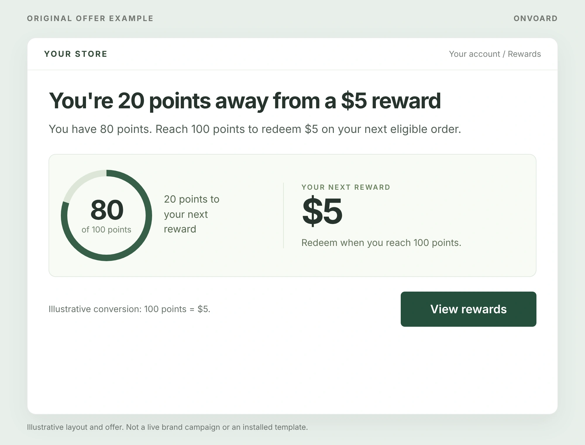
Original OnVoard illustration: the balance, next threshold and dollar value appear together.
A permanent loyalty program isn't a short promotion by itself. The promotional version is something temporary inside the program: bonus points, double points, a birthday reward, member-only access, or a limited redemption offer.
The part we care about most is whether the customer can understand the value. If 1,000 points means nothing until someone opens a help page, the program is asking them to do too much math.
You're 20 points away from a $5 reward
You have 80 points. Reach 100 points to redeem $5 on your next eligible order.
Button: View rewards
Illustrative conversion: 100 points = $5.
Track points issued, redeemed, expired, and still outstanding. Own the liability. A reward you promise today is a future obligation until it's used or expires.
Make points understandable in money or a named benefit. In a hypothetical program where 100 points buy $5 of credit, because the store sets that conversion rate:
Account state | Useful customer-facing message |
|---|---|
80 points | You have 80 points. Reach 100 to redeem $5. |
100 points | You can redeem $5 on your next eligible order. |
A bonus-points event | Earn twice the usual points on eligible orders this weekend. |
Illustrative points conversion. Set a rate your store can fund.
25. Gift cards and store credit
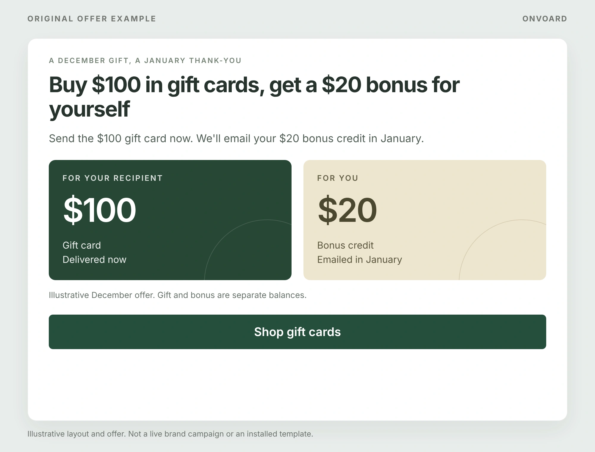
Original OnVoard illustration: the recipient gets the $100 gift, more than the purchaser's separate $20 bonus in January.
Buy $100 in gift cards, get a $20 bonus for yourself
Send the $100 gift card now. We'll email your $20 bonus credit in January.
Button: Shop gift cards
Illustrative December offer. Gift and bonus are separate balances.
Gift cards and store credit keep value attached to a future purchase. As a promotion, that might be bonus credit, a win-back offer, compensation, or a returns alternative.
For example, paying $50 for $55 in credit adds $5 of promotional face value, because the store is giving $5 more in credit than it collected in cash. That is not the full fulfillment cost of the future order, and it is not the same as giving $5 in cash, because credit only costs the store when it is actually redeemed. Check what customers can redeem, any extra spend, and the cost of supplying the eventual purchase.
We like store credit more for retention than for cold acquisition. Asking someone who has never bought from you to pre-commit money is a harder sell than rewarding a customer who already knows the store.
In the illustrated December offer, the customer buys a $100 gift card for someone else and receives a separate $20 bonus in January, less than the gift itself. The recipient gets the gift immediately, while the purchaser has a reason to return later. These are sample terms, not a real brand campaign.
That distinction should be just as clear in your offer. Say who receives each balance, when it can be used and which products qualify. Do not bury the conditions for promotional credit inside the purchased gift's message.
How much discount can you actually afford?
Discount depth is a margin decision before it's a copywriting decision. Margin first.
Take a simple $100 order with $50 in product cost, because a round number makes the arithmetic easy to follow. Before other costs, gross profit is $50. Give 20% off and revenue falls to $80 while product cost stays at $50, leaving $30 of gross profit.
Order economics | No discount | 20% off |
|---|---|---|
Revenue | $100 | $80 |
Product cost | $50 | $50 |
Gross profit before other costs | $50 | $30 |
The discount reduced gross profit on that order by 40%, more than the 20% off the customer received. That does not mean the promotion is automatically bad. It means the offer has to earn back what it gives away through additional orders, basket growth, repeat purchases or inventory movement.
This is also why “free shipping versus 10% off” has no universal answer. Calculate both on the baskets your customers really place.
How we'd launch a promotion without overcomplicating it
Pick the problem. First order, basket value, stock, abandonment, or repeat purchase.
Choose the cheapest mechanic that can solve it. Don't start with a game, a 4-tier ladder, or a deep discount unless the simpler version has a reason to fail.
Price the offer on real baskets. Use your product cost, shipping cost, reward cost, and normal order values.
Build the store-side rule before the message. The popup can present a promise. Checkout, shipping, inventory, or your loyalty ledger still has to honor it.
Run 1 clear test. Change the mechanic or timing, not 5 variables at once.
Judge the commercial result. A high popup conversion rate isn't enough if the orders are less profitable or the reward mostly goes to people who would have bought anyway.
For a starting point, browse the OnVoard popup templates. They save you design and setup time, though the harder call, deciding what your store should actually offer, is still yours to make.
What should you measure?
Measure the number that matches the reason you ran the promotion.
First-order offer: qualified first purchases, discount cost, and whether returning customers received it accidentally.
Basket promotion: order value and contribution after the incentive, not just the number of people who crossed the threshold.
Inventory promotion: units moved, cash recovered, and margin surrendered on the targeted products.
Referral: qualified new customers and reward cost, not shares.
Loyalty or birthday promotion: repeat purchase and redemption over the period in which the reward can actually be used.
Popup campaign: dismissals and repeat exposure alongside signups and redemptions. A campaign that gets attention by annoying everyone isn't a win.
Where possible, randomly hold back the promotion from a comparable group and measure purchases and contribution in both groups. A before-and-after comparison can help you spot changes, but seasonality, traffic mix and other campaigns can explain them too. Attributed revenue tells you which orders touched a campaign; it does not prove that the campaign created those orders.
Common questions
What is the difference between a sales promotion and a discount?
A discount lowers the price. A sales promotion is the wider category: discounts, free shipping, gifts, bundles, samples, early access, loyalty rewards, referral rewards, and other temporary offers can all be promotions.
What is the best sales promotion for a new ecommerce store?
If the main problem is getting the first purchase, we'd start with a simple first-order offer or a narrowly timed exit offer. If margin is already tight, test a fixed-cost benefit such as free shipping or a gift against the equivalent percentage discount before deciding.
Should I use free shipping or a percentage discount?
Calculate both. A $6 shipping subsidy costs more than 10% off a $40 order and less than 10% off a $100 order. Product weight, destination, existing shipping thresholds, and basket size can change the answer.
How often should I run promotions?
There's no useful universal cadence. None exists. We'd run them when there's a specific commercial reason, then stop when the reason is gone. If shoppers learn that another sale is always around the corner, waiting becomes rational.
Do sales promotion popups work?
A popup can present the promotion at the right moment and capture the response. It can't make a weak offer profitable. Judge the offer, timing, audience, and store-side economics together, every time, before you credit the popup for a sale the product or price actually earned.
Which promotion would we test first?
For a store that has never tested promotions, we'd usually choose the smallest useful experiment: one audience, one offer, one timing rule, and one commercial outcome. That gives you an answer you can use instead of a campaign with too many moving parts to explain.
Once you've chosen the offer, our website welcome message examples cover the wording, buttons and signup confirmations used to present it.