On this page
A website welcome message helps a new visitor find a reason to stay. For an online store, that might be a useful product recommendation, a first-order discount, or a quick answer to “Do you ship to me?” It doesn't have to be a popup, and it doesn't have to ask for an email address.
Below are 30 website welcome message examples for online stores. Each includes wording you can adapt, suggested button text, and advice on where it belongs, and there are options for homepage visitors, email signups, returning customers, and the message people see after submitting a form.
Our starting preference is simple: give the visitor something useful before asking them for something. “Welcome to our store” is friendly. “New here? Start with our bestsellers” is friendly and gives them somewhere to go.
The sample messages are original copy, not quotations from customers or claims about campaign results. Change the offers, dates, and service details to match your store. The linked OnVoard designs are starting points; their screenshots show the original template copy. Each numbered example also includes an original illustration of that layout; it is a mockup of our sample wording, not a photo of a real store.
Which welcome message should you use?
What the visitor needs | Message to start with | Where to put it |
|---|---|---|
A place to start shopping | A bestseller, beginner, or gift-finding message | Homepage or relevant collection page |
A reason to join your emails | A specific offer, useful advice, or new-release updates | Signup form, popup, or footer |
An answer before buying | Help with size, delivery, pickup, or product choice | The page where that question arises |
Something relevant on a return visit | New arrivals, account shortcuts, or a verified member benefit | Homepage, account area, or a targeted message |
Confirmation after signing up | The promised code or a clear explanation of what happens next | The form's success screen |
Choose the row that matches the visit. Don't put all these messages on the homepage at once. A shopper who wants to browse doesn't need to join a birthday club, claim a discount, and answer a product quiz before seeing your products.
Homepage welcome messages that help people start shopping
These examples work as ordinary page content, and someone should be able to read the message and continue browsing without closing an overlay.
1. Point new visitors to your bestsellers
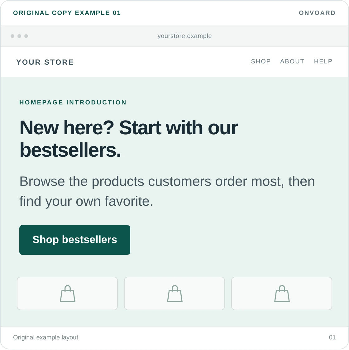
New here? Start with our bestsellers.
Browse the products customers order most, then find your own favorite.Button: Shop bestsellers
We'd use this when the store sells a broad range and the homepage doesn't offer an obvious starting point. It gives an undecided visitor a manageable selection without making them explain their preferences first.
The destination matters. Link to products that really are bestsellers, not a collection assembled from whatever you need to clear. For a brand-new store without sales history, change the heading to “New here? Start with these” and describe the selection as your own picks.
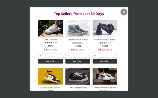
For a product-led message, the Top Sellers Product Recommendations template is a starting design. Configure the product selection before using a bestseller claim.
2. Say what you sell without a brand speech
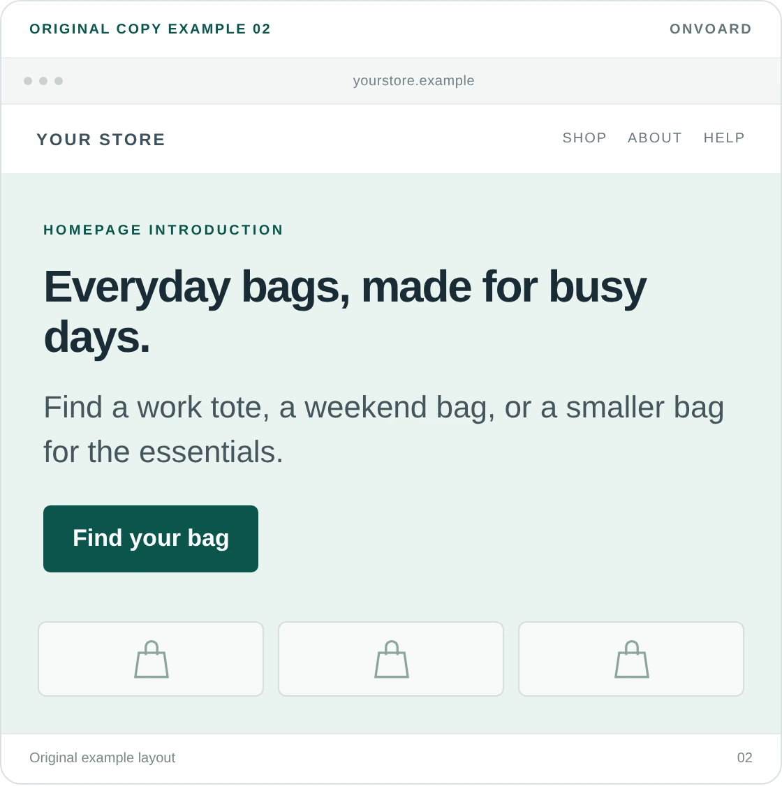
Everyday bags, made for busy days.
Find a work tote, a weekend bag, or a smaller bag for the essentials.Button: Find your bag
This is for a visitor who has never heard of the brand. They need to understand the range before they can care about its story. Naming the products and how people use them does more work here than “Welcome to a world of possibilities.” Show, don’t narrate.
Keep the choices visible on the page below. If the button opens a collection, that collection should help people distinguish the work totes from the weekend bags. A clear sentence followed by an unfiltered catalog only solves half the problem.
3. Help a beginner choose
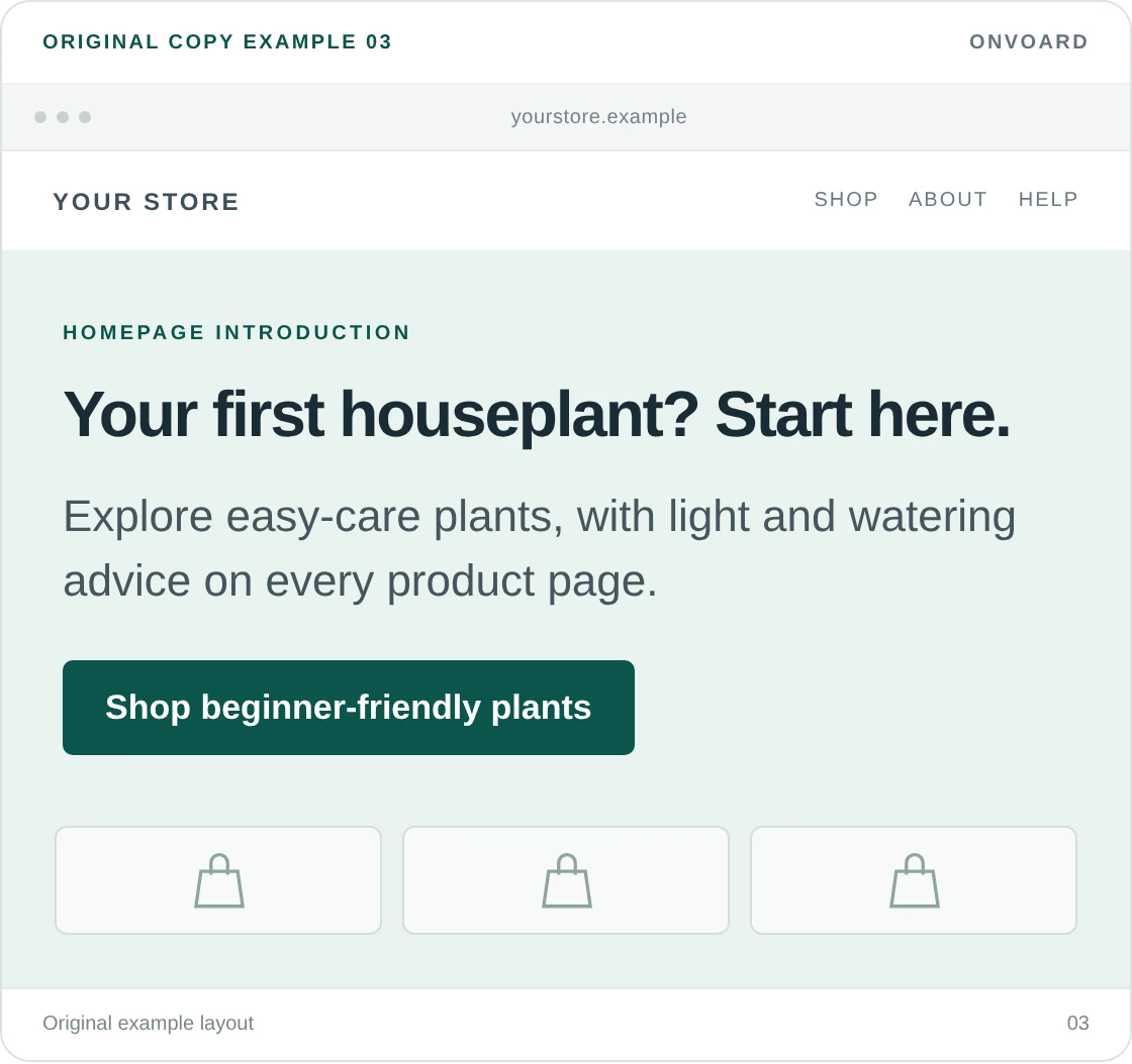
Your first houseplant? Start here.
Explore easy-care plants, with light and watering advice on every product page.Button: Shop beginner-friendly plants
A beginner needs reassurance about choosing, not a reminder that your store has a large selection, and we'd use this for products where people worry about buying the wrong thing: plants, coffee equipment, hobby supplies, or skincare routines.
The Sill's dedicated beginner collection is a real example of a useful destination for this kind of message. The lesson isn't to copy its copy. It's to make the promised help available after the click. Don't call products beginner-friendly unless you can explain what makes them easier to use or care for.
4. Give gift shoppers a shortcut
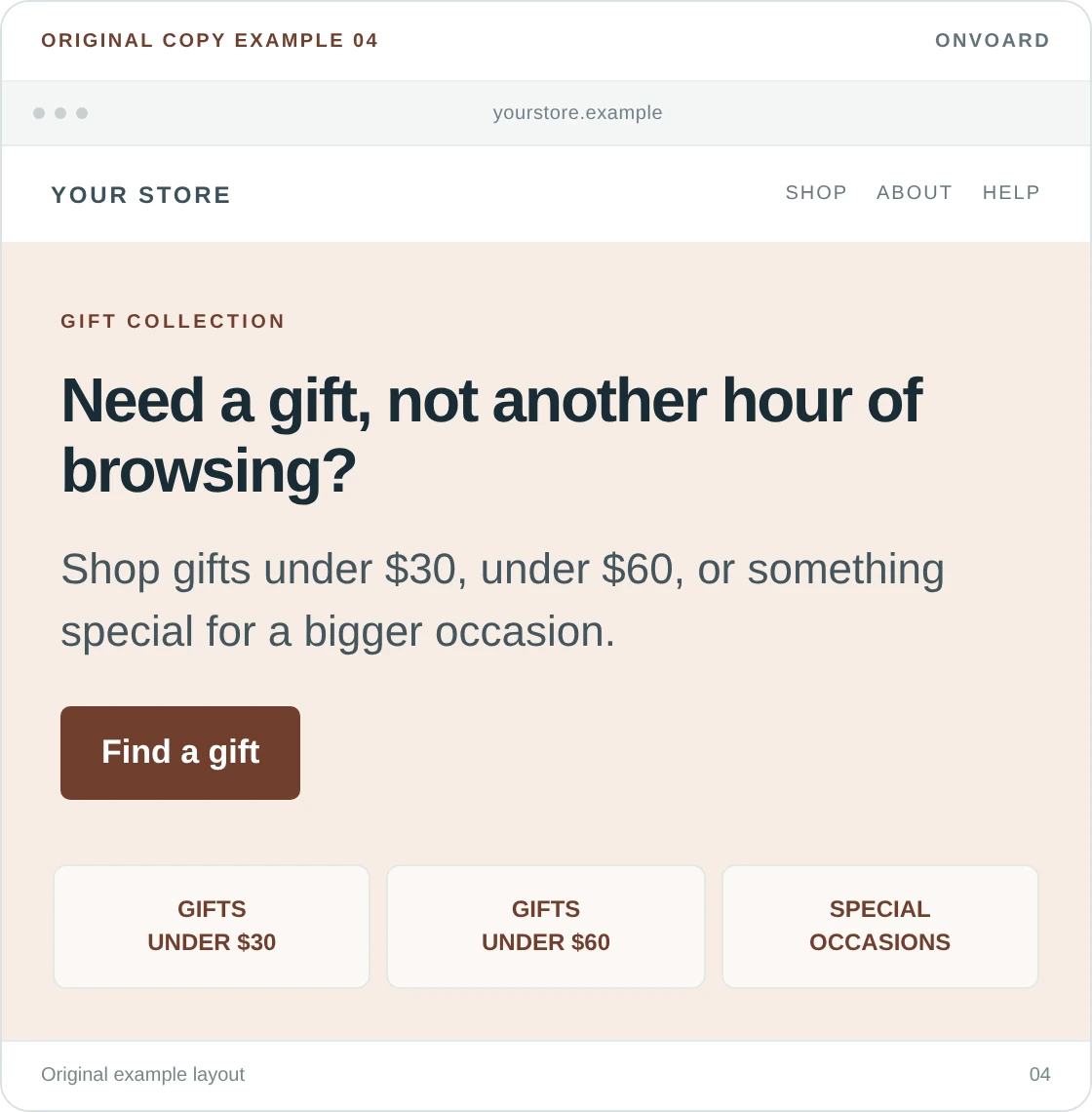
Need a gift, not another hour of browsing?
Shop gifts under $30, under $60, or something special for a bigger occasion.Button: Find a gift
Price ranges give a visitor an immediate way to narrow the choices. You could instead organize by recipient or occasion, but don't ask them to make all those decisions in the welcome message.
The budget is also a promise. Check that each collection has enough suitable, available products at the stated price. If most of the “under $30” choices need paid extras to become a presentable gift, change the range or explain what is included. Gift wrapping and delivery information belong close to the products.
5. Introduce the people who make the product
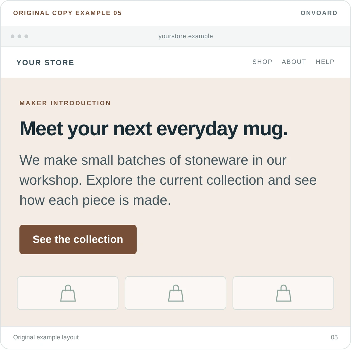
Meet your next everyday mug.
We make small batches of stoneware in our workshop, and explore the current collection and see how each piece is made.Button: See the collection
Use a detail you can actually show: a workshop, a material, a manufacturing method, or a maker's work. “Passion for quality” tells a visitor very little on its own.
Hiut Denim's own account of its Welsh factory and makers shows what specific brand material looks like. Your business doesn't need the same history. A product you make or select for a clear reason is enough. Keep the longer story available through a separate link rather than putting it between the visitor and the collection.
6. Welcome visitors into a current collection
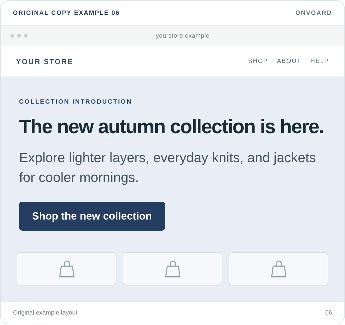
The new autumn collection is here.
Explore lighter layers, everyday knits, and jackets for cooler mornings.Button: Shop the new collection
This is a useful homepage welcome when a launch gives returning and new visitors the same clear destination, and it doesn't need to say “welcome” to do the job.
Match the season to the audience, and remove the message when the collection is no longer new. We wouldn't put a countdown beside a normal collection launch unless something really ends. The products, photography, and availability can make the message timely without invented urgency.
Email signup messages that don't depend on a discount
A signup invitation should tell people what they'll receive. “Join our community” can work when a community actually exists. For a normal mailing list, naming the emails is more helpful.
7. Offer updates about new arrivals
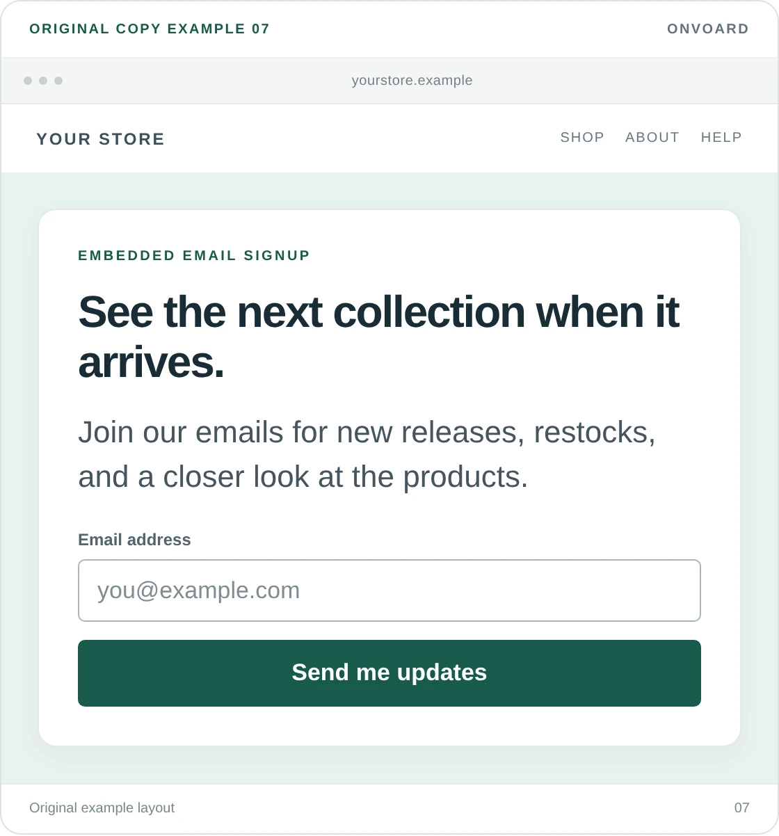
See the next collection when it arrives.
Join our emails for new releases, restocks, and a closer look at the products.Button: Send me updates
This suits a store that regularly has something new to show. Be selective about the list of benefits: don't promise styling advice, exclusive offers, and behind-the-scenes stories if every email is a sale announcement.
We'd put this beside a new-arrivals collection or in the footer before making it an interrupting popup. A visitor who has just enjoyed browsing your products has a reason to want the next release. The offer is weaker before they know what you sell.
8. Invite people to genuine early access
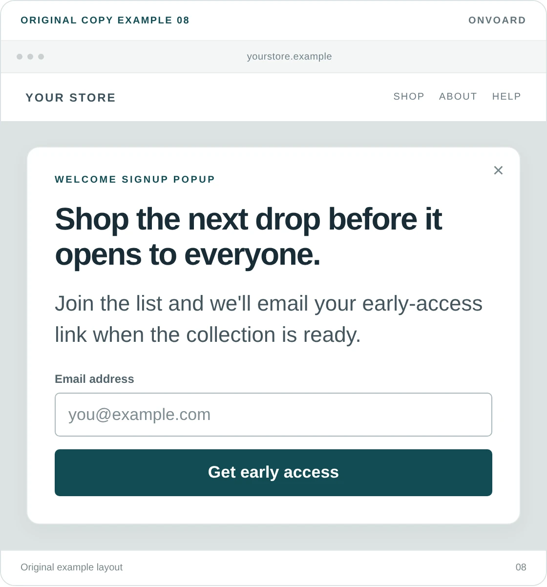
Shop the next drop before it opens to everyone.
Join the list and we'll email your early-access link when the collection is ready.Button: Get early access
The visitor should receive access they wouldn't get by returning to the public site at the same time. Real access, not a label. If all you're sending is a launch announcement, use example 7 instead.
Don't confuse early access with guaranteed stock. Unless you reserve inventory, avoid wording such as “Your pair is waiting.” We'd also make the eventual email say when early access ends, so subscribers don't have to guess whether their link still provides a benefit.
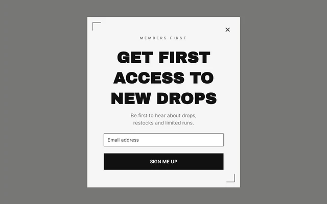
The Fashion Early Access design can be adapted for this message. Review its existing reward screens if you're offering access without a coupon.
9. Promise useful advice about the products
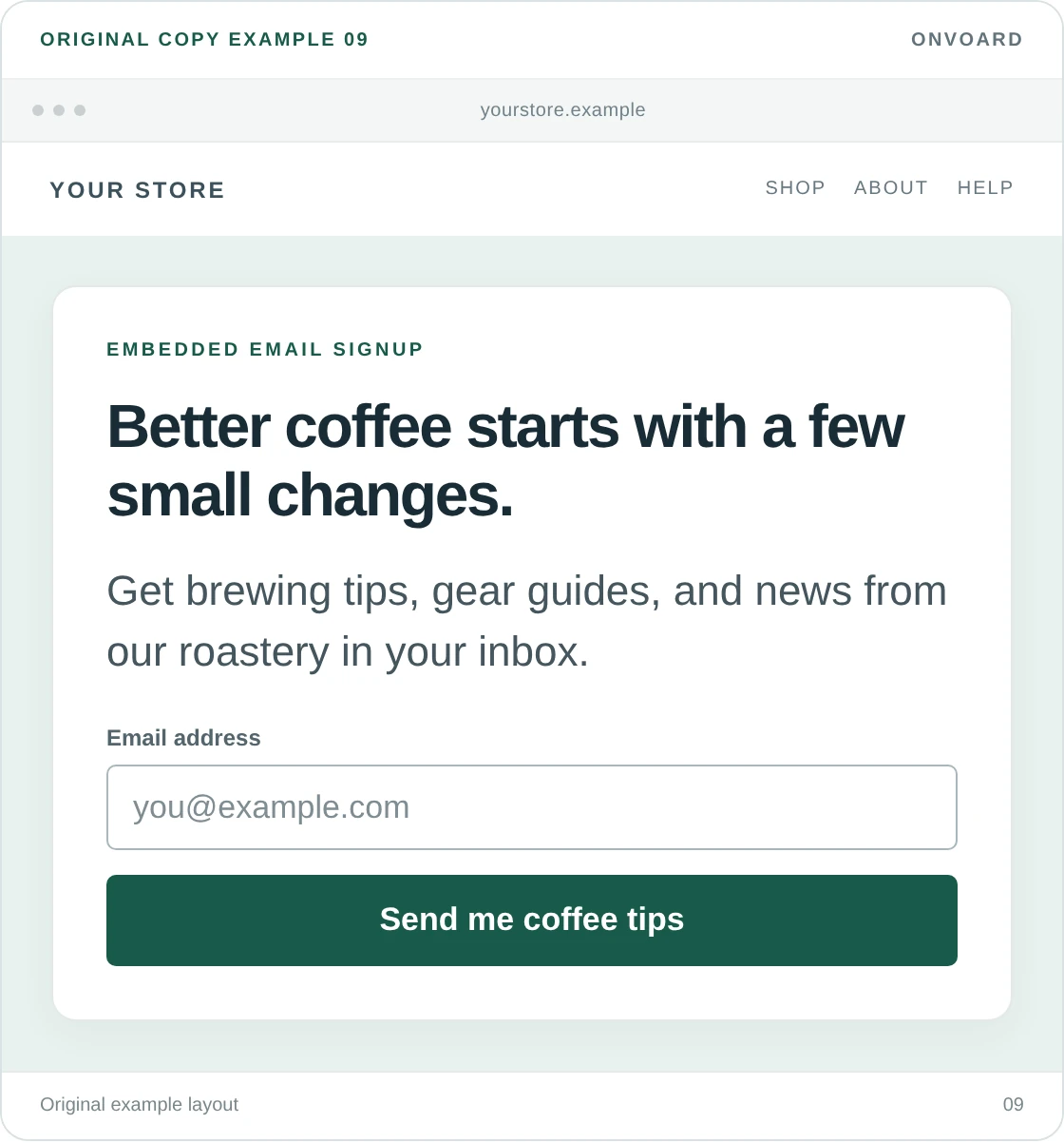
Better coffee starts with a few small changes.
Get brewing tips, gear guides, and news from our roastery in your inbox.Button: Send me coffee tips
The reason to subscribe here is learning something useful, and it works best when the store can provide advice beyond “buy our product”: choosing a grind size, cleaning equipment, or understanding roast options.
Name the advice you actually publish. “Expert tips” is less convincing than “brewing tips and gear guides,” and a promised weekly schedule becomes a problem if you only send when someone finds the time. State a frequency when you can maintain it, not because a template has room for another line.
10. Let a visitor wait for a specific product
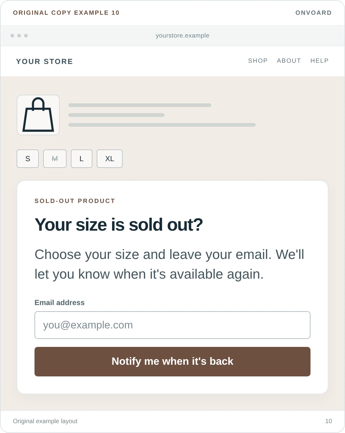
Your size is sold out?
Choose your size and leave your email. We'll let you know when it's available again.Button: Notify me when it's back
This belongs on the unavailable product, not as a general welcome popup across the store, and the visitor has a specific reason to share an address, and your message should preserve that reason.
OnVoard Back In Stock is the relevant product for restock notifications; a normal newsletter form is not a substitute. Keep the product and variant attached to the request. Don't quietly replace “tell me when my size returns” with an invitation to receive every marketing email.
11. Explain a birthday invitation
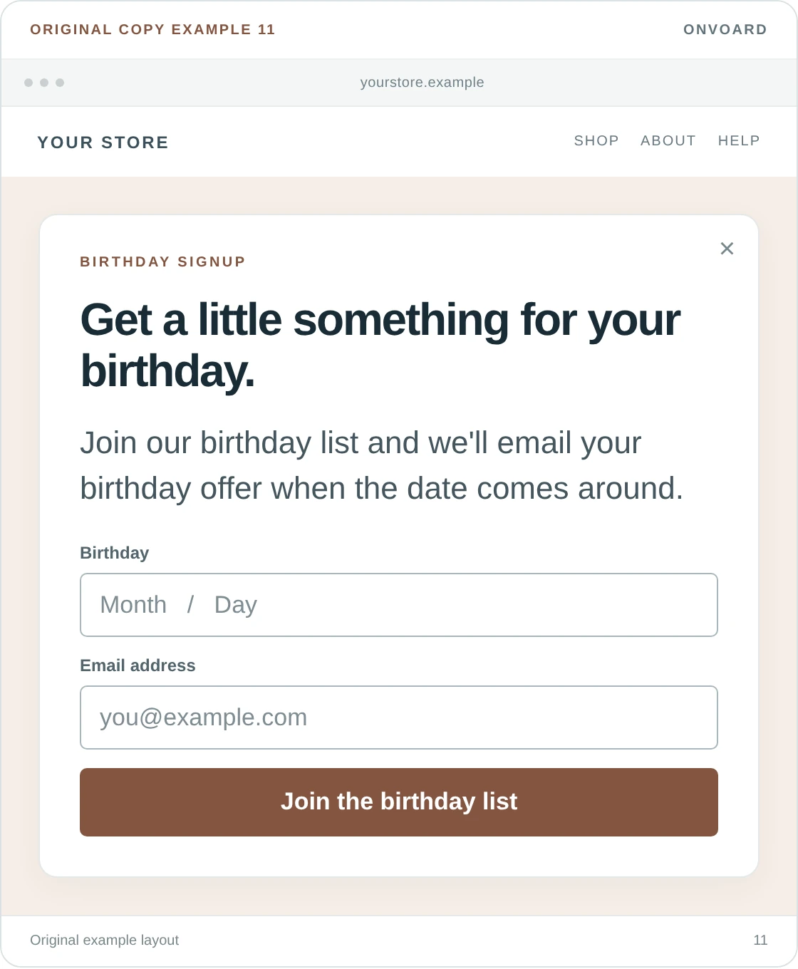
Get a little something for your birthday.
Join our birthday list and we'll email your birthday offer when the date comes around.Button: Join the birthday list
This is a better fit after someone has shown interest in the store than as the first thing covering the homepage. The visitor is being asked for an extra detail for a benefit that arrives later.
Choose the actual offer and the birthday email before collecting dates. If you only need a month and day, don't ask for a birth year just because the field allows it. For a children's brand, address the parent rather than inviting a child to submit contact details.
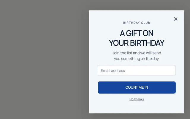
The Baby Birthday Club template illustrates the signup invitation. The later message and reward need to be set up separately.
12. Make a rewards invitation understandable
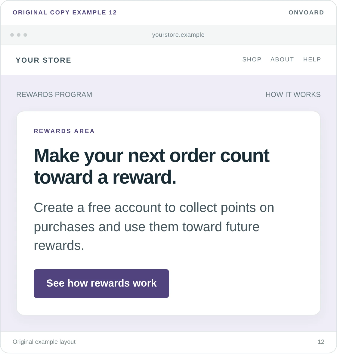
Make your next order count toward a reward.
Create a free account to collect points on purchases and use them toward future rewards.Button: See how rewards work
We'd link to a short explanation of earning and redeeming before asking an unfamiliar shopper to create an account, and a points balance means little until someone knows what the points can buy.
Where the program has a simple, verified earning rate, use that instead of vague language. Don't announce a “VIP upgrade” when you offer a single rewards program. For OnVoard users, Reperks is the rewards product; your welcome message should describe the program you've actually configured.
Welcome offer messages with a clear benefit
A discount can give someone a reason to sign up, but the amount and the conditions need to be understandable together. Keep the main restriction beside the offer rather than revealing it after the visitor submits.
13. Offer a first-order percentage discount
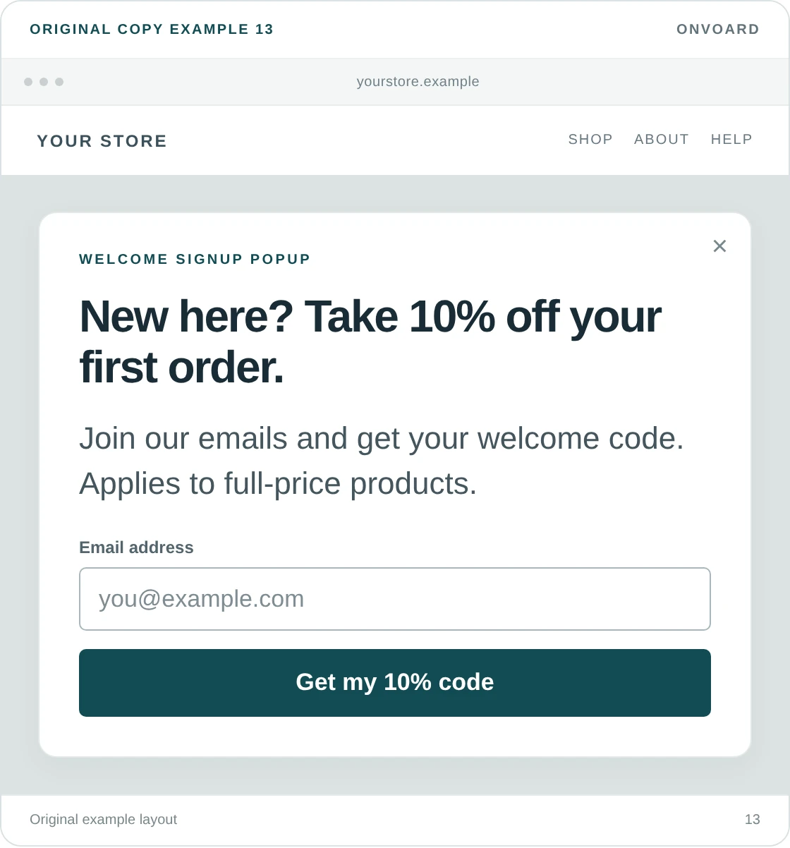
New here? Take 10% off your first order.
Join our emails and get your welcome code. Applies to full-price products.Button: Get my 10% code
This tells the visitor the amount, who qualifies, and what they're signing up for, and it also avoids a common ambiguity: “Get 10% off” can sound like a discount for everyone, including existing customers.
We'd show the code on the success screen when the campaign supports it, then send a copy by email. That lets the shopper continue shopping without having to leave for their inbox. If your setup sends the code only by email, say “Email my code” instead.
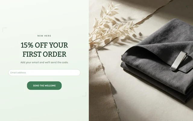
Start with the Fashion Welcome Offer or Supplements Welcome Offer design. Change the offer and the requested fields to match your campaign.
14. State a fixed discount and minimum spend together
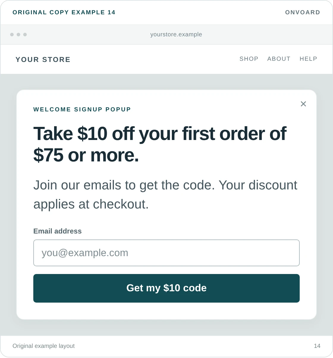
Take $10 off your first order of $75 or more.
Join our emails to get the code. Your discount applies at checkout.Button: Get my $10 code
The minimum spend belongs in the headline here because it changes whether the offer is useful. Putting “$10 off” in large text and hiding “when you spend $75” under the form creates a needless disappointment.
Check a typical order before choosing the amount. On a $75 order, $10 is roughly 13% off, more than double the roughly 7% it works out to on a $150 order. Those are example calculations, not recommended prices. Our sales promotion guide goes into choosing the offer. This message's job is to state it clearly.
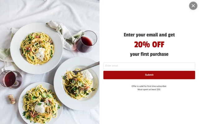
The Email Capture Full Screen design is a starting point for a signup and follow-up message. Its screenshot shows the original signup offer, not the $10 sample above. Replace its copy and configure your own discount.
15. Explain a free-shipping offer
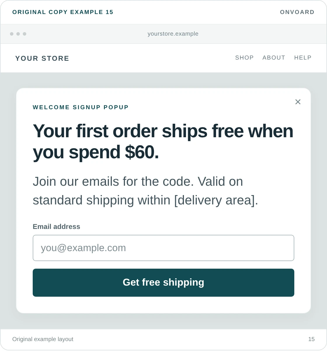
Your first order ships free when you spend $60.
Join our emails for the code, and valid on standard shipping within [delivery area].Button: Get free shipping
Free shipping needs a destination and service level if either is restricted. A visitor outside the eligible area shouldn't need to complete a form to discover that the offer isn't for them.
If free shipping already applies automatically to every order over $60, don't pretend email signup is required to receive it. Use an announcement such as “Free standard shipping on orders over $60” and let people shop. We'd reserve the signup version for an additional benefit the subscriber really receives.
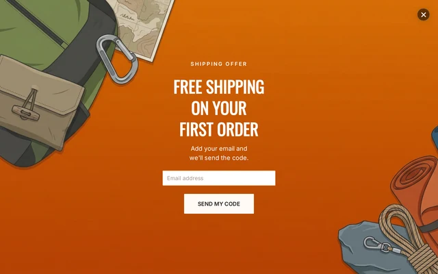
The Outdoor Free Shipping template provides a design to adapt. Match its message to the shipping discount you create in your store.
16. Name the free gift
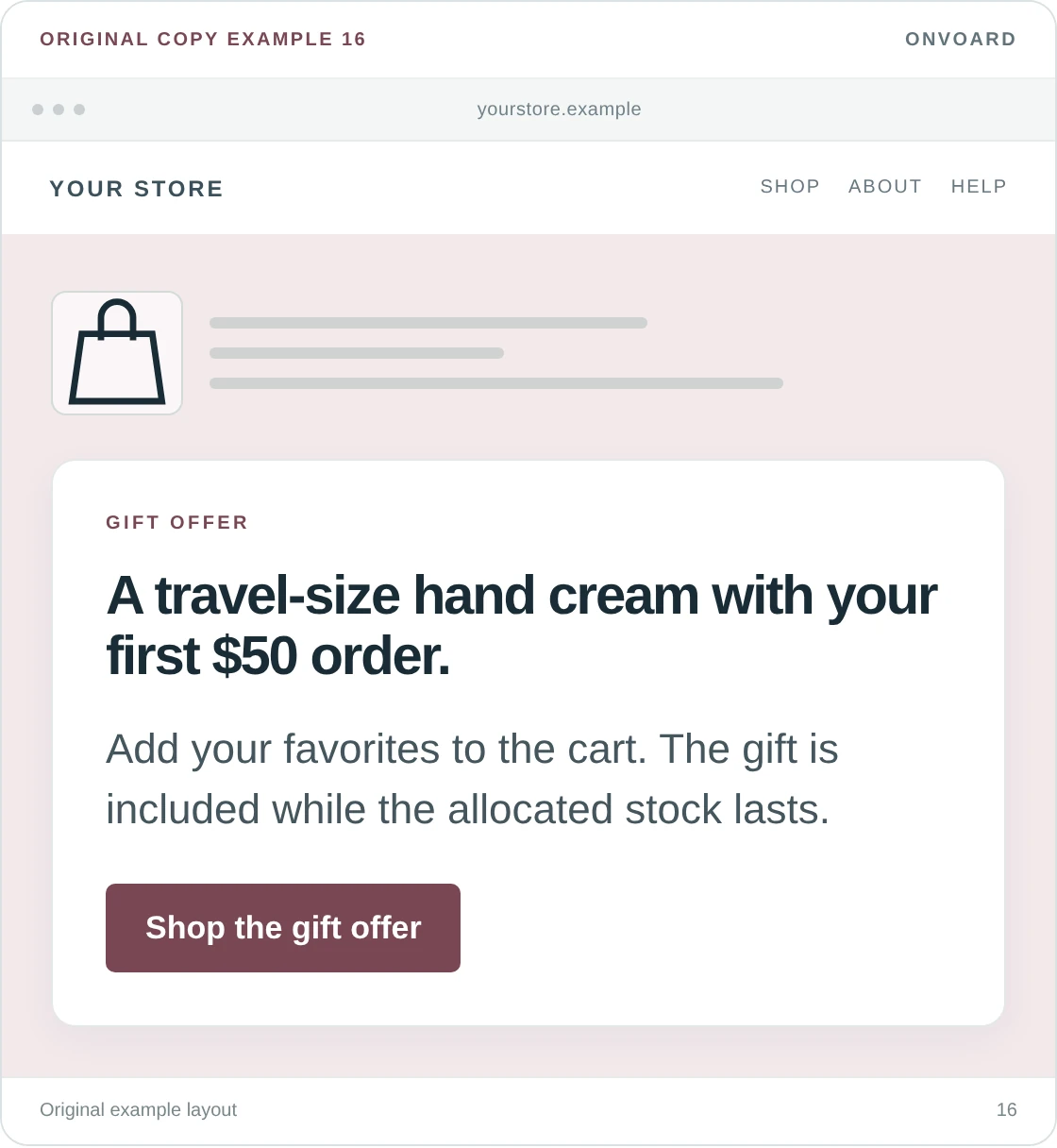
A travel-size hand cream with your first $50 order.
Add your favorites to the cart, and the gift is included while the allocated stock lasts.Button: Shop the gift offer
A named gift is easier to evaluate than “A special surprise just for you.” Show the size and, where useful, a photo. The visitor should know whether they want it before working toward the threshold.
This example doesn't collect an email address. That's intentional: the gift can be a shopping offer on its own. Confirm how the gift gets into the order, then write the instruction accordingly. If customers must add it manually, the message must not promise that it appears automatically.
17. Make a game invitation honest about what comes next
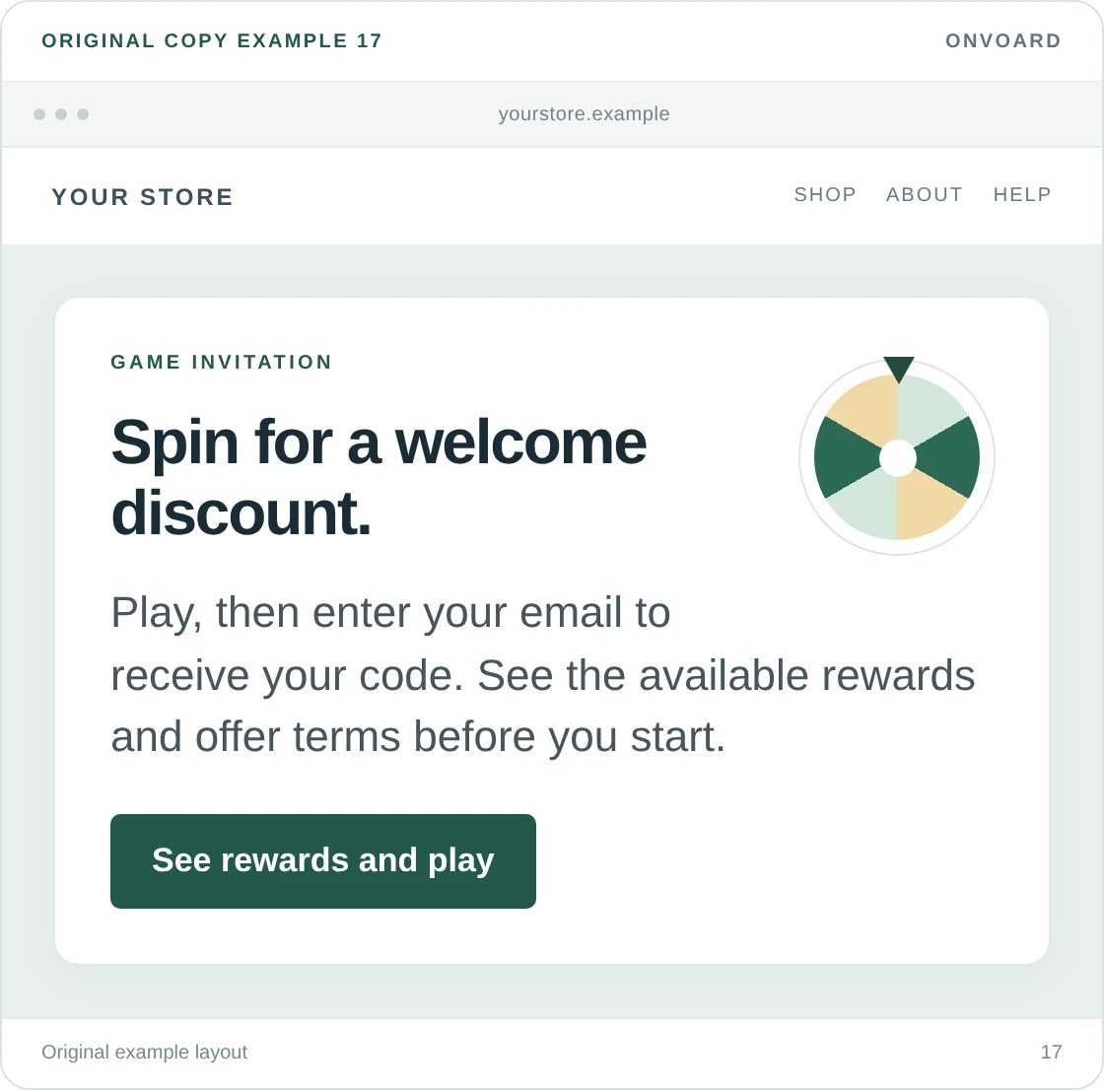
Spin for a welcome discount.
Play, then enter your email to receive your code, and see the available rewards and offer terms before you start.Button: See rewards and play
We'd avoid a game introduction that reveals the email requirement only after the visitor finishes playing. Tell people what they'll need to do before they begin.
A wheel also needs clear rewards. Don't give the biggest prize most of the visual attention if the presentation misleads people about their chances. Adapt this wording to the actual order of screens, reward setup, and campaign terms. A game is optional; a plain discount form may suit your store better.
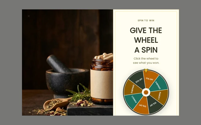
The Supplements Spin Wheel template is a visual starting point, not evidence that a wheel will outperform a plain form.
Welcome messages that answer a shopping question
Sometimes the most useful greeting is help with something the visitor is already trying to do, and use these on relevant pages, not as a checklist of services to squeeze into a homepage popup.
18. Help someone find the right size
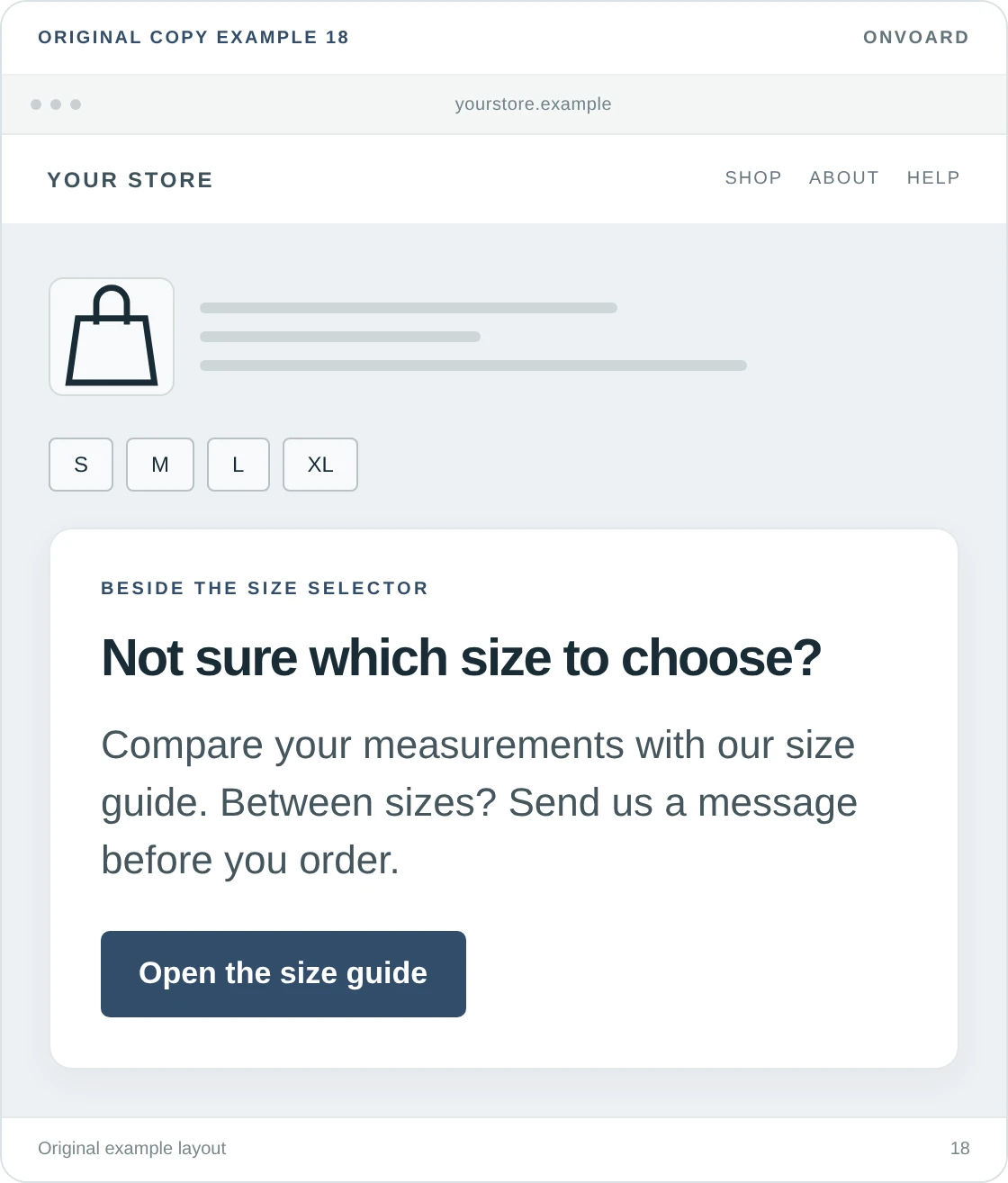
Not sure which size to choose?
Compare your measurements with our size guide. Between sizes? Send us a message before you order.Button: Open the size guide
This is more useful near a size selector than a general “Need help?” prompt, and the visitor has a question, and the message offers a direct answer plus a fallback.
Allbirds places fit guidance alongside its size selection, which illustrates the placement principle. Your own advice must be specific to the product. Don't use the same size recommendation for every item if the fits differ, and don't promise personal help unless someone will respond.
19. Tell shoppers where to check delivery
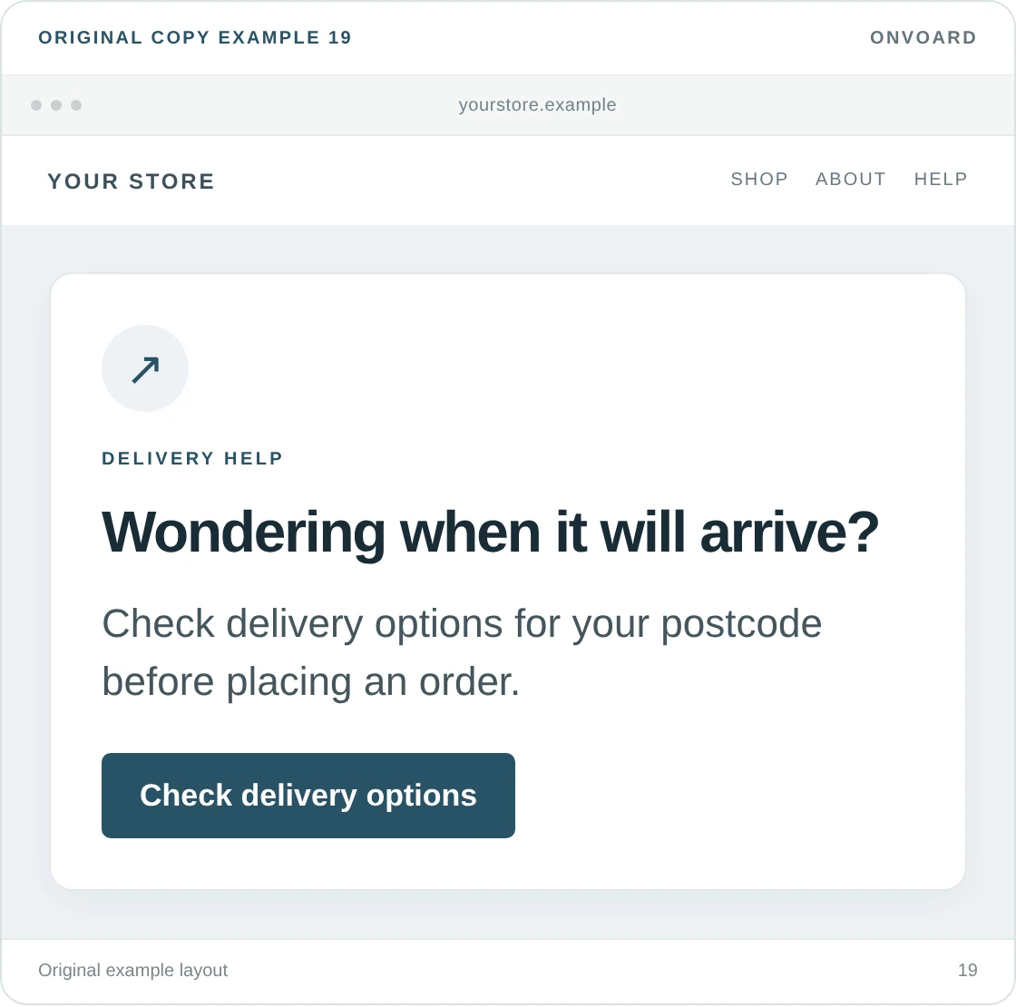
Wondering when it will arrive?
Check delivery options for your postcode before placing an order.Button: Check delivery options
The best destination is a delivery checker when the store has one. Otherwise, send people to a clear shipping page and change the button to “See shipping information.”
We'd rather give an accurate route to an answer than put an unsupported arrival promise in a welcome message. Say what you can prove. “Ships in 2 business days” and “Arrives in 2 business days” are different promises. Use the wording your fulfillment and carrier arrangements can support.
20. Welcome local shoppers with pickup information
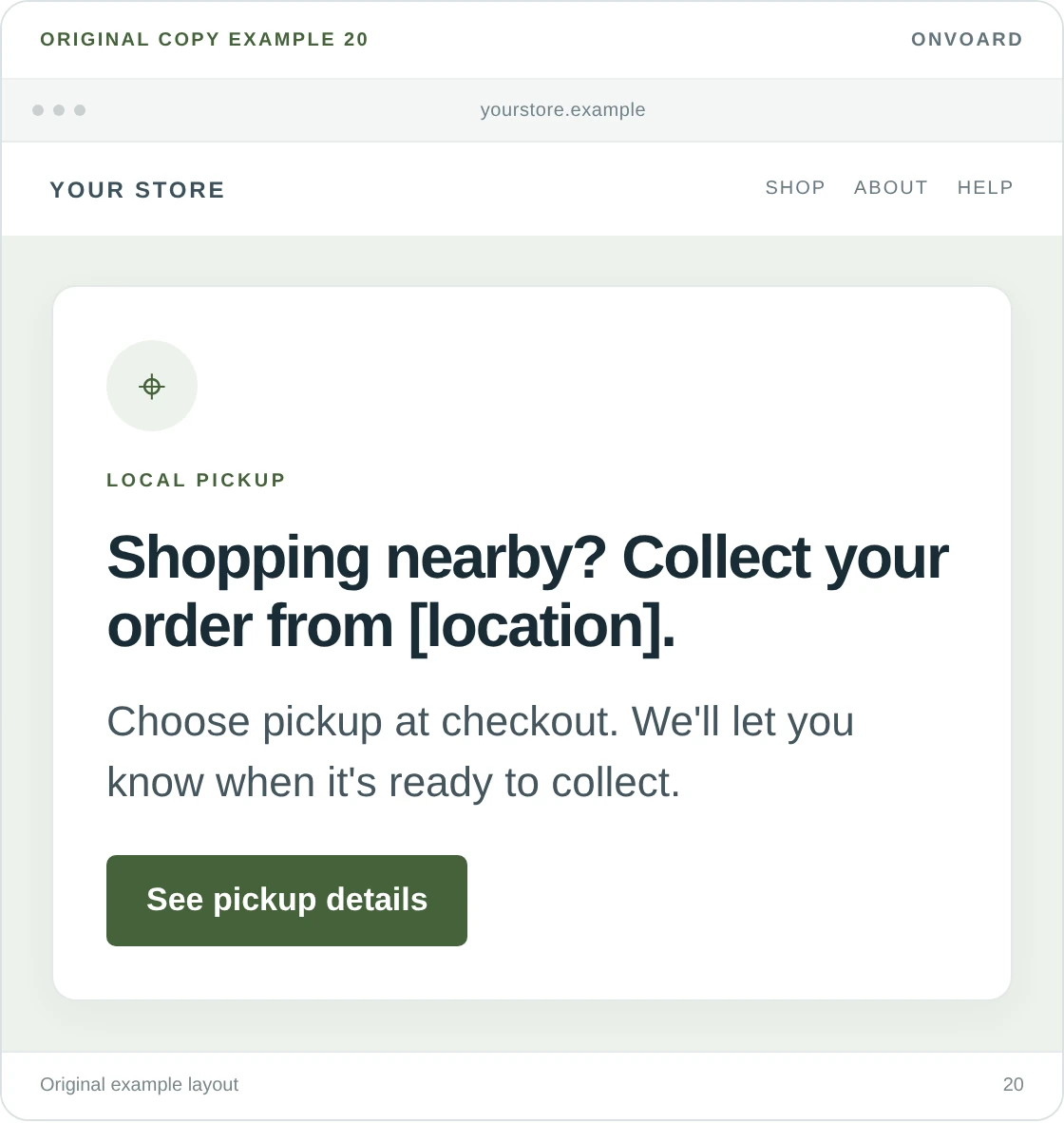
Shopping nearby? Collect your order from [location].
Choose pickup at checkout. We'll let you know when it's ready to collect.Button: See pickup details
This belongs on a local landing page or in a message shown to a relevant audience, and it can also work as a small announcement bar if most of the store's customers are nearby.
Include the address, opening hours, and collection instructions at the destination. A visitor's approximate location doesn't prove they want pickup, so keep delivery available. Avoid “Ready today” unless the cutoff, stock availability, and preparation time are all accounted for.
21. Offer help choosing between products
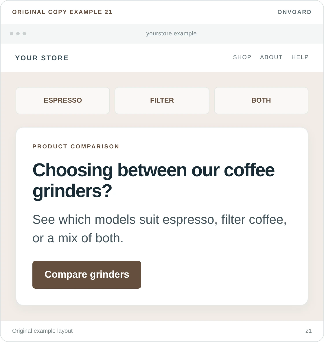
Choosing between our coffee grinders?
See which models suit espresso, filter coffee, or a mix of both.Button: Compare grinders
A specific comparison is easier to act on than an invitation to “discover your perfect match.” We'd use it when your range contains similar-looking products with important differences.
The button needs to open an actual comparison or buying guide. Don't route it to a contact form unless the message says you're offering personal advice. You can write a small, useful comparison before building a quiz; a quiz is not necessary for every product decision.
22. Offer support without pretending someone is always online
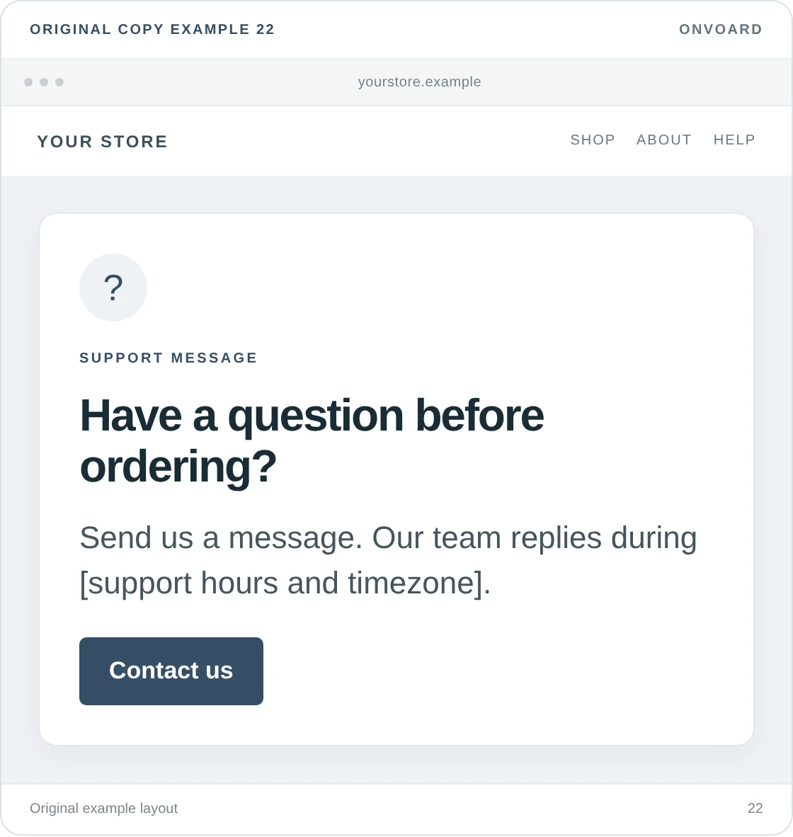
Have a question before ordering?
Send us a message. Our team replies during [support hours and timezone].Button: Contact us
“We're here to help” is fine. “Chat with us now” is a more specific promise. Use it only when the destination and staffing match.
A contact link can provide this welcome without a chatbot or a live-chat service. We'd also put answers to common delivery and returns questions nearby, so customers don't have to wait for support to answer something already documented. Keep the contact option visible for questions those pages don't resolve.
23. Explain that an item is a preorder
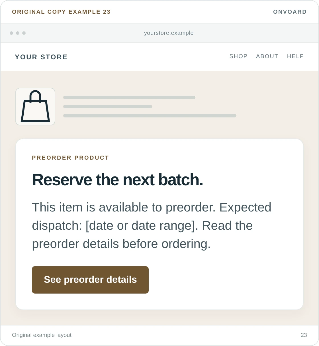
Reserve the next batch.
This item is available to preorder. Expected dispatch: [date or date range]. Read the preorder details before ordering.Button: See preorder details
This is a product-page welcome, not a general signup invitation, and the visitor needs to understand that paying now does not mean the product is ready to ship.
Put payment timing, expected dispatch, and cancellation information on the destination page. Don't call an estimate a guarantee. If you're only collecting interest and cannot accept preorders, use “Join the waitlist” instead of “Reserve”; those actions give customers different expectations.
Welcome-back messages for returning visitors
A returning browser is not necessarily an existing customer. Someone may have visited without buying, and a customer may return from a device you haven't seen before. Match the message to what you actually know.
24. Show returning visitors what's new
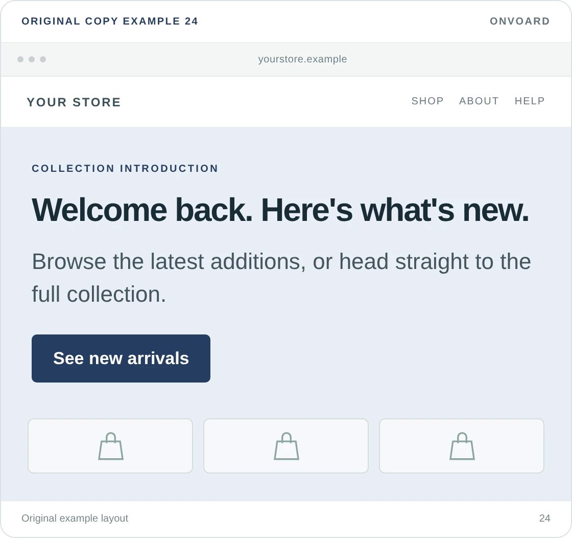
Welcome back. Here's what's new.
Browse the latest additions, or head straight to the full collection.Button: See new arrivals
This is a useful welcome-back message when all you know is that the browser has visited before. It doesn't assume an order, an account, or a particular product preference.
Keep the destination genuinely current. If you haven't added products recently, drop “what's new” and offer a route back to the main collection. We wouldn't display the same email-capture offer to someone your system reliably identifies as already subscribed.
25. Help an identified customer find their past orders
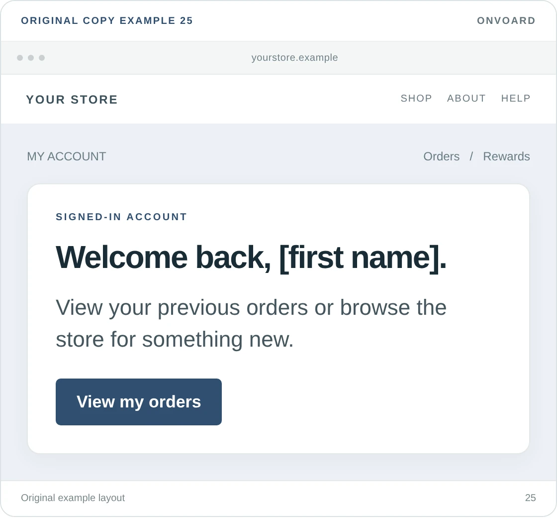
Welcome back, [first name].
View your previous orders or browse the store for something new.Button: View my orders
Use this in an authenticated account area or another context where the customer's identity is actually established, and a name guessed from a shared device is not good personalization.
Make the fallback read naturally if the name is missing: “Welcome back.” The button should open that customer's order history, with the proper access controls. Don't promise “Buy it again” if the destination only shows order details and offers no route to reorder.
26. Remind an identified member about a real benefit
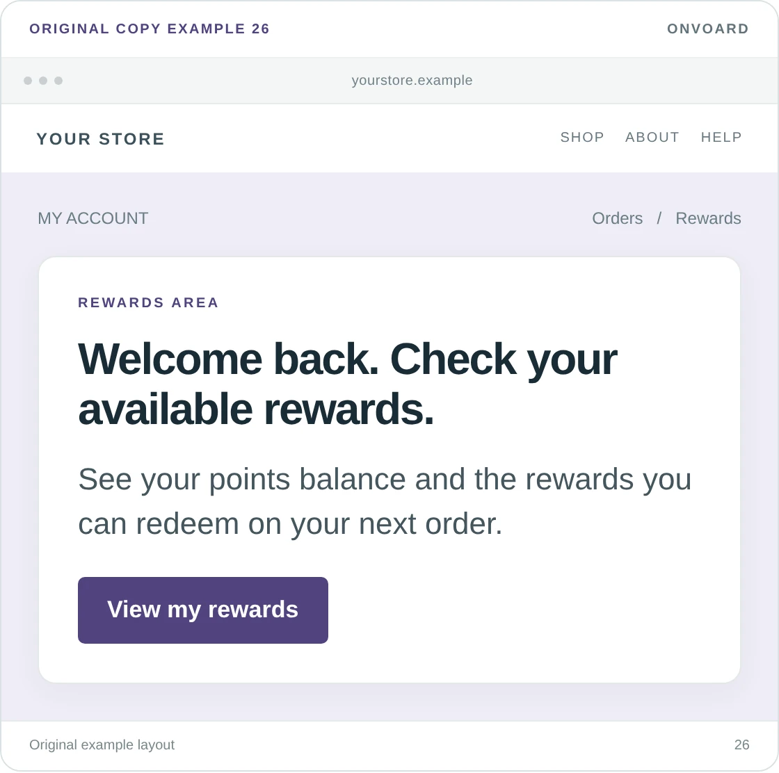
Welcome back. Check your available rewards.
See your points balance and the rewards you can redeem on your next order.Button: View my rewards
This helps an existing member without inventing a discount for the visit, and we'd link directly to the rewards area instead of making them search for the launcher or account menu.
Only show a specific balance or reward value when it comes from the current member record. The version above deliberately avoids a made-up balance. If the visitor is not a member, show an invitation to learn about the program rather than “Your rewards are ready.”
27. Match the welcome to the email or advert they clicked
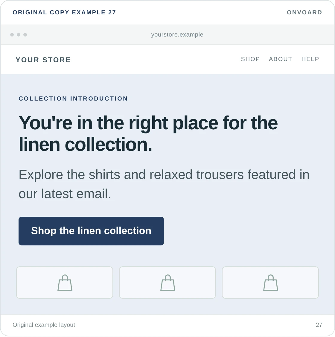
You're in the right place for the linen collection.
Explore the shirts and relaxed trousers featured in our latest email.Button: Shop the linen collection
A visitor arriving from a specific campaign doesn't need the general brand introduction again. Continue the subject that earned the click.
Show this only on the matching landing page or when you can reliably identify the campaign route. Everyone else needs the normal version. If the email promised a discount, the destination should show the same offer and restrictions. A different, larger popup offer can make the original message confusing.
Welcome messages after a visitor signs up
The form's success screen is part of the welcome. Use it to deliver what you promised and let the visitor continue. Don't make someone submit successfully and then wonder whether anything happened.
28. Show the promised discount code
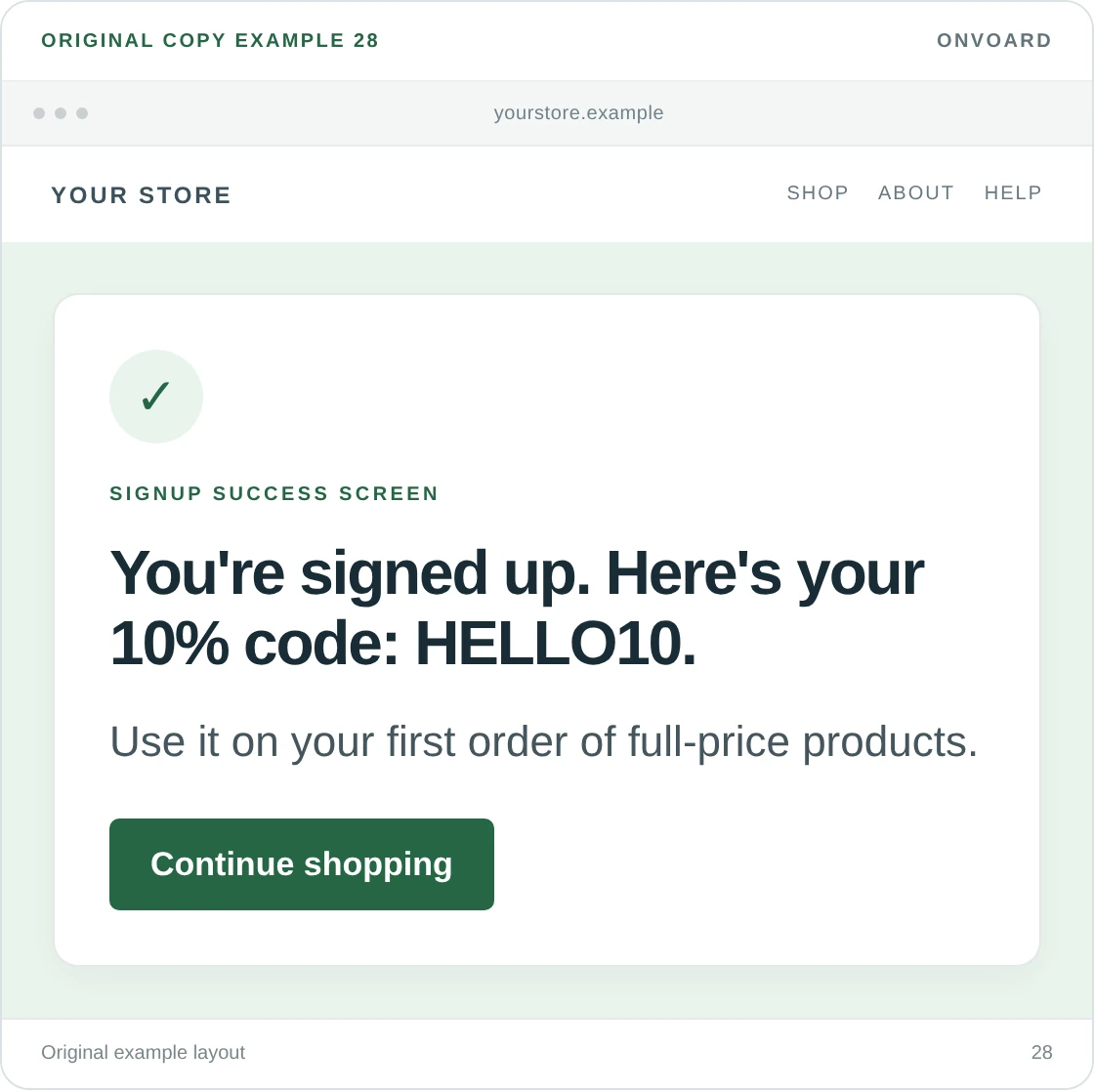
You're signed up. Here's your 10% code: HELLO10.
Use it on your first order of full-price products.Button: Continue shopping
HELLO10 is sample wording, not a live code. Nothing about it is real. Replace it with the code your campaign actually issues and repeat the important qualification from the signup screen.
Make the code selectable or copyable, and don't rely on the visitor remembering it after closing the form. If the button applies the discount, it can say “Shop with my discount.” If it only opens the collection, “Continue shopping” is more accurate. We'd test the entire route through checkout before using the stronger wording.
29. Say when the promised message is on its way
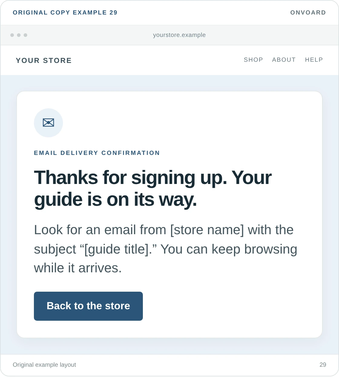
Thanks for signing up. Your guide is on its way.
Look for an email from [store name] with the subject “[guide title].” You can keep browsing while it arrives.Button: Back to the store
This makes sense when signup triggers an email containing the promised guide, and don't use it for a newsletter with no immediate email, or for a double-opt-in process that still needs confirmation.
Giving the sender and subject helps someone recognize the message. We'd avoid displaying their full email address unnecessarily on a shared screen. Provide an easy way to correct a mistyped address, and only mention checking spam as secondary help rather than making it the main welcome.
30. Explain a confirmation step plainly
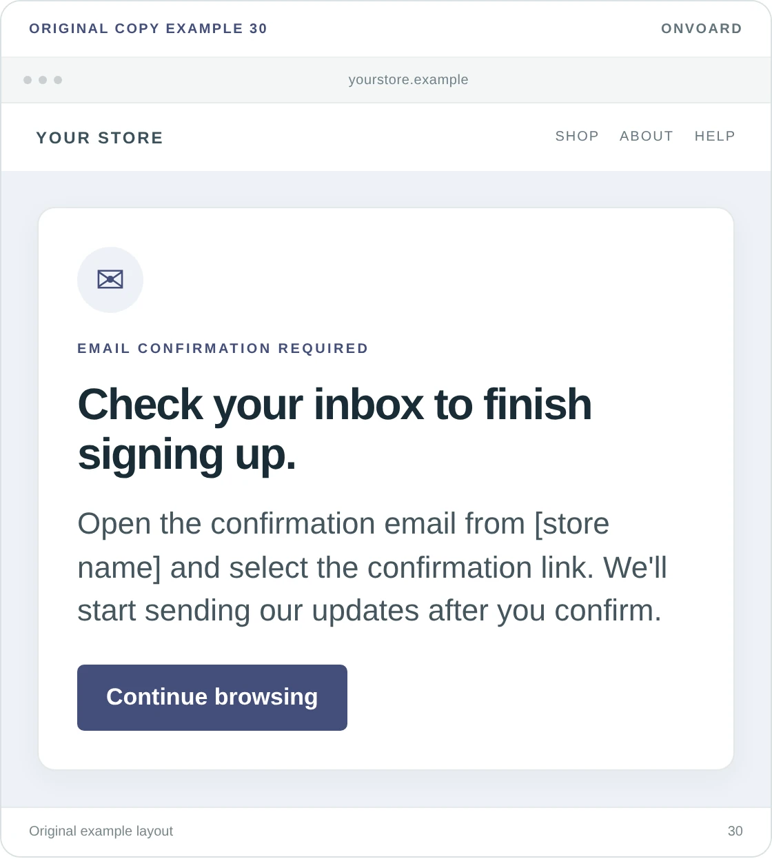
Check your inbox to finish signing up.
Open the confirmation email from [store name] and select the confirmation link. We'll start sending our updates after you confirm.Button: Continue browsing
Use this when your actual signup process requires email confirmation, and “You're subscribed” would be premature at this point.
The confirmation email should repeat the same purpose as the form. If signup includes a discount or download, say when that benefit arrives: on this screen, in the confirmation email, or after confirmation. Don't leave the visitor to discover a new step each time they complete the previous one.
How to write your own website welcome message
Start with something the visitor can use. Then make sure the wording and the next screen agree. We use the following questions as an editing check, not a formula that every message has to sound like.
Where has this visitor landed? A homepage visitor may need an introduction. Someone on a sold-out product needs a way to hear about its return. Don't show both people the same speech.
What are you offering or explaining? Name the collection, discount, delivery information, guide, or help. Replace “exclusive benefits” with the actual benefit.
What happens when they select the button? Write that action on the button, and “See size guide” is clearer than “Discover more” when the destination is a size guide.
Which condition would change their decision? Put a minimum spend, first-order restriction, delivery area, or email requirement near the promise. Keep the full terms available without making the headline misleading.
Can you remove a sentence without losing useful information? Greetings rarely need a paragraph about your commitment to an exceptional shopping experience, and use the space to help someone shop.
Compare these versions:
Less useful | More useful | What changed |
|---|---|---|
Welcome to our amazing world of fashion. | New here? Shop everyday basics in sizes [your range]. | The visitor can identify the products and whether the range fits. |
Join our community for exclusive benefits. | Join our emails for early access to new collections. | The signup has a stated benefit, provided early access is real. |
Your surprise is waiting. | Enter your email to receive a 10% first-order code. | The visitor knows both the request and the reward. |
Success! | You're signed up. Check your inbox for your code. | The confirmation explains the next step. |
The clearer versions aren't automatically better because they're shorter. They're better because the reader has less to guess. Keep a longer line when it supplies a useful restriction or explains the next step.
Where should the message appear?
Use the homepage for orientation, a signup form for an invitation, and a product page for product-specific help. A popup is a presentation choice, not a requirement for welcoming visitors.
We'd start with normal page content when the message is useful to nearly everyone who arrives. A welcome offer can sit inside the page or open as a popup after the visitor has had a chance to browse. There isn't a universal delay that suits every store.
For search visitors, don't let a promotional overlay prevent access to the page they clicked. Google's guidance on intrusive interstitials recommends less intrusive alternatives such as banners. That is a reason to consider placement carefully, not a claim that every popup causes a ranking penalty.
On a phone, check the actual screen with the keyboard open. The email field, submit button, and close control should remain usable. Keep field labels visible rather than relying only on disappearing placeholder text; W3C's guidance on form labels explains why labels need to identify their controls.
Also test dismissal. A welcome message that returns on the next page after someone closes it has ignored a clear choice. Cap repeated appearances and suppress invitations once the relevant action is complete, where your setup can identify that action.
Using these messages with OnVoard
ActionPop lets you build popup campaigns with text, images, buttons, forms, and multiple screens, and you can also place a campaign inside a page as an embedded form. That makes it possible to use a signup invitation without putting it over the products.
Start by choosing a message and its destination, then adapt the design. Don't let a template's existing offer decide what your store promises.
Choose a relevant design. The templates linked above provide starting layouts, and a simple text-and-button message does not need an email field or a reward screen.
Replace the full flow's copy. Check the headline, button, field labels, error messages, and success screen. A new headline on an otherwise unchanged template can leave contradictory instructions.
Choose who sees it. ActionPop supports visitor, page, device, and contact-related filters, and use customer-specific wording only when the matching customer information is available.
Choose the placement and display behavior. For a popup, set when it opens and how often it can appear. An embed sits in the page, so it doesn't need the same interruption rules.
Test what the visitor receives. Submit the form, follow the button, and check any promised email or discount, and publishing a message about a reward does not create that reward by itself.
If the message is only a homepage introduction, your theme's existing text and button section may be enough. We wouldn't add a popup tool just to display a sentence that belongs on the page.
How to tell whether the message helps
Measure the action the message actually offers, and a link to a size guide should not be judged by newsletter signups, and a newsletter form should not be judged only by clicks on the submit button.
Message | First useful measure | What to examine next |
|---|---|---|
Bestseller or collection greeting | Visits to the linked collection | Whether those visitors view products and buy |
Email signup invitation | Completed, valid signups | Confirmation where required, later engagement, and orders |
Welcome discount | Code delivery and redemption | Sales after discount and the cost of the offer |
Shopping-help message | Use of the guide or support route | Whether the original question is being resolved |
For example, 80 valid signups from 2,000 form impressions gives a 4% submission rate. If 120 signups come from 4,000 impressions after a change, the count rose but the rate fell to 3%, less than the original 4%. Those made-up figures show why we'd look at the count and denominator together.
ActionPop reports impressions, engagement, submissions, and assisted revenue. Assisted revenue is not proof that the welcome message caused an order. Use it alongside the campaign's intended action and your store's order data, not as a substitute for checking the offer's cost.
When comparing wording, keep the offer and placement consistent where possible. ActionPop does not provide a native split-test mechanism. A before-and-after comparison can still be useful, but changes in traffic, season, or promotions can also affect the result. Don't present that comparison as a randomized test.
Website welcome message FAQ
What is a welcome message on a website?
It's the short introduction or invitation a visitor sees when arriving on a site or completing an action such as signing up. On an online store, it might direct someone to products, explain a welcome offer, or tell a new subscriber what happens next.
What is a good welcome message for an online store?
A useful starting point is “New here? Start with our bestsellers,” linked to an accurate bestseller collection. For an email signup, say what subscribers receive. The right message depends on the page and the visitor's next step; a discount is not always necessary.
How short should a website welcome message be?
Keep it to a headline, the detail needed to understand it, and a clear next action. There is no ideal word count. Add a line when it explains a condition or prevents confusion, and cut a line when it only repeats the greeting.
Does every website need a welcome popup?
No. A homepage heading, announcement bar, or embedded signup form can do the job. A popup should earn its interruption with a relevant invitation, and visitors should be able to dismiss it easily.
Is a website welcome message the same as a welcome email?
No. The website message appears on the site; a welcome email arrives in the inbox after signup or another eligible event. They should agree about any offer and next step, but they are separate pieces of copy.
Should the message use the visitor's name?
Only when you reliably know who the visitor is and the context makes personalization appropriate. A generic greeting is better than the wrong name. For anonymous visitors, help based on the page they're viewing is often more useful than pretending to recognize them.
Choose a message that fits the page, make its button lead somewhere useful, and check the next screen, and a visitor should finish reading it knowing what they can do, not wondering what your welcome was trying to say.