On this page
The biggest number in popup analytics is also the easiest one to overread.
Assisted revenue sits right there on ActionPop's Overview. I want it there, just not claiming more than it can prove.
When someone engages with an ActionPop campaign and an order follows, that order can count toward assisted revenue. The campaign was part of the path to purchase. That doesn't mean the popup caused the order.
Email works differently in OnVoard. A send's revenue gets tied to that one email, which is why we call it attributed. A campaign engagement doesn't get that same tie, so ActionPop's number is assisted instead - a different strength of claim, and a big revenue figure doesn't make them interchangeable.
That's the part I care about with the new popup analytics. Not just "here's how much revenue appeared after a popup." I want enough context around that number to decide whether the campaign is actually doing useful work.
ActionPop has assisted $35M+ in revenue to date, more than 25 times what Recommender, OnVoard's other assisted channel, has assisted in the same window. Both numbers are assisted, not attributed, so that's a fair comparison. Email's attributed revenue is a different measure entirely, and I'm not stacking it against either one here.
Are impressions turning into anything?
Start on Overview.
You get Impressions, Engagement rate, Submission rate and Assisted revenue across all campaigns.
I wouldn't start with Impressions.
A popup can show a lot and accomplish very little. Impressions tell you how much exposure you bought yourself. Engagement rate tells you how often someone actually interacted with the campaign, and Submission rate tells you how often an impression became a valid submission.
The counts underneath matter too. A percentage without its denominator is easy to misread, so both rates show the action count against impressions.
Then there's Assisted revenue, with the number of orders tied to campaign engagement underneath it.
Read it as a progression - shown, acted on, submitted, then purchased later - not a strict funnel. These are different outcomes, useful together because they stop the revenue number floating around without any clue what happened before it.
The charts underneath show Impressions, Engagements and Submissions over time.
And these are counts, not rate charts. I wouldn't eyeball a conversion rate from 2 lines on different scales. The rates are already calculated above.
What the charts are good at is showing whether the total is still happening now.
A campaign can have a respectable lifetime submission count and have done almost nothing recently. Or impressions can climb while submissions stay flat. The total won't show you either problem, but the timeline will.
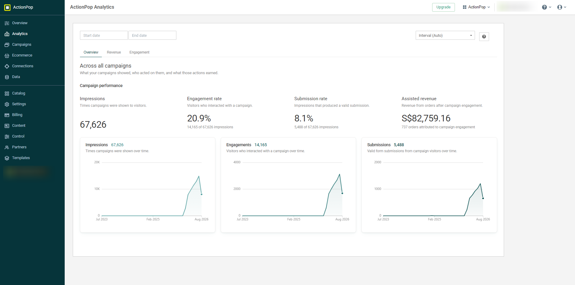
Overview puts impressions, engagement, valid submissions and assisted revenue on the same screen, with the activity behind the rates shown underneath.
Which campaigns assisted the most revenue?
Now open Revenue.
Campaigns by revenue ranks every campaign from highest to lowest assisted revenue, with Sales beside it - the fastest way to see which ones deserve a closer look. Use it as an investigation queue, not a winner board.
A campaign at the top assisted more revenue. That's what the number says. It doesn't say every dollar in that row was incremental, and it doesn't say the order wouldn't have happened without the campaign.
That's exactly why we call it assisted.
Click a campaign and you can look at its own analytics rather than stopping at the account-wide total. A campaign with a lot of exposure and a lot of assisted revenue is a different story from one reaching fewer people but getting a much stronger response.
Below that are Top products by units and Top products by revenue.
I wanted both because "what sold most?" has 2 perfectly valid answers.
Units tells you what moved most inside the orders connected to campaign engagement, and revenue tells you what carried the most value inside those same orders.
They won't always be the same product. That's useful.
If you only sort by units, a lower-priced item can dominate the list while something else contributes more revenue. If you only sort by revenue, you lose the volume side of the story.
And there's another distinction worth keeping straight: these cards tell you what was inside the assisted orders. They don't claim the popup itself sold that exact product.
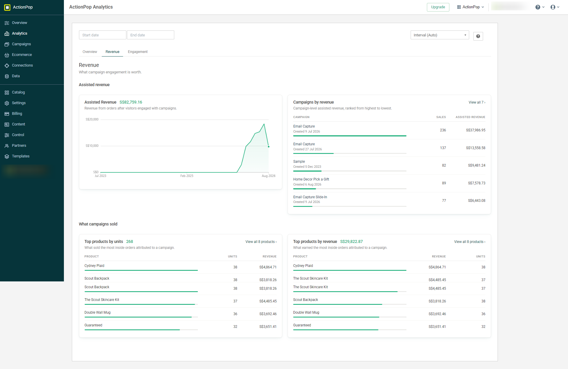
Revenue ranks campaigns by assisted revenue, then shows what sold inside the orders connected to campaign engagement.
Is the response healthy enough to trust?
The Engagement tab strips the page back to rates.
Reach puts Engaged, Submitted and Purchased against the same base: impressions.
I like that more than 3 percentages with 3 different denominators.
If you saw the campaign, what share became an engagement, what share became a valid submission, and what share turned into a purchase tied back to that engagement?
These are 3 outcomes measured against the same starting point, not a person-by-person funnel - which is what makes them easy to compare without doing denominator gymnastics.
Then look at Response quality.
Right now the thing I'm watching there is Spam blocked: the share of submissions ActionPop stopped as spam.
If it crosses the threshold we flag, it shows Needs attention.
That's not a performance trophy. It's a debugging signal.
Look at that before celebrating a growing submission count if Spam blocked is flagged. More responses aren't useful if a meaningful share of what you're collecting is junk.
And I wouldn't hide that number because it makes the dashboard look worse. If the data needs attention, the useful report is the one that says so.
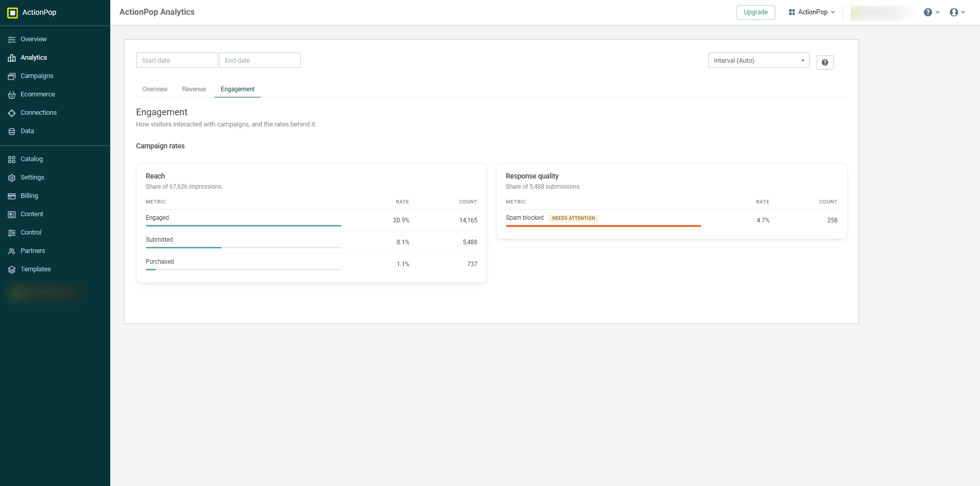
Engagement keeps the 3 reach outcomes on the same impressions denominator, then separates spam-blocked submissions into Response quality.
What I'd check first
Open ActionPop Analytics today and go straight to Campaigns by revenue.
Find the campaign sitting at the top.
Then don't stop at the money.
Go back and look at its impressions, engagement and submissions. Is it near the top because it reached far more people, are visitors actually interacting with it and submitting, and is Response quality clean?
That's the useful path through popup analytics: money first, then enough evidence to understand where the money sits.
And I'd keep one word in mind the whole time: assisted.
A popup can be part of a purchase without being the reason for it.