
On this page
A newsletter signup has to earn an interruption, an email address, or both.
The form is only one part of that exchange. A shopper is already doing something when you ask them to stop: opening the homepage, comparing products, reading a guide, scrolling a collection, or moving toward the exit. Your signup needs to make the interruption worthwhile, ask for no more information than the next step requires, and then keep the promise after the visitor submits.
Whether the surface is called a newsletter signup form, email signup form, email capture form, opt-in form, or email popup, the decision is the same: what are you asking for, what does the shopper receive, and why is this the right moment?
That is why we do not treat a newsletter signup as a box with a headline, an email field, and a button. It is a chain:
trigger or placement → promise → field burden → success state → first email
A weak link anywhere in that chain can waste a strong popup. A clear 15% offer feels broken if the shopper submits an email and only then discovers that a phone number is mandatory. Early access is meaningless if the public launch opens at the same time. A great signup rate is less impressive if the subscribers immediately ignore the welcome flow or the discount costs more margin than the extra orders are worth.
Use these 30 examples to compare what each signup asks, what it gives, why the timing or sequence matters, and what to change before using the same mechanic on a different store. When you want to build one of these flows, compare the live OnVoard ActionPop templates as implementation starting points.
Treat every screenshot as a design reference. Test the offer, timing, and follow-up against your own traffic, margin, and audience before publishing.
Which newsletter signup should you use?
Start with the commercial job, then choose the format.
What you need | Signup patterns to consider first | Main trade-off |
|---|---|---|
Win more first orders | First-order discount, free shipping, gift with purchase | You may subsidize shoppers who were already going to buy |
Grow without discounting | Early access, waitlist, new-arrival alerts, useful content | The future value has to be genuinely worth joining for |
Collect email plus phone | Email first, then optional or separately justified phone step | Every additional ask creates another place to lose people |
Learn one useful preference | Choice question, product-interest question, birthday club | Only collect data that will change the next experience |
Make a strong offer harder to ignore | Spin wheel, scratch card, pick-a-gift | More attention also means more interaction and promotional weight |
Keep shopping quiet | Inline form, slide-in, launcher | Lower interruption usually means lower visibility |
Recover a leaving visitor | Exit-intent signup | Do not teach every shopper that moving toward the exit earns the best deal |
Protect list quality | Confirmation step, double opt-in where appropriate | Extra confirmation introduces another drop-off |
Turn the signup into a real lifecycle | Immediate reward plus welcome workflow | The first email has to deliver the promise, not start a different conversation |
Our default: use the simplest signup that gives the shopper a credible reason to join. Add a field, screen, game, or discount only when it solves a specific problem.
A spin wheel is not an upgrade from an email field just because it has animation. A phone number is not automatically valuable because SMS exists. A 20% welcome offer is not stronger if 10% would have changed the same number of purchase decisions.
The first question is always: what are we trying to earn, and what will the shopper receive in return?
A newsletter signup is a chain, not a box
The 5 parts deserve separate decisions.
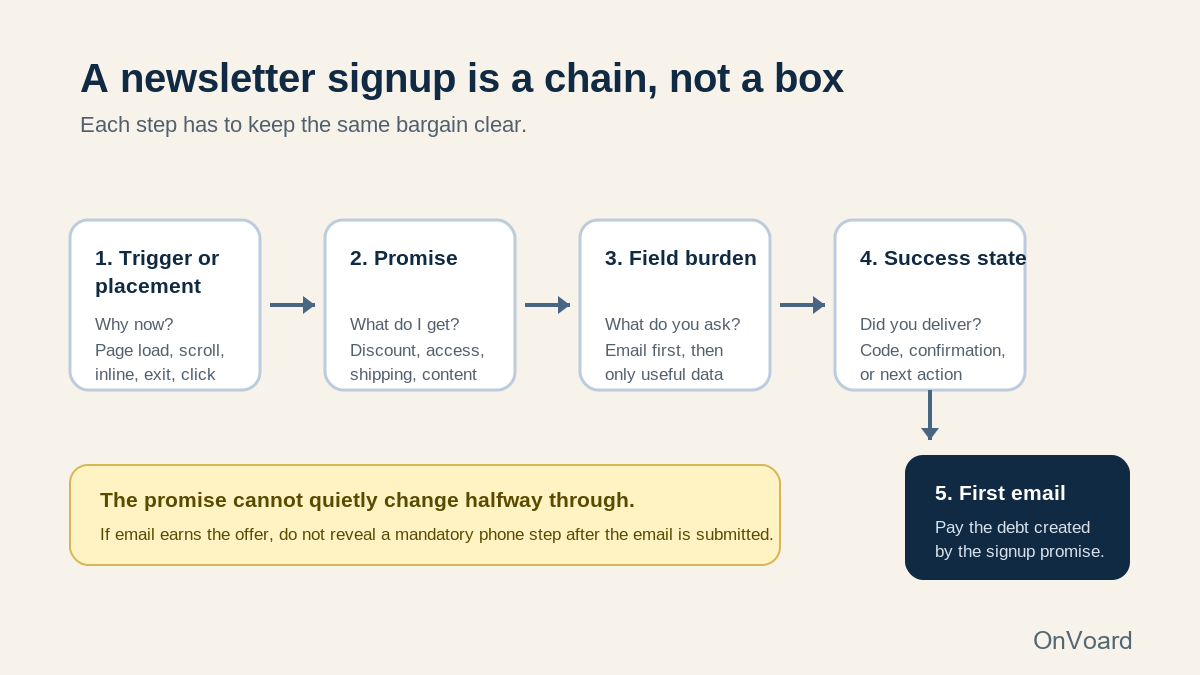
Trigger or placement. Why is the visitor seeing the signup now?
Promise. What do they get for joining?
Field burden. What are you asking them to provide before they receive it?
Success state. Does the next screen actually deliver or explain the promised next step?
First email. Does the inbox continue the same bargain?
The promise cannot quietly change halfway through. If an email address earns the offer, do not reveal a mandatory phone step after the email is submitted. If the visitor is joining a waitlist, do not turn the success state into a generic "thanks for subscribing." If the popup promises a code, the first email should not make the subscriber hunt for it.
That chain is the organizing idea for all 30 examples below.
Welcome-offer newsletter signup examples
Discounts are common because the value is easy to understand. That does not make every welcome discount a good decision.
Use this family when the immediate purchase is valuable enough to justify the subsidy and when you can target the offer to people who are actually eligible. The design should be simple because the commercial bargain is already doing most of the persuasive work.
1. Espiritu makes the first-order exchange impossible to miss

Espiritu's observed popup gives the shopper one dominant message: “15% off your first order”. The email field sits directly below it, the continuation button is obvious, and the visitor can decline and return to the site.
The strength is clarity. There is no game to understand, no vague "join our community" promise, and no second benefit competing with the discount. Product photography gives the form brand context without making the action harder to find.
That makes this a useful baseline before testing anything more complicated.
The important question is not whether your store should copy that exact percentage. It is whether the first-order incentive changes enough purchase decisions to justify its cost. If a smaller discount would create roughly the same incremental orders, the larger number only makes acquisition more expensive.
We would also make eligibility part of the campaign rather than relying on the copy. A known returning customer or someone who already used the welcome offer should not keep seeing "your first order" language.
Start with one dominant offer, one primary field, and one obvious action.
Test the incentive size and eligibility before changing the layout.
2. Province of Canada uses a straightforward first-order reward
Province of Canada has used a first-order discount to make email signup immediately useful to a shopper who is not ready to buy yet.
There is nothing exotic about that mechanic, which is why it is valuable as a reference. It solves a simple acquisition problem: a visitor is interested enough to browse but has not yet given the store a way to reach them again.
The risk is paying for an address you might have received without the discount, or discounting an order that would have happened anyway. A signup rate alone cannot answer that.
For a store considering this pattern, we would compare at least 3 things:
completed email signups;
first purchases from those subscribers;
the discount cost on those orders.
Then look beyond the welcome period. A high-signup cohort that disappears after using the code can be less valuable than a smaller group that joined because it genuinely wanted launches, content, or restock news.
Province of Canada establishes a useful baseline: make the first-order condition explicit.
Test the offer against your own margin instead of copying another brand's percentage.
3. OnVoard Fashion Welcome Offer separates the capture from the reward
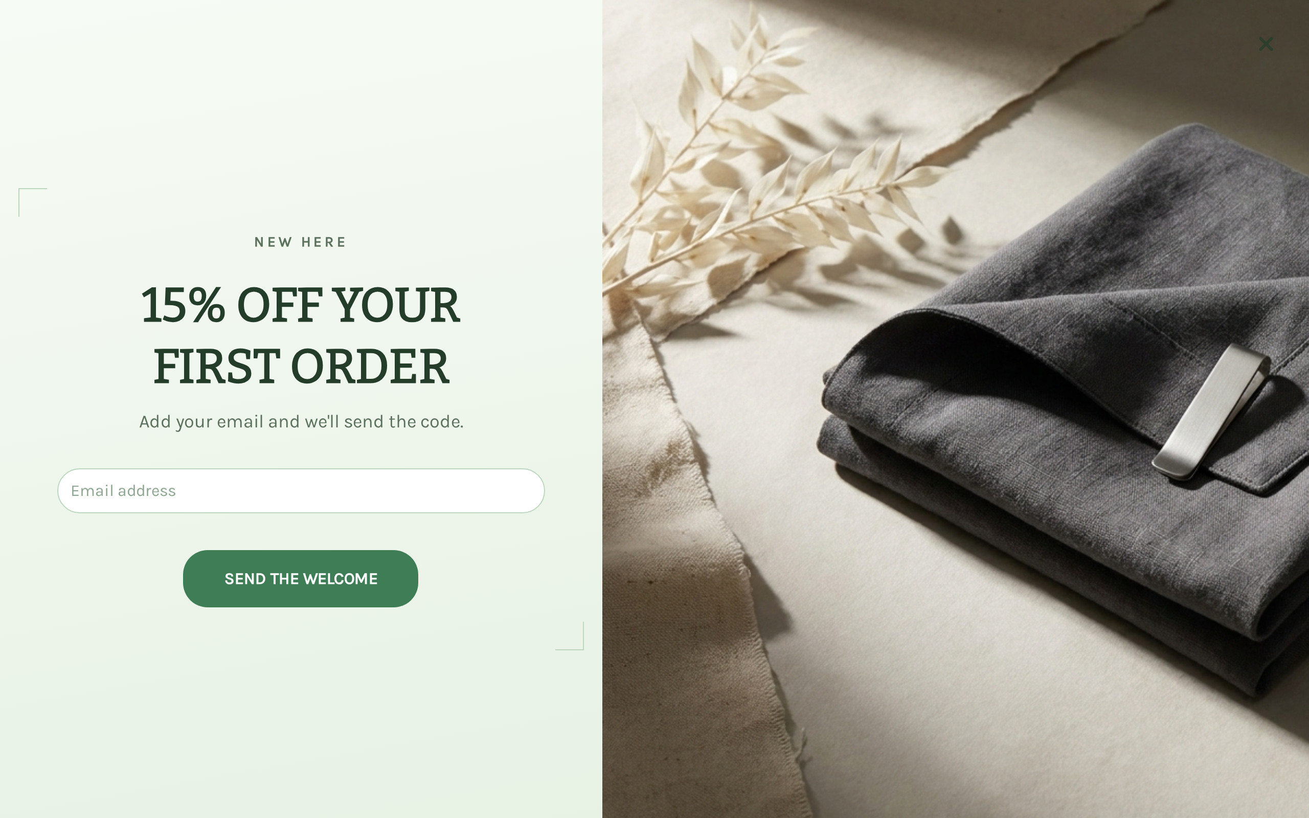
The Fashion Welcome Offer ActionPop template uses a 3-page flow:
Email → Phone → Reward
Its first screen presents a 15% first-order offer with a single email field. The template is useful because the architecture can be changed without redesigning the whole campaign.
If email is the only acquisition goal, we would shorten it:
Email → Reward
If SMS is genuinely valuable, keep the phone step, but decide whether it is required before launch. A shopper who was told that email earns the code should not discover that the code is actually locked behind a phone number.
That distinction matters more than the visual design.
ActionPop lets you change the page order and remove pages, so treat the template as a starting configuration rather than a finished strategy. The free plan can run the same campaign features with OnVoard branding on the popup.
Build a similar signup free: open the Fashion Welcome Offer from the popup template library, keep the email capture, remove the phone page if you do not need SMS, connect a real discount code, then set completion so someone who has already submitted does not keep seeing the acquisition offer.
4. OnVoard Outdoor Free Shipping changes the incentive, not the basic flow
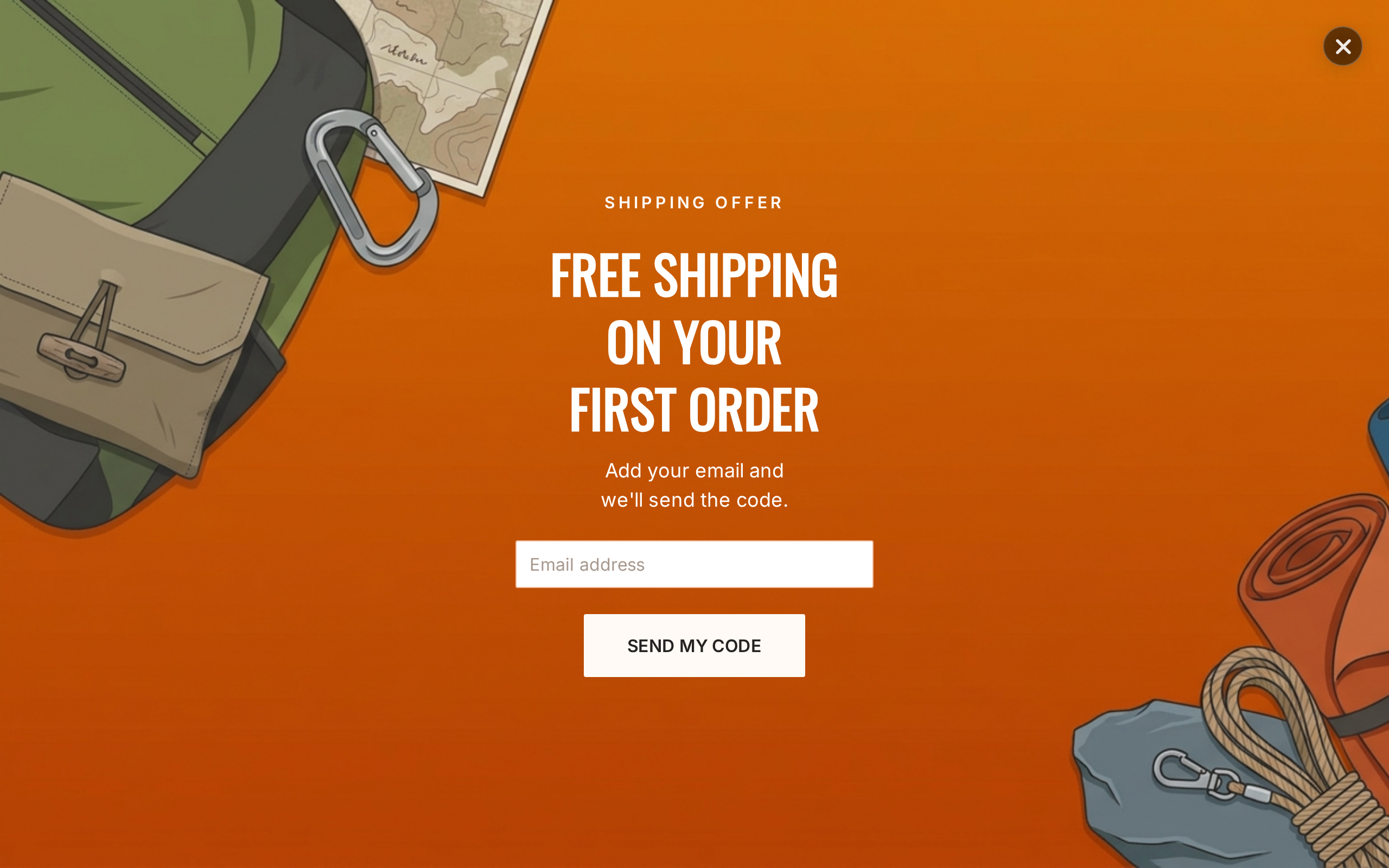
The Outdoor Free Shipping template keeps the same basic acquisition structure but replaces a percentage discount with shipping value.
That is a useful reminder that "welcome offer" does not mean "10% off."
Whether free shipping is cheaper depends on your order economics. Suppose a typical shipping subsidy is $7:
Illustrative example: on a $50 basket, 10% off costs $5;
Illustrative example: on a $100 basket, 10% off costs $10;
Illustrative example: free shipping costs roughly $7.
The cheaper offer changes with basket size. The more important question is which friction the shopper actually feels.
If delivered price is the objection, free shipping can be more meaningful than another percentage headline. If shipping is already free above a threshold most customers reach anyway, the signup may be promising a benefit the shopper already had.
Build a similar signup free: start from Outdoor Free Shipping, match the visible wording to the shipping discount you actually create in the store, and remove any extra contact step you do not need.
5. Email Capture Full Screen shows why conditions belong beside the offer
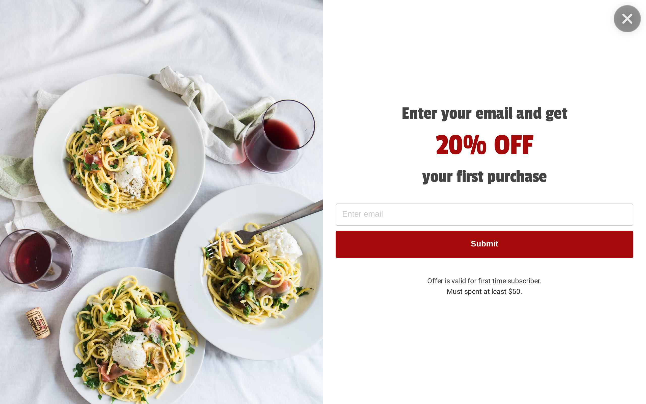
OnVoard's Email Capture Full Screen template pairs a first-order discount with a minimum-spend condition.
That condition is not fine print. It changes whether the reward is useful.
"20% off" and "20% off when you spend at least $50" are materially different promises. If the threshold only appears after submission, the campaign has made the offer look better than it is.
Put the condition close to the value claim and sanity-check it against normal basket sizes.
If your average order is already around $90, a $50 threshold is invisible. The same threshold can be a significant hurdle if typical orders are $28.
This is one of the cases where adding a few words makes the popup better rather than worse.
What to copy: show the restriction before the email is submitted.
What to test: whether the threshold protects margin without making the offer irrelevant to normal orders.
6. Supplements Welcome Offer proves that the first screen should do one job
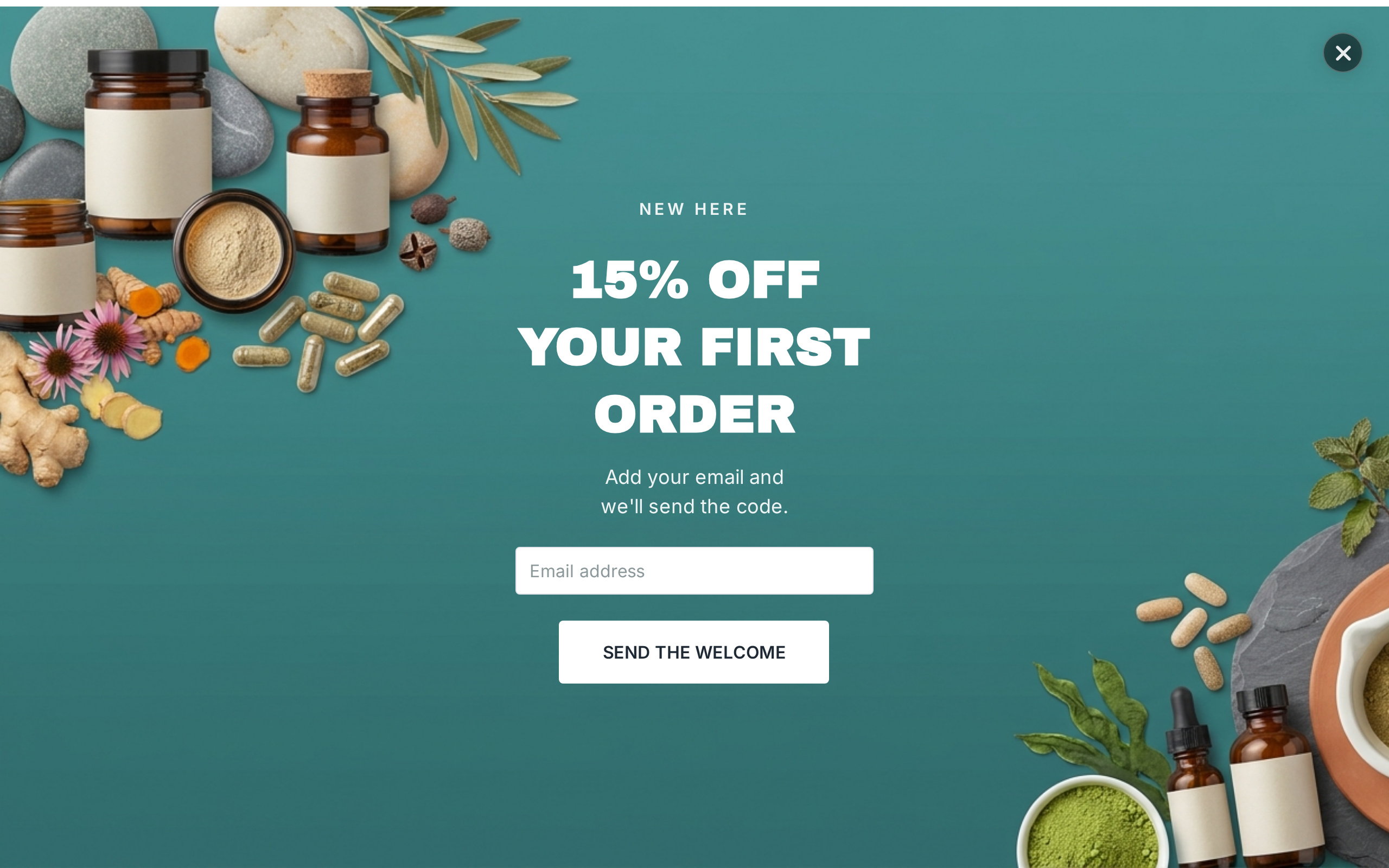
A category-specific ActionPop welcome template can look very different while using the same commercial mechanic: a first-purchase incentive in exchange for contact information.
The same commercial mechanic can carry a different story from one category to another.
The product photography, type, and tone can match supplements, fashion, coffee, or skincare. The operating questions stay the same:
who is eligible;
what reward is promised;
what fields are required;
when the campaign appears;
what happens after submission.
Do not mistake a visually different template for a new acquisition strategy.
Pick the template whose composition is easiest to adapt to your store, then make the commercial logic yours. The most expensive mistake is not choosing the "wrong" design. It is letting a template's existing offer or field sequence decide what your store should do.
Newsletter signup examples that do not depend on a discount
A permanent welcome coupon is easy to explain, but it can also train shoppers to begin every relationship by asking for money off.
Stores with launches, scarce inventory, genuinely useful content, or strong product communities can sometimes offer access instead.
Early access earns its place only when the access is real.
"Early access" that arrives at the same time as the public launch is just a label.
7. Fluff sells first access instead of lowering the price

Fluff operates on a limited-drop model and has used first access to new products as the reason to join.
That fits the business better than an evergreen discount.
The subscriber is not being paid to give up an email address. They are buying informational advantage: tell me when the shop opens and what is coming before I miss it.
Inventory and timing make notification valuable for limited runs, collectibles, seasonal drops, small-batch products, and frequently sold-out items.
The useful lesson is to make the benefit match the reason people care about the product.
If the main attraction is scarce availability, another 10% off can actually distract from the stronger story.
Name the access precisely.
Avoid "VIP" or "early access" when subscribers receive nothing meaningfully earlier.
8. Rhode turns a launch into a waitlist

Rhode's Sephora Europe launch page used a simple waitlist: product imagery, a "see you soon" message, and an email field.
The mechanic is a demand-capture page for a specific event, not really a discount popup.
That matters because a dedicated waitlist can collect better context than a generic sitewide newsletter form. Everyone who joins has signaled interest in the same launch.
The store can then make the first email extremely specific:
launch timing;
where the product will be available;
what the subscriber should expect next.
A waitlist does not need a dense form. The future event is already the reason to join.
What to copy: tie the signup to one concrete future moment.
When not to use it: when there is no actual event, product availability change, or announcement worth waiting for.
9. Canyon Coffee keeps the interruption small because the promise is softer

Canyon Coffee's observed signup appears as a compact box at the side of the page instead of taking over the whole screen. The promise includes journals, recipes, exclusive promotions, and more.
A softer promise suits a smaller surface.
The store is not offering an urgent one-time reward, so it does not need to behave as if the visitor must stop everything and act immediately.
A smaller surface protects more of the shopping experience while still making the list visible.
The trade-off is attention. A subtle form that nobody notices is not automatically good UX.
We would use this kind of treatment on content pages, product pages after some browsing, or returning visits where the subscriber proposition is useful but not urgent.
What to copy: match the amount of interruption to the importance of the offer.
What to test: whether the quieter format is actually seen by enough eligible visitors.
10. Fashion Early Access gives you a buildable no-discount starting point
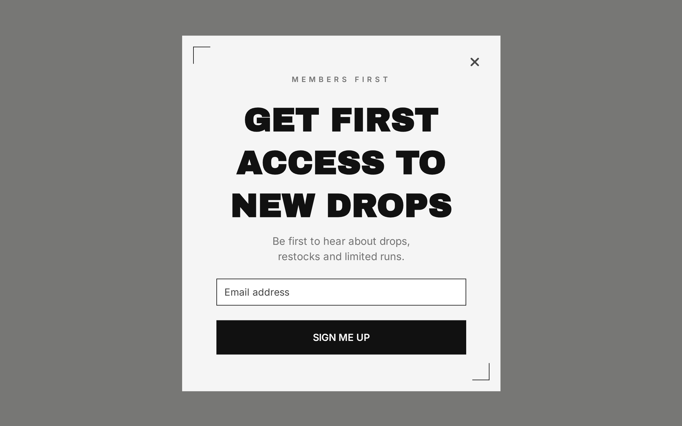
The Fashion Early Access ActionPop template is built around new drops and limited runs.
Its current template flow can include email, phone, and reward pages, but the most useful customization may be deletion.
If early access is the real offer, the clean version is:
Email → Confirmation
If you want SMS for launch alerts:
Email → Optional or separately justified phone step → Confirmation
Do not leave a coupon in the flow simply because the starting template has a reward page.
The copy should say what early access means. Is the subscriber shopping before the public site opens, receiving a private link, or merely hearing the launch announcement first?
A strong early-access campaign can be simpler than a discount campaign because the future product is the value.
11. Collectibles Early Access fits products where missing the drop is the pain
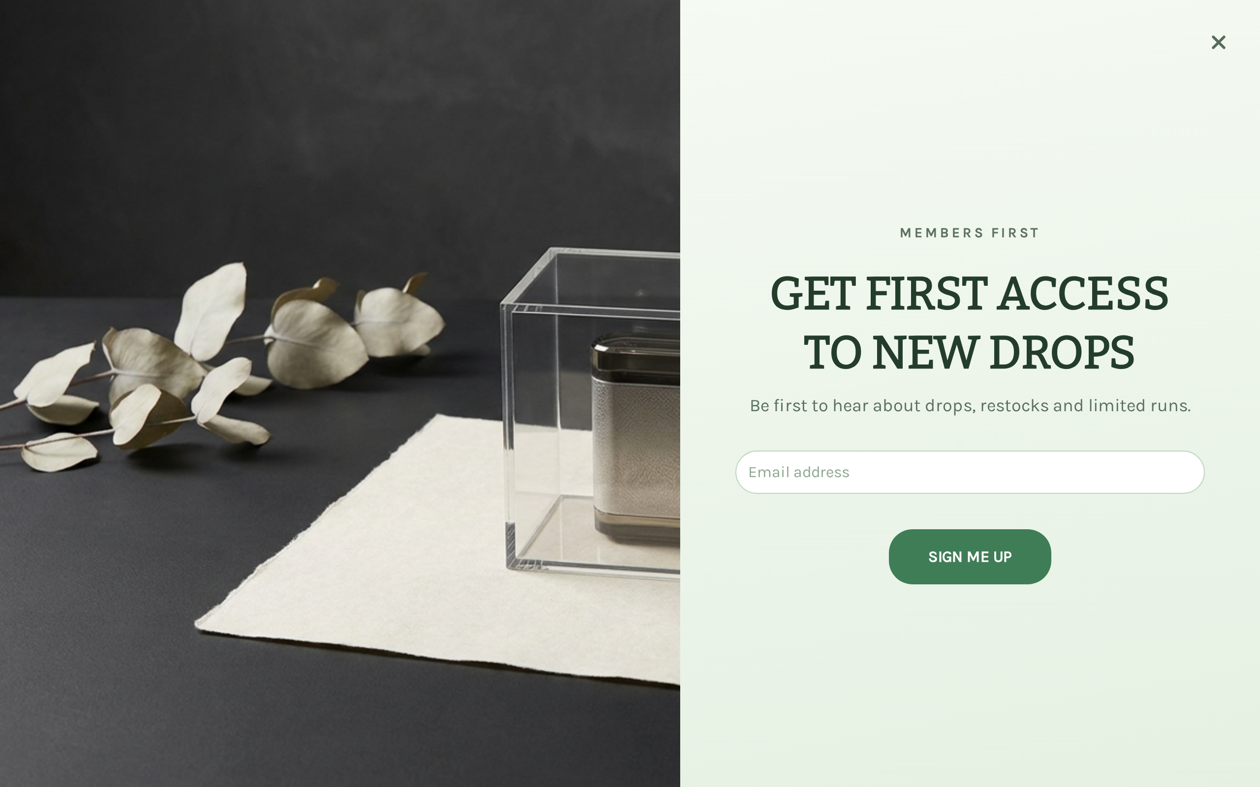
OnVoard's Collectibles Early Access template uses the same broad mechanic in a category where scarcity feels natural.
For collectibles, scarcity makes early notice a useful promise.
For collectibles, limited colors, signed runs, hobby releases, and drop-based products, "be first to know" can solve a real customer problem: missing availability.
The implementation lesson is to connect the signup to the downstream workflow.
If the form promises first notice, the launch automation should be ready before the form goes live. Otherwise you are collecting a segment without a reliable way to pay off the promise.
We would also distinguish notification from reservation.
Unless inventory is actually held, do not say "your item is waiting" or imply guaranteed availability.
Multi-step newsletter signup examples
Multi-step forms can reduce the first commitment, collect a second channel, or learn something useful before the first email.
They can also create friction for no reason.
A screen earns its place only if the answer changes the next experience, the requested channel has a distinct job, or the step makes the original exchange easier to understand.
12. Fishwife uses a micro-question before the email

Fishwife's observed mystery-discount popup opens with a small question: have you tried Fishwife yet?
The visitor chooses between 2 answers before the email field appears.
The first interaction is easier than filling a form, and the answer can distinguish people who already know the product from people who are curious.
The mistake would be copying the question without using the information.
A preference or status question should change at least one of these:
the next screen;
the offer;
the welcome content;
the product shown;
the segment used later.
If every answer leads to identical messaging forever, you collected friction, not useful data.
ActionPop implementation: use a choice page before capture and route different answers to different pages. Keep the number of options small enough to answer without thinking like a survey respondent.
13. Fly By Jing lets one choice lead the experience

Fly By Jing has used a full-screen signup that asks how spicy the visitor likes it before revealing the rest of the acquisition flow.
The question is on-brand and easy to answer. It also gives the merchant a piece of product preference data that could plausibly affect what gets recommended next.
That is the standard an acquisition question should meet.
"What are you interested in?" with 12 vague categories is work.
"How spicy do you like it?" is concrete, fast, and connected to the product.
If you build a similar flow, decide the downstream use first. For example, someone choosing "mild" might see a different product recommendation or welcome block than someone choosing "fire."
The question becomes more defensible when the visitor notices that their answer mattered.
14. Elavi asks what the shopper prioritizes before collecting the channels

Elavi's popup asks what matters most when choosing a snack, then uses a discount as the exchange for continuing with contact details.
This is a good example of zero-party data with an obvious merchandising use.
A priority such as high protein, low sugar, indulgence, or family-friendly can change which product benefit the welcome sequence leads with.
But there is a limit.
The first screen is not the place to conduct full market research. One useful decision variable can improve the experience. 5 demographic and preference questions can make the signup feel like a survey the shopper is doing for your benefit.
Ask one question only when the answer has a clear downstream use.
Do not collect "nice to know" attributes you never use.
15. Magic Spoon collects birthday and dietary context for a reason

Magic Spoon has used a lightbox that offers a chance to win cereal while asking for a birthday, dietary preference, and email.
The birthday is tied to another visible promise: a birthday gift.
That makes the extra field easier to justify because the form tells the visitor why it is being collected.
Dietary preference can also be useful when the product assortment or content changes accordingly.
Still, we would challenge every field separately.
If the giveaway only requires an email, does the birthday have to be mandatory now? If the birthday program is important, is full birth date required or would month and day be enough? If dietary preference never changes the messages, remove it.
The principle is not "collect rich profiles at signup." It is ask for data only when you can name the experience it improves.
16. Supplements Survey shows how to branch without building a full quiz
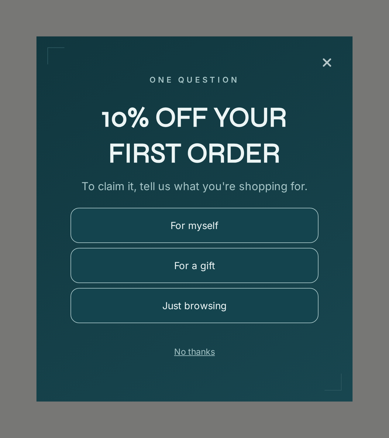
The Supplements Survey ActionPop template begins with a choice question, then can continue to email, phone, and reward.
Its first page asks what the visitor is shopping for.
ActionPop can route answers to different pages, so a shopper buying for themselves, shopping for a gift, or just browsing can receive a relevant next message.
This is a lightweight branch rather than a diagnostic quiz.
That distinction keeps the campaign fast.
If you need 6 questions before you know what to recommend, build a proper quiz and decide whether it belongs before or after email capture. Do not stretch a signup popup into a product finder just because pages can be added.
Build a similar flow free: start from Supplements Survey, rewrite the one question around the decision that changes your next message, route each answer, and remove phone if email is the only channel you need.
17. Baby Birthday Club asks for data tied to a future moment
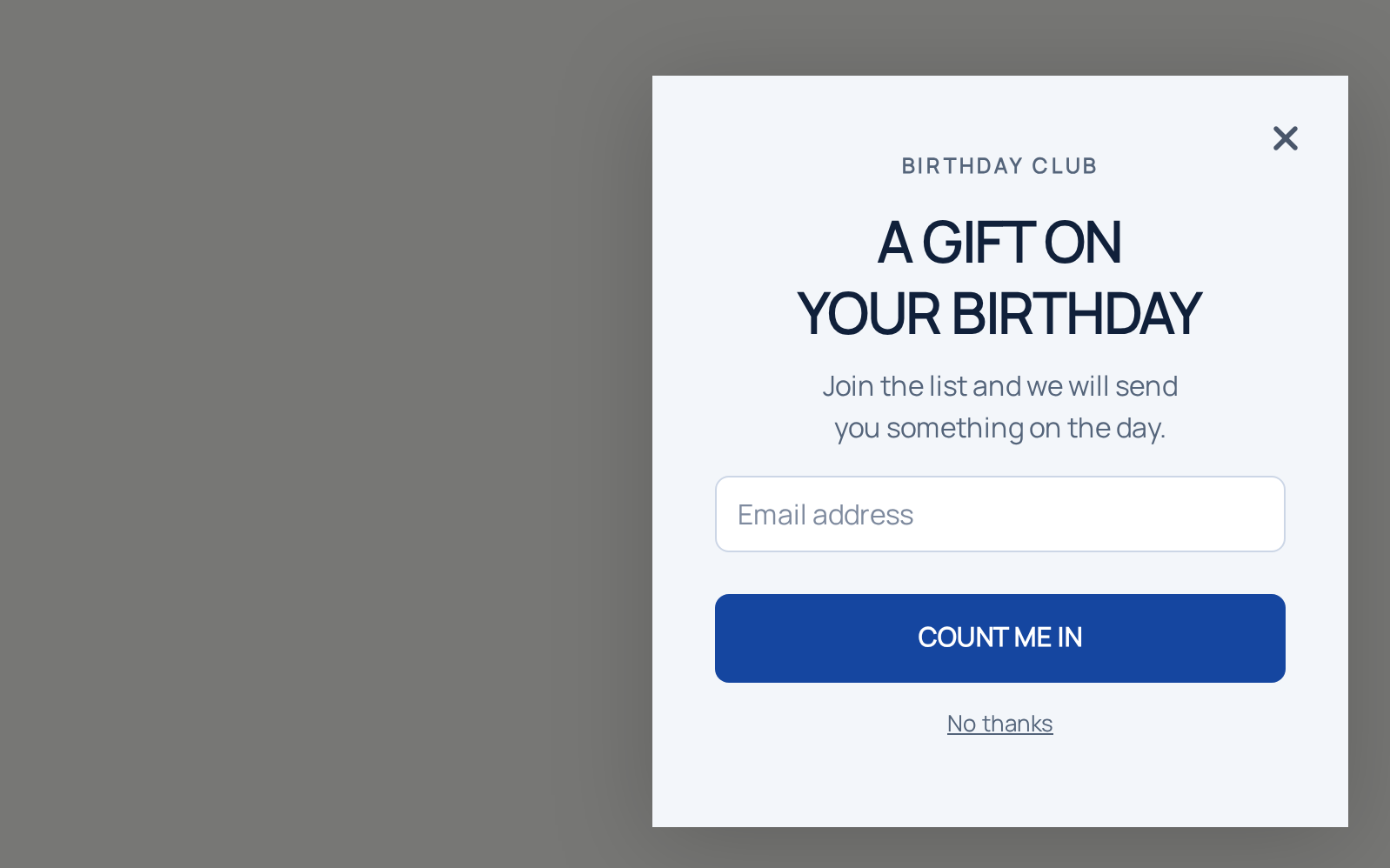
The Baby Birthday Club template is a better reason to ask for extra information than generic personalization.
The campaign can collect an email, birthday-related information, and optionally a phone number before confirmation.
A birthday question earns its place when a real birthday program can use the answer.
The copy should make that relationship explicit.
"Enter your child's birthday" is a field instruction.
"Join the birthday club for a surprise around their big day" explains why the field exists.
This idea extends beyond birthdays. Replenishment intervals, anniversaries, event dates, and product lifecycle moments can all justify extra information when a real workflow uses it later.
The form becomes harder to justify when the store cannot point to the future message or benefit that data will support.
18. Outdoor SMS Signup reminds us that channel order should follow the objective
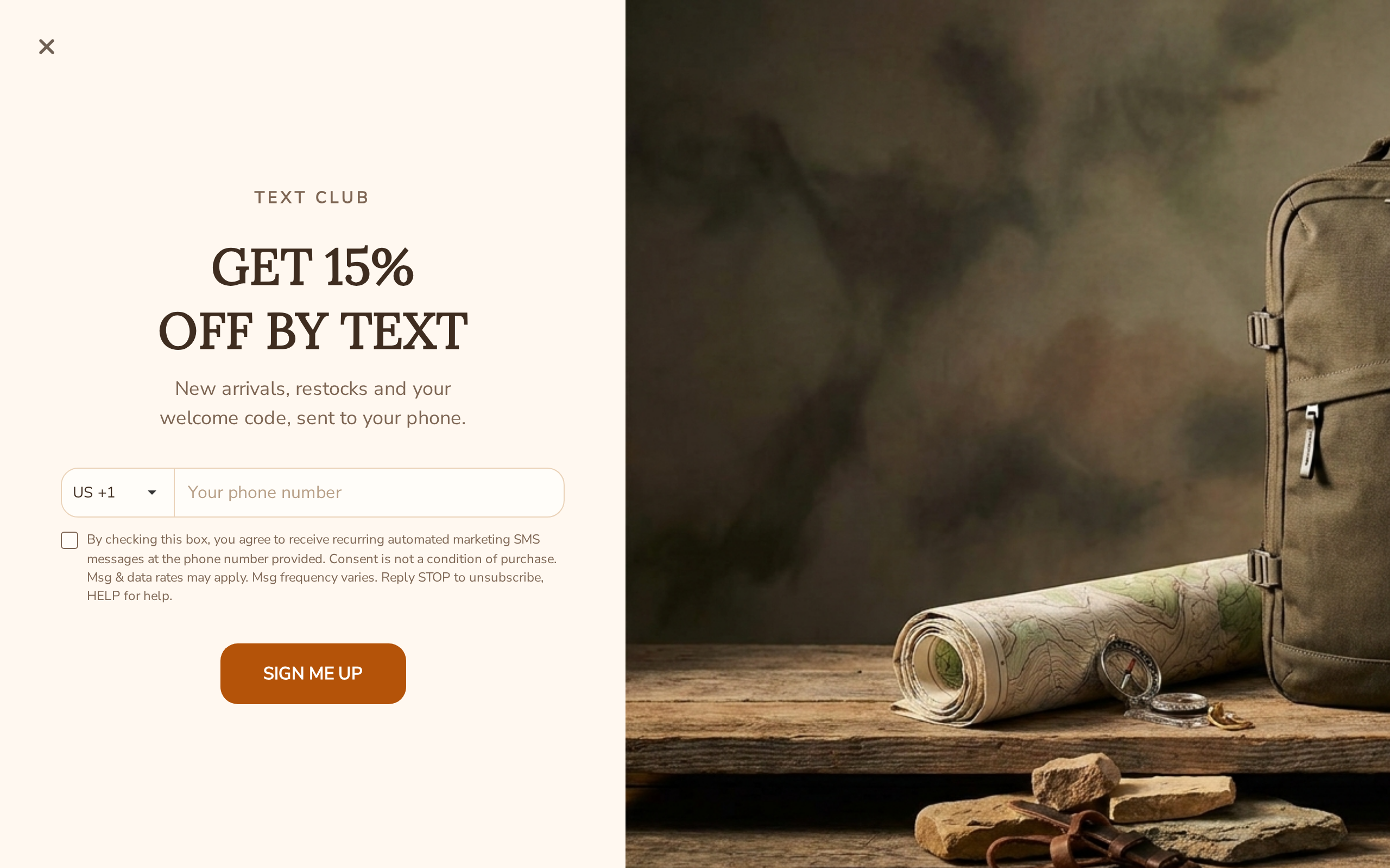
OnVoard's Outdoor SMS Signup template starts with phone, then email, then reward.
Email-first is a useful default, not a universal law.
If the most valuable promise is time-sensitive SMS, such as a short-lived restock or drop alert, phone might be the primary channel.
For a normal newsletter acquisition campaign, we would usually reverse it.
The first field should match the channel whose value proposition is strongest. Do not lead with phone simply because collecting 2 channels sounds more valuable in a dashboard.
Also separate the permissions. Email consent and SMS consent are not interchangeable. The subscriber should understand what each field signs them up to receive.
Add a step only when it earns something useful
The 4 common capture shapes are:
Email only: email → deliver the promise.
Email then phone: secure the email, then make a separately justified second ask.
Question then email: use one answer to change the next experience.
Game then email: use interaction to earn attention, then collect the address needed to claim or receive the reward.
If the question, phone number, or game does not change anything important, remove it.
Gamified newsletter signup examples
Gamification can buy attention. It cannot rescue a bad bargain.
Use it when the offer is worth considering but a normal form is easy to ignore, or when the brand can carry a playful interaction without making the site feel cheap.
The prize table, odds, and field sequence are business decisions. The wheel or scratch animation is presentation.
19. Kopari turns the reveal itself into the attention hook

Kopari has used a full-page scratch-off signup. The visitor does not simply read a discount number. They interact to reveal it.
The mechanism gives the campaign a moment of suspense that a static form does not have.
That can be useful when the main problem is getting the visitor to stop long enough to consider the offer.
We would not copy the game because an external case study reported a lift. A screenshot can show the mechanic, not prove what the same mechanic would do on another store.
Instead, compare it against a plain form on your own traffic and keep the commercial variables as controlled as possible. If the scratch version also changes the discount size, timing, and required fields, you will not know which difference mattered.
The reveal can be the hook, but keep the economics and the signup requirement separate.
20. Supplements Spin Wheel makes prize odds part of the campaign economics
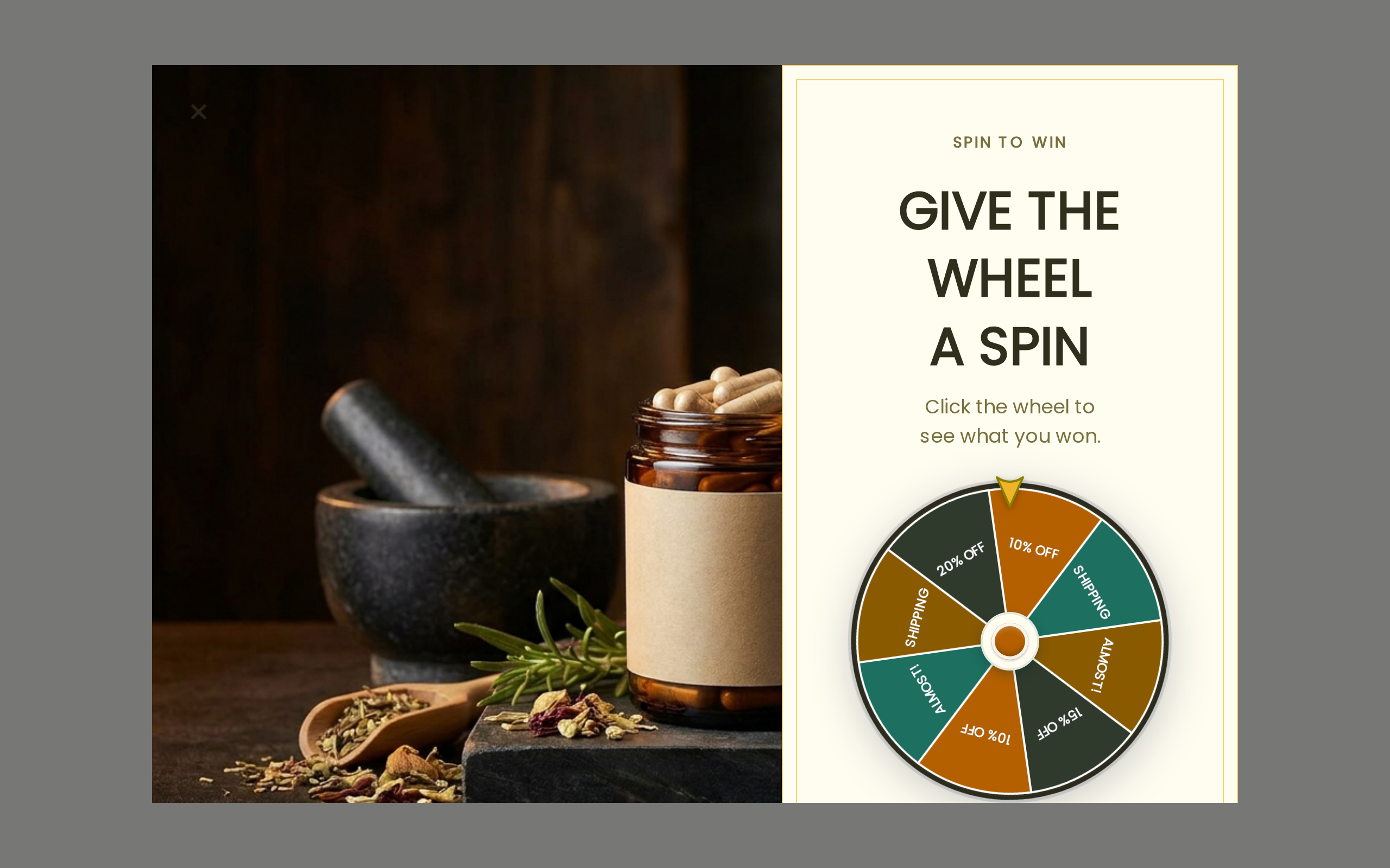
The Supplements Spin Wheel ActionPop template uses:
Spin → Email → Phone → Reward
ActionPop lets the merchant configure wheel slices, prizes, and odds.
That means the most important settings may sit behind the artwork.
Consider a simplified prize table:
Prize | Chance | Illustrative cost when redeemed |
|---|---|---|
5% off | 40% | $3 |
10% off | 35% | $6 |
Free shipping | 20% | $7 |
25% off | 5% | $15 |
A rough expected reward cost from those made-up inputs is:
(0.40 × $3) + (0.35 × $6) + (0.20 × $7) + (0.05 × $15) = $5.45
That does not mean every spin costs $5.45. Redemption, order value, margin, and eligibility all change the real economics. The calculation forces the prize table to become a commercial decision instead of decoration.
Build it free: start from Supplements Spin Wheel, set prizes and odds deliberately, then decide whether email must be collected before or after play and whether phone deserves its own step.
21. Supplements Scratch Card changes the order of curiosity and capture
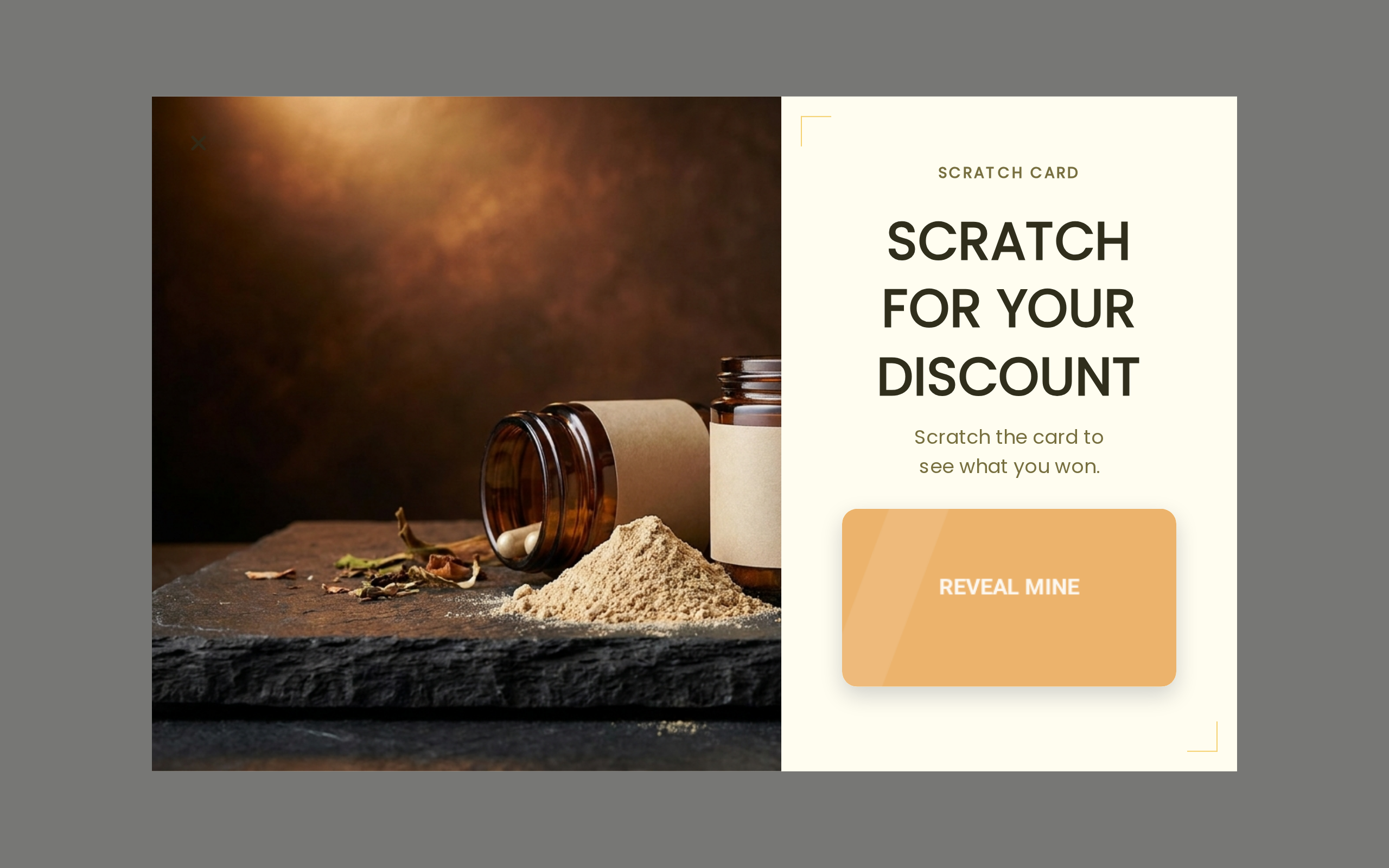
The Supplements Scratch Card template uses a reveal interaction instead of a wheel.
ActionPop can place capture before or after play, which makes the sequence itself testable.
If the visitor already wants the game, collecting email before the reveal can be the price of entry.
If curiosity is the main attention mechanism, letting the shopper start the reveal before the form may create a stronger reason to continue.
Neither order is automatically better.
The choice changes what the visitor has invested before being asked for data.
For a first version, keep the rest of the flow short. If you test scratch-before-email but also add phone, a second preference question, and a larger reward, the experiment stops teaching you anything about the order.
22. Outdoor Pick a Gift changes the interaction without changing the underlying reward system
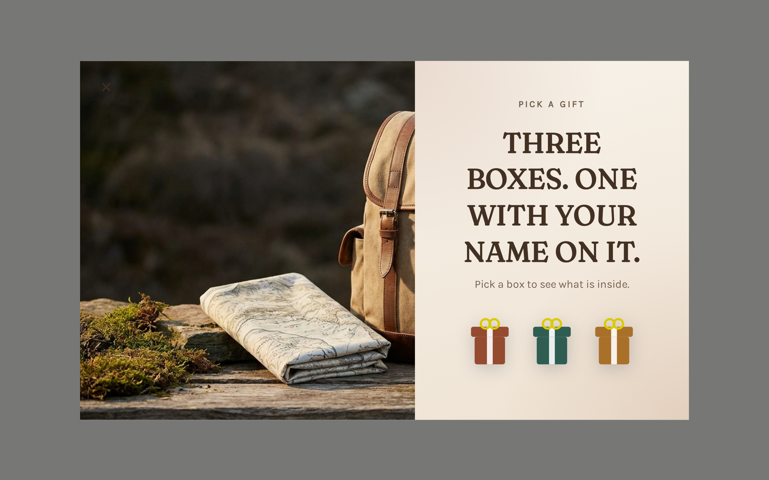
The Outdoor Pick a Gift template presents several choices and asks the visitor to pick one.
It feels different from a wheel even though the underlying campaign can still resolve into a configured reward.
Choosing feels more natural than spinning for brands in gifting, collectibles, beauty, or seasonal campaigns.
The same caution still applies.
Do not make someone complete 4 pages for a reward they would have happily accepted from a one-field form.
The interaction must earn more attention than it costs in friction.
If a plain email capture already performs well and the brand is intentionally restrained, a game may be a downgrade.
23. Mystery Scratch Takeover saves the game for the exit moment
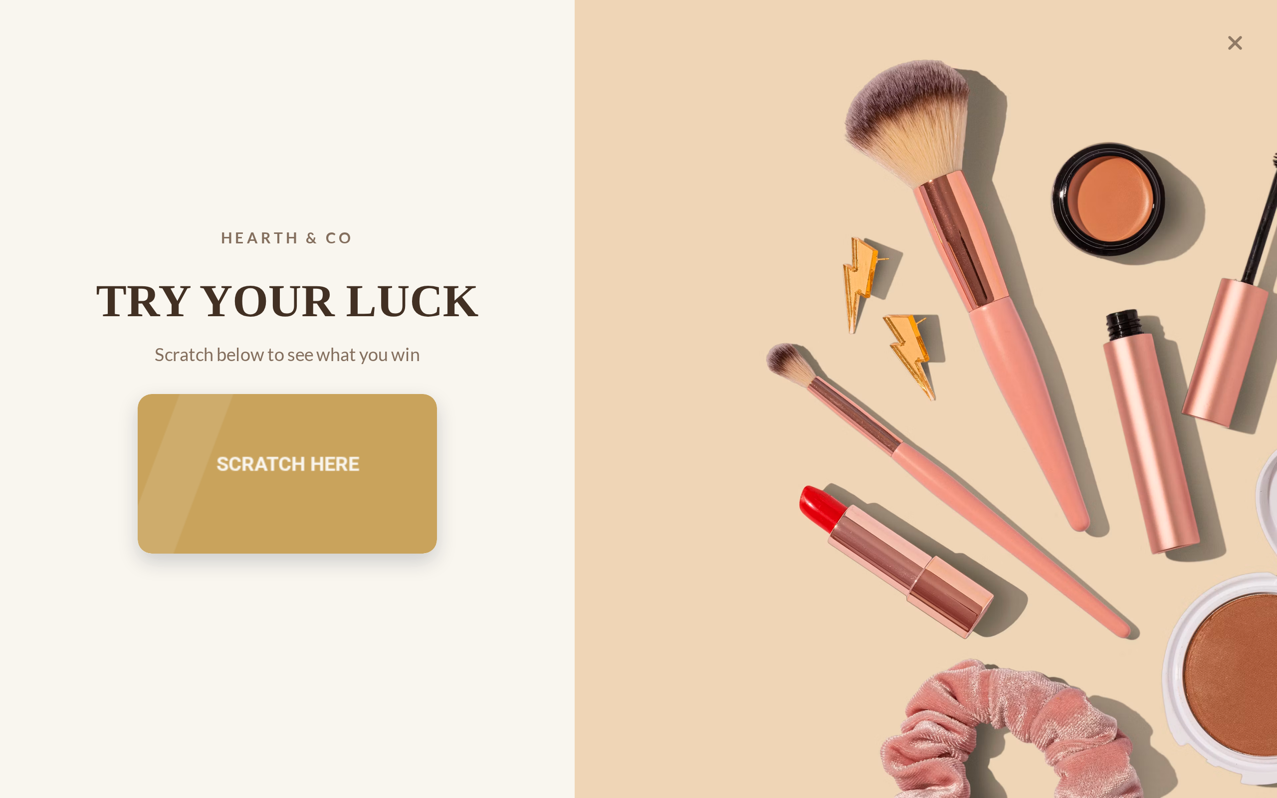
The Mystery Scratch Takeover combines 2 mechanics:
a scratch-card reveal;
exit-intent timing.
That changes the context.
A full-screen game on page load interrupts someone who has barely seen the store. The same takeover on exit is making a last attempt after the visitor has had a chance to browse.
This can justify a louder treatment, but it also creates a discount-training risk.
If regular visitors learn that moving toward the exit produces the best offer, the campaign can reward the behavior you were trying to recover from.
We would start with a reasonable offer, restrict eligibility, and set frequency controls before increasing the prize.
The exit trigger is not permission to give away margin.
Timing and placement newsletter signup examples
The visible form can stay identical while the campaign changes dramatically depending on when and where it appears.
A page-load modal, a scroll-triggered slide-in, an inline form, and an exit takeover all ask for the same email address in different moments.
Treat the moment as part of the message.
24. Taylor Stitch waits until the visitor has browsed

Taylor Stitch has used a popup triggered after the visitor scrolls roughly halfway through the homepage.
That lets the shopper learn something about the store before the interruption.
This is a good response to a common page-load problem: the store asks for an email before the visitor knows whether the products are relevant.
A scroll trigger is still only a proxy for engagement. Someone can scroll quickly without caring, while another visitor may spend a long time above the fold.
That is why ActionPop also exposes time, page, product, visitor, and event context. You can combine a more meaningful eligibility rule with the trigger rather than assuming one scroll percentage fits the whole site.
Delay the ask until the visitor has had a fair chance to understand the store.
25. Pip's uses a delay because the popup also explains a rebrand

Pip's used a popup to explain that Pipcorn had become Pip's while also offering the signup discount shown in the popup.
Pip's popup has 2 jobs, so the timing needs to support both:
reassure returning visitors that they are on the right site;
acquire contact information with an offer.
Showing it immediately could cover the new packaging and page context that make the rebrand message understandable.
A short delay gives the page time to establish what changed, then the popup explains it.
This is a useful exception to the rule that a signup should focus on one message. The rebrand notice is not random extra copy. It resolves a real source of visitor confusion.
If your second message does not solve something important, leave it out.
26. Fashion Exit Intent reserves the signup for a leaving visitor
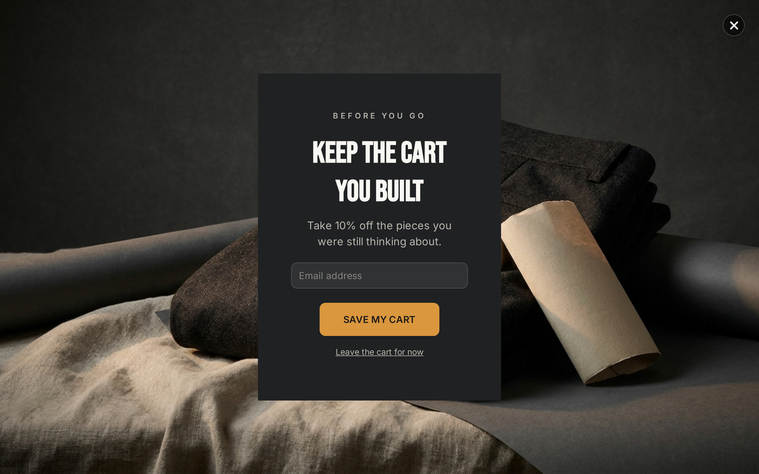
The Fashion Exit Intent ActionPop pattern moves the welcome-style capture to the moment a desktop visitor appears to be leaving.
That creates a different bargain from a homepage popup.
The shopper has already had time to browse. If they were going to leave without buying or subscribing, an acquisition offer has a clearer recovery job.
Do not automatically make the exit incentive richer.
Test timing separately from offer size. You may find that the same welcome incentive performs differently when it appears after engagement.
Also remember that exit intent is not equally detectable on every device. Mobile visitors do not give you the same mouse movement signal as desktop visitors, so the mobile experience needs a different trigger strategy.
27. Skincare Free Shipping shows the same builder can work inline
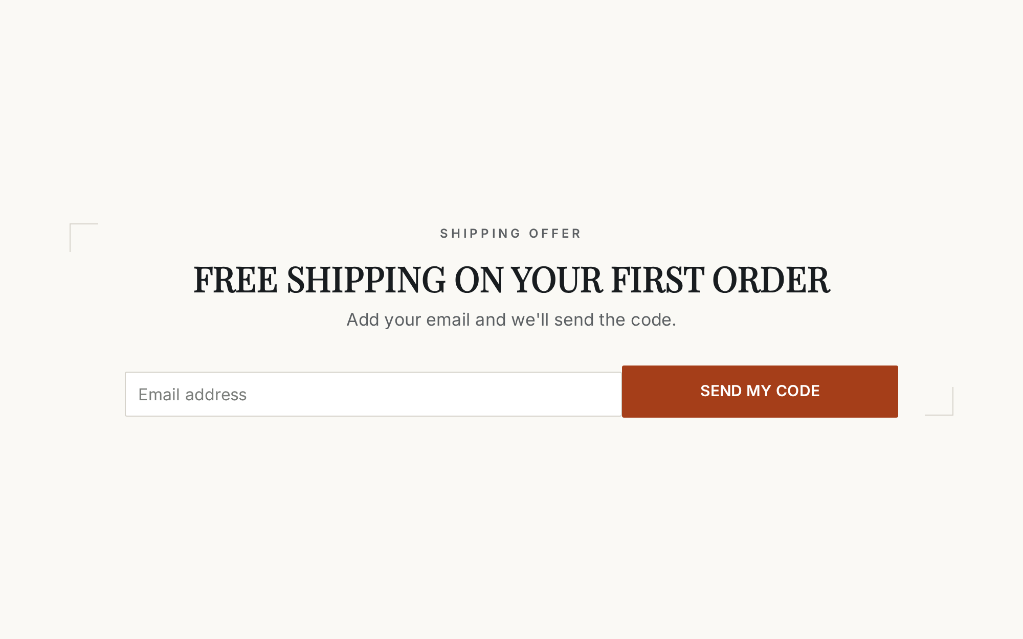
The Skincare Free Shipping ActionPop template is an inline campaign.
That means the signup sits inside the page rather than opening over it.
Inline capture suits stores that want ActionPop's capture, reward, and reporting capabilities without another overlay.
Inline works well around natural pauses:
below a collection;
after useful editorial content;
before the footer;
on a dedicated landing page;
inside a membership or launch page.
There is no page-load interruption to configure because the visitor reaches the form by reaching that part of the page.
The trade-off is discovery. If only a small portion of visitors scroll that far, the form may need another acquisition surface elsewhere.
Build it free: use an inline template, remove any field you do not need, and judge it on eligible page visitors rather than total site traffic.
Match interruption to visitor intent
A simple rule is useful here:
use a louder surface only when the moment or offer earns it.
Inline forms fit natural pauses.
Launchers let the visitor choose when to open the campaign.
Slide-ins suit engaged browsing without covering the whole page.
Modals suit clear value exchanges.
Fullscreen takeovers need a high-value moment or unusually strong reason.
Exit campaigns are a last interruption, not the default first impression.
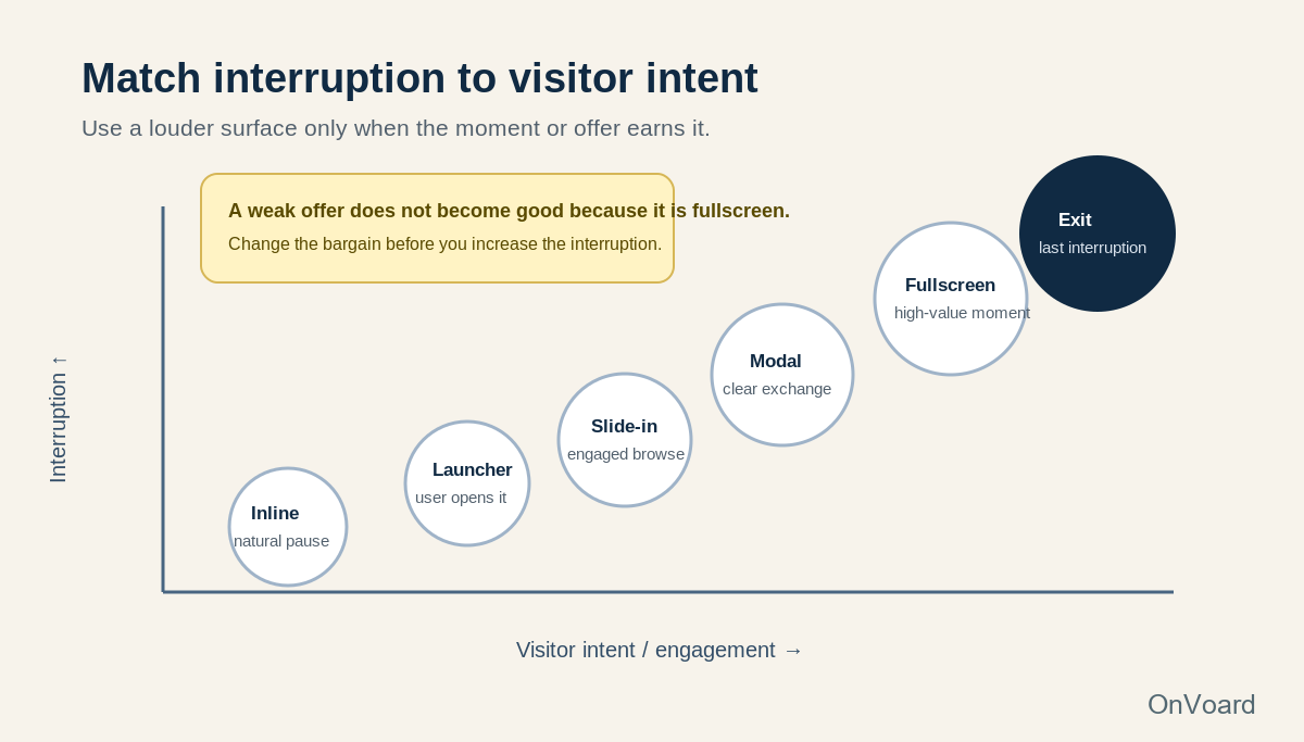
A weak offer does not become good because it is fullscreen.
Google's Search guidance also recommends avoiding intrusive interstitials that block access to the main content, and specifically suggests less obstructive treatments such as banners for prompts including newsletter signup. That is another reason to make the surface proportional to the job.
Newsletter signup examples that finish the exchange
The signup is not complete when the email reaches your database.
The shopper still needs to know what happened and receive what you promised.
This is where good acquisition flows often break.
28. Sleepy Jones keeps the confirmation step short

Sleepy Jones provides a simple double-opt-in example.
The email clearly asks the recipient to confirm that they want marketing updates and explains that no action is needed if they did not subscribe.
The useful lesson is restraint.
A confirmation email is a functional step. It does not need to become a full welcome newsletter before the subscriber has even completed the opt-in.
If your process requires confirmation, make the primary action obvious and avoid burying it beneath products, founder copy, or unrelated promotions.
Then let the actual welcome email do the welcoming after the subscription state is clear.
29. Masienda repeats the reason to finish confirming

Masienda's confirmation email does more than say "confirm your email."
It reminds the recipient why they started: the first-order discount, recipes, and updates.
That is a small but important continuity decision.
Every additional step creates a place to lose someone. Repeating the benefit gives the recipient context for why this confirmation matters.
This is especially useful when the original signup happened in a popup that is no longer visible.
The inbox has to carry the promise forward on its own.
If the signup only promised a code, lead with the code or confirmation required to receive it. If it promised early access, mention that access again. Do not switch to a generic community message between the form and completion.
30. Immi connects the signup incentive to the first welcome email


Immi previously used a website signup offering a chance to win a year's supply of ramen.
The welcome email then acknowledged that entry rather than pretending the subscriber arrived through a generic "join our newsletter" form.
This is the full chain working properly.
The signup creates a specific expectation. The email confirms that the action counted. Then the message can introduce the product and brand without leaving the subscriber wondering whether the original offer was lost.
That is the standard we would use for every signup flow, including simple discount campaigns.
If the form promises:
Get 15% off your first order.
Email 1 should make the promised discount easy to find.
If the form promises:
Get first access to the next drop.
Email 1 should explain what happens next and how access will arrive.
If the form asks:
What are you shopping for?
The first messages should use the answer soon enough that providing it felt worthwhile.
A signup creates a small debt. The success state and first email pay it.
How many fields should a newsletter signup ask for?
Start with the field needed to deliver the promise.
For an email newsletter, that is usually the email address.
Every additional field needs a named job.
Field | Ask now when... | Delay or remove it when... |
|---|---|---|
Email is the promised channel | Rarely | |
First name | You have a real personalization use | It only exists because forms usually ask |
Phone | SMS is part of a clearly explained second exchange | Email is the real acquisition objective |
Birthday | A birthday program actually exists | Nothing happens around the birthday |
Product interest | It changes recommendations or messages | Everyone receives the same welcome flow |
Country or location | Availability, shipping, or content genuinely differs | You can infer it reliably or ask later |
Preference question | One answer changes the next step | It is research for the merchant, not value for the shopper |
Progressive capture is usually cleaner than a wall of fields.
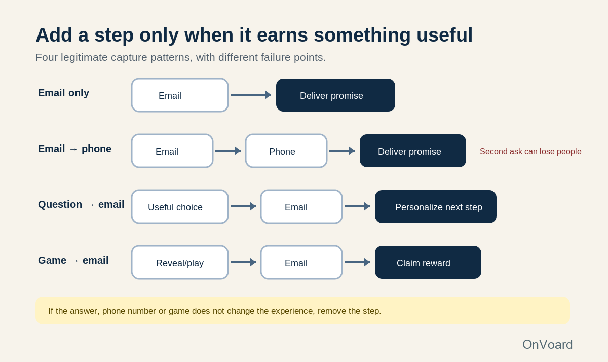
Secure the smallest commitment first. Then make the second exchange explicit.
That is why Email → Phone → Reward should not automatically mean the phone is mandatory. It means the builder can support a second channel. The merchant still has to decide whether that channel earns the extra friction.
Choose the incentive from economics, not habit
A higher signup rate can still produce a worse acquisition program.
Imagine 2 offers shown to 10,000 eligible visitors.
Offer A: 10% off
600 email signups
120 subscribers place an order
Illustrative average pre-discount basket: $70
Illustrative simplified discount cost on those orders:
120 × $7 = $840
Offer B: early access
350 email signups
90 subscribers place an order
no percentage-discount cost
Offer A generated 250 more addresses and 30 more first purchases.
Whether it was better depends on the incremental margin from those extra purchases, what would have happened without the offer, and what the 2 subscriber groups do later.
That is why we would not optimize a welcome offer on submission rate alone.
The same logic applies to free shipping, gifts, and prize games.
A gift has unit cost and fulfillment complexity. Free shipping has a subsidy that changes by location and order profile. A spin wheel has a distribution of possible reward costs. A sweepstakes can collect a large audience whose motivation is the prize rather than the product.
Put the acquisition mechanic beside the order economics before deciding that "more signups" is the objective.
How to build a similar newsletter signup with ActionPop for free
ActionPop's current free plan includes the same campaign features as the paid plan, with OnVoard branding kept on the popup. That makes the template library useful for testing a signup idea before paying for another tool.
The fastest setup is not "pick the prettiest template."
Use this sequence instead.
1. Name the acquisition job
Write one sentence:
We want to capture ______ from ______ because ______.
For example:
We want to capture email from first-time non-subscribers because we have a first-order offer worth following up.
or:
We want to capture email from launch-page visitors because the next product drop is not available yet.
That sentence decides more than the template color.
2. Choose the closest play
Use Fashion Welcome Offer or another welcome template when the job is first-order acquisition.
Use Fashion Early Access or Collectibles Early Access when access is the value.
Use an Inline capture when the page already has a natural signup location.
Use Supplements Survey when one choice should change the path.
Use Spin Wheel, Scratch Card, or Pick a Gift when the offer is worth testing with more interaction.
Use an exit-intent template when the campaign's job is specifically to recover a leaving visitor.
3. Delete pages before adding them
A template might ship as:
Email → Phone → Reward
That does not mean your campaign should.
If email is the objective:
Email → Reward
If there is no incentive:
Email → Confirmation
If one question changes the message:
Question → Email → Confirmation
If the game is the hook:
Game → Email → Reward
Complexity should be earned.
4. Configure targeting before polishing the copy
ActionPop can use store and visitor context such as:
new versus returning visitor;
logged-in state;
past orders;
total spend;
customer tags;
country;
device;
product or page;
cart value;
cart item count;
time on site.
A first-order offer is more credible when it is limited to people who can actually use it.
An early-access signup can appear on launch-related pages rather than every page.
A high-intent exit offer can be held back from people who have already subscribed.
Precise eligibility often improves the experience more than another hour of headline editing.
5. Choose the trigger that matches the moment
ActionPop can fire on page load, scroll depth, element click, a launcher button, exit intent, add to cart, checkout, or a custom JavaScript event.
Use the trigger to answer "why now?"
A homepage welcome offer might appear after a short delay.
An editorial signup might be inline or scroll-triggered.
A leaving desktop visitor might receive an exit campaign.
A launch waitlist may not need an overlay at all.
Do not pick a trigger because it is available. Pick it because the visitor state makes the ask more relevant.
6. Set completion and frequency rules
Someone who has already completed the email step should not keep seeing the acquisition campaign.
Neither should a visitor have to close the same welcome popup on every page.
Decide:
what action counts as completion;
maximum views;
minimum time between showings;
whether an already engaged visitor should be suppressed;
whether a launcher should replace repeated overlays.
Frequency is part of the experience, not a reporting setting you configure after launch.
7. Connect the real reward
Publishing popup copy does not create a discount in the store.
If the campaign promises a code, make sure the corresponding promotion exists and the conditions match the visible wording.
ActionPop can display coupon codes and support unique-code delivery, but the commercial rule still needs to be correct in the commerce platform.
Test the complete customer path:
submit the form;
receive or reveal the code;
copy it;
add an eligible product;
reach checkout;
verify the discount behaves as promised.
Do this on mobile too.
8. Start the welcome workflow immediately
The acquisition event should become a lifecycle event, not a row sitting in a list.
Route the new subscriber into the relevant welcome workflow and make Email 1 continue the same exchange.
A subscriber from a first-order popup needs the promised offer.
A waitlist subscriber needs launch context.
A survey subscriber should see their answer used.
A game participant should understand the reward they received.
The first email is part of the signup UX.
Mobile signup design needs a stricter standard
A popup that feels modest on a desktop preview can cover nearly everything on a phone.
Test the actual device.
Open the keyboard. Enter a long email address. Close the campaign. Rotate the screen. Follow the reward. Return to the page.
For mobile we would prioritize:
one dominant promise;
one required field on the first capture screen where possible;
a close control that is easy to hit;
field labels that remain understandable when typing;
no decorative text that pushes the action below the viewport;
no interaction that blocks access to the page without a strong reason.
Google recommends avoiding intrusive dialogs that obstruct access to the main content and suggests less obstructive alternatives, including banners, for newsletter signup prompts.
That does not mean every popup is forbidden.
It means the interruption needs to be proportionate and dismissible, and you should not make the search visitor fight a promotion before reaching the content they clicked.
Consent is part of the signup design
The correct consent process depends on jurisdiction, channel, and what you plan to do with the data.
Do not copy another brand's footer text and assume it solves yours.
For processing based on consent under the GDPR, European Commission guidance describes valid consent as freely given, specific, informed, and unambiguous. The request should be clear and distinguishable and explain the intended use of the data.
In the United States, CAN-SPAM works differently. The FTC's rules for commercial email focus on requirements such as accurate sender information and subject lines, identification and address requirements, and a clear functioning way to opt out. Prior affirmative consent does not remove the other commercial-email obligations.
SMS introduces another set of requirements.
The design consequence is straightforward:
know what permission you need before deciding what the field, checkbox, and disclosure should say.
ActionPop can record consent wording and channel grants when you use its consent element. That is useful recordkeeping. It does not decide the legal basis or write universally valid consent copy for every market.
Measure the signup as a funnel, not one rate
A form submission is an important event, not the final verdict.
Use a funnel.
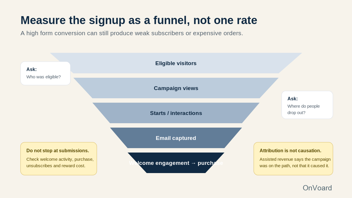
1. Eligible visitors
Who could actually see the campaign after targeting and suppression?
That is the clean denominator for many acquisition questions.
2. Campaign views
How many eligible people saw it?
A strong form cannot convert visitors who never encounter it.
3. Starts or interactions
For a question, game, or multi-step flow, how many people begin?
A large drop before the email field can mean the opening hook is weak or the interaction looks like too much work.
4. Email captures
How many valid addresses did the campaign actually earn?
This is the primary acquisition event.
5. Secondary-step completion
If you ask for phone or another field, measure it separately.
Do not let a weak phone step make a successful email capture look like a failed campaign.
6. Welcome engagement
Did the new subscriber open, click, and reach the thing that was promised?
This starts measuring the quality of the signup, not merely the quantity.
7. Reward use and purchase behavior
For incentive campaigns, check:
reward redemption;
first purchase;
time to purchase;
order value;
unsubscribes;
complaints;
later engagement;
repeat purchase where enough time has passed.
A campaign can assist an order without causing it.
ActionPop's assisted-revenue reporting tells you that the campaign was part of a path associated with later revenue. Treat that as involvement, not proof of causation.
If you need causal confidence, you need a stronger experimental design than an attribution label.
A launch checklist for the first version
Use one signup first.
Do not deploy 30 campaigns because this article contains 30 examples.
Before launch:
State the promise in one sentence. A shopper should know why they are joining.
Name eligibility. Decide who should and should not see the campaign.
Remove unnecessary fields. Every field needs a downstream job.
Choose the surface deliberately. Inline, slide-in, modal, fullscreen, launcher, or exit should match the moment.
Set the trigger. Page load is not the default answer to every acquisition problem.
Set frequency and completion. Do not keep asking after the visitor has answered.
Verify the reward. The actual store rule must match the popup copy.
Verify the success state. Tell the visitor what happened and what comes next.
Verify the first email. Pay off the promise immediately.
Test on a real phone. Include the keyboard and close control.
Test a returning subscriber. They should not be treated like a new unknown visitor.
Check consent and disclosure. Use the requirements that apply to your audience and channels.
Record the pre-launch baseline. Know what you will compare after the campaign runs.
Measure the full funnel. Do not stop at form submissions.
The best first version is usually easier to understand than the version you initially imagined.
Start with a clear exchange. Make the moment appropriate. Ask for only the data you can use. Then make the success state and first email prove that the signup was worth completing.