On this page
Open rate is probably the first email marketing metric most people look at.
I think that's backward.
Before I care whether someone opened an email, I want to know whether the email reached them in the first place. A subject line can't rescue a message that never made it to an inbox.
There's a slightly unintuitive reason this matters in email analytics. Open rate only looks at delivered emails. Failed sends aren't sitting in its denominator making the percentage look worse. They've already disappeared from the calculation.
So you can have an Open rate that looks perfectly respectable while a delivery problem is happening further up the funnel.
That's why I read email performance in order: sent, delivered, failed, opened, clicked, then revenue.
Across OnVoard, complaint rate sits at 0.02%, 5x better than the 0.1% threshold inbox providers act on, and bounces run 0.09%. That's not luck. We manually approve every sender before they're allowed to send, so nobody on OnVoard shares a reputation with someone else's spam list. It protects deliverability, not inbox placement - we can't promise every email lands in the inbox, but we can promise the sending pool it rides on stays clean.
Can I trust the Open rate yet?
Start on Marketing Platform Analytics and read the Overview from left to right.
Total sends is the attempted volume. Then you get Delivery rate and Failure rate before Open rate and Click rate.
That order is deliberate.
Delivery rate and Failure rate both divide by sends. Open rate and Click rate switch to a different base entirely: delivered emails.
That makes the first question pretty simple. Did enough of what I tried to send actually arrive?
If Failure rate is moving the wrong direction, fix the delivery problem before touching the subject line.
The 2 charts underneath help with that. Emails delivered over time gives you the volume. Failure rate over time tells you whether the problem is persistent, improving, or concentrated in a particular period.
A lifetime rate can hide a recent problem surprisingly well. The line is usually more useful than the total when something has changed.
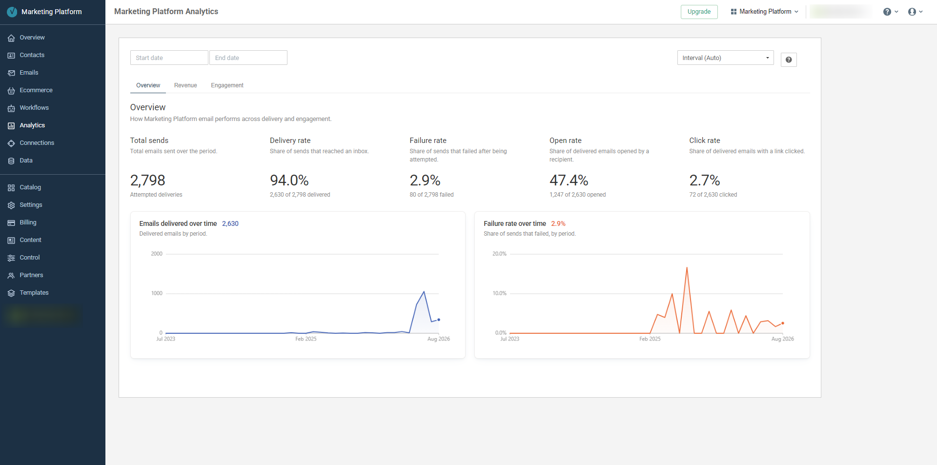
Overview puts delivery before engagement, then shows delivered volume and Failure rate over time.
This is the part I think a lot of email marketing metrics advice gets backward. It jumps straight to opens because they're interesting.
Delivery is less interesting. It's also upstream of everything else.
Are opens turning into clicks?
Once delivery looks healthy, I move to Engagement.
The headline counts are Delivered, Opened and Clicked, followed by Click-to-open rate.
That last one answers a narrower question than Click rate.
Click rate asks what share of delivered emails got a click. Click-to-open rate narrows that same question down to just the emails that were opened.
Together they separate 2 different problems.
If people aren't opening, I'm looking at what happens before the email body gets a chance to work.
If people open but don't click, now I'm interested in the email itself.
The Open and click rate over time chart puts both rates on the same scale. That's more useful than staring at either one alone - if Open rate holds while Click rate falls away, you know where to start investigating.
Then there's Delivery problems and complaints.
That card ranks Failed, Hard bounced, Soft bounced, Marked as spam and Unsubscribed using the same sends denominator. Metrics that cross an attention threshold can get a Needs attention flag rather than quietly sitting in the table.
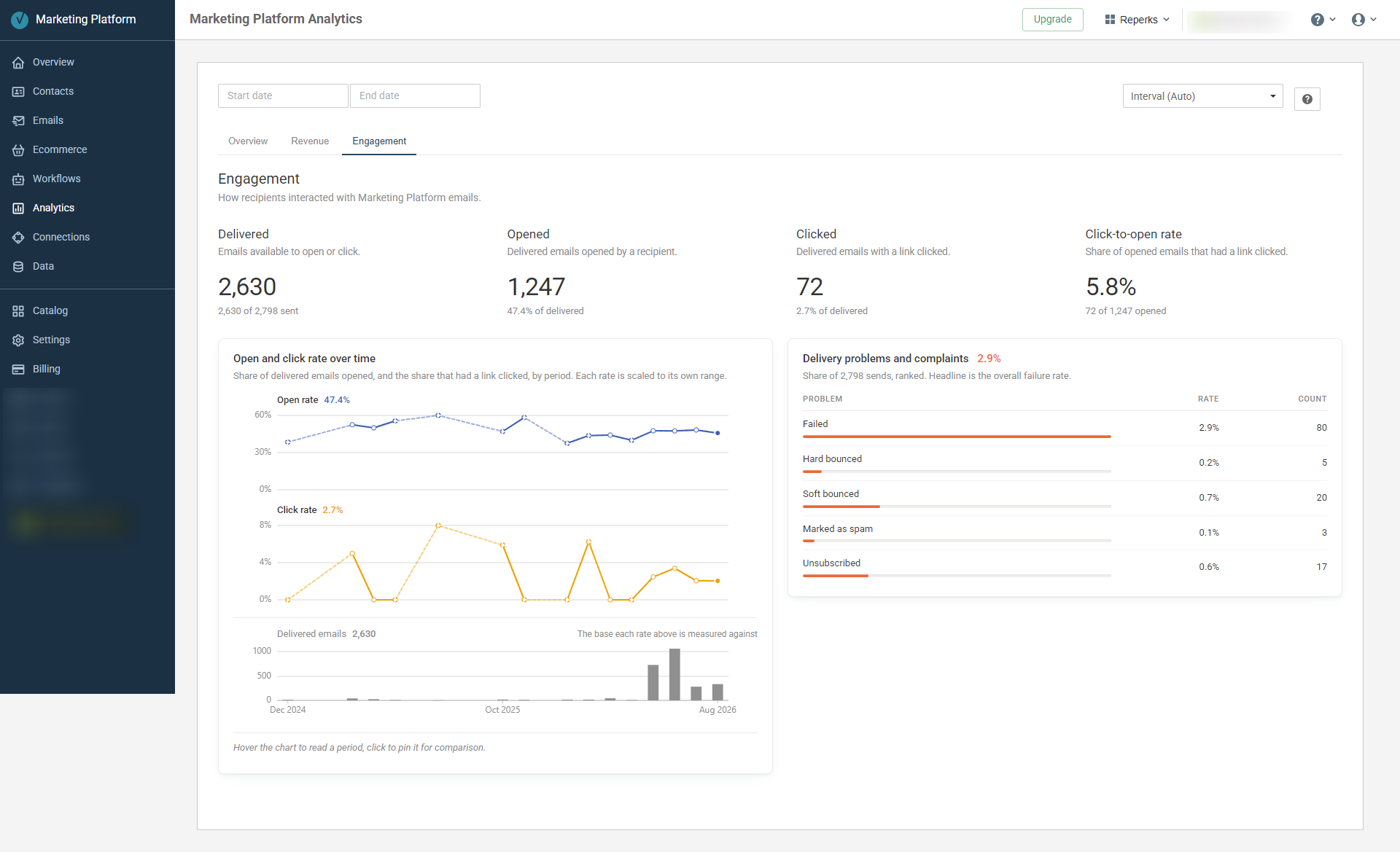
Engagement shows the delivered-to-open-to-click path, with delivery problems and complaints beside it.
I wouldn't treat an unsubscribe or spam complaint as just another engagement event, which is why they're separated from opens and clicks.
Is email earning more than attention?
Only after delivery and engagement do I go to Revenue.
The account-wide Revenue tab starts with Attributed revenue and Conversions.
The word attributed matters here.
OnVoard ties email revenue to a conversion associated with an email recipient. That's a different claim from the assisted revenue used by ActionPop and Product Recommender, where a campaign or recommendation was part of the path before the order.
I wouldn't mix those 2 concepts or rank them against each other as if they measure the same thing.
Attributed still doesn't mean "this email caused every dollar." It means OnVoard has an attribution link between the email and the conversion. That's the level of claim I'd stick to.
Beside it, Revenue per delivered gives the attributed revenue over delivered emails. Store revenue gives you the comparison baseline. When both sides have enough order data, Average order value compares the value of attributed email orders with the store average.
Then Revenue Contribution splits the email side into Total, Broadcast and Workflow against store revenue.
And at the bottom, Top products by units sits beside Top products by revenue.
The product that moves the most units doesn't have to be the product carrying the most revenue. If you're planning what to feature again, a single "top products" ranking throws away half that story.
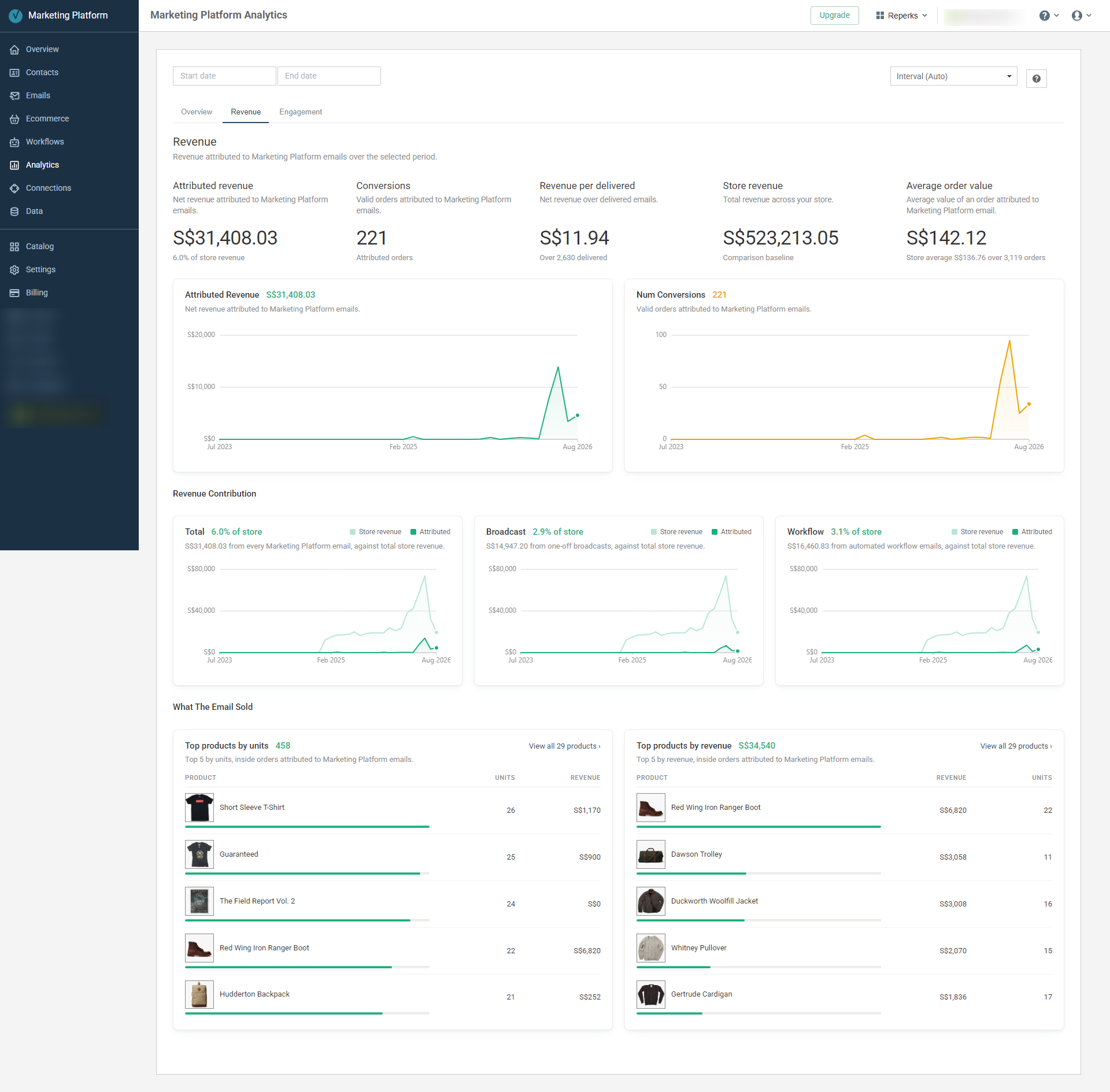
Revenue connects attributed orders back to the account-wide picture, then shows what sold inside those attributed orders.
Read those product cards literally, too, since it would be easy to over-read them. What they show is products inside orders attributed to Marketing Platform email, not proof the email is the reason a shopper picked that exact item over another one.
Is the account average hiding a bad email?
Account-wide analytics tells me whether something is wrong.
The email-level view is where I start narrowing it down.
Open an email's Analytics and the first tab follows the same delivery-first logic: Total sends, Delivery rate, Skip rate and Failure rate.
Skip rate matters here because it's a different failure mode than Failure rate: it's what we withheld before ever attempting delivery, not a send that went out and then failed.
Below that, Delivered Emails and Failure rate over time let you inspect that email across the date range rather than judging it from the account aggregate.
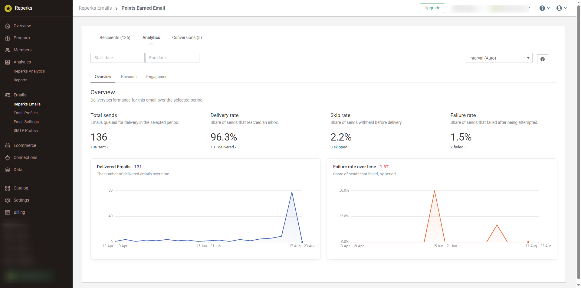
A single email gets its own delivery view, including Skip rate and Failure rate before any engagement analysis.
This is also not a broadcast-only report.
The same email analytics shape is used for Reperks, Back In Stock and Reviews emails. So whether I'm investigating a one-off broadcast or an app email, I can work through the same sequence instead of learning a different reporting model for each one.
What did this email actually sell?
The email's Revenue tab narrows the account-wide view to that email.
You get Revenue, Conversions, Avg conversion value and Revenue per delivered recipient.
The headline on this page is simply called Revenue, but the underlying relationship is still attribution to this email. Conversions are orders attributed to it, and the revenue chart follows that same scope over time.
Then comes What The Email Sold.
Again, there are 2 rankings: Top products by units and Top products by revenue.
That's the card I'd use after a campaign works.
Not "the email made money, great." What was actually inside those attributed orders matters more than the total. Maybe the product I expected really did carry it. Or maybe one item I wasn't watching pulled most of the revenue while a pile of cheap add-ons padded out the unit count.
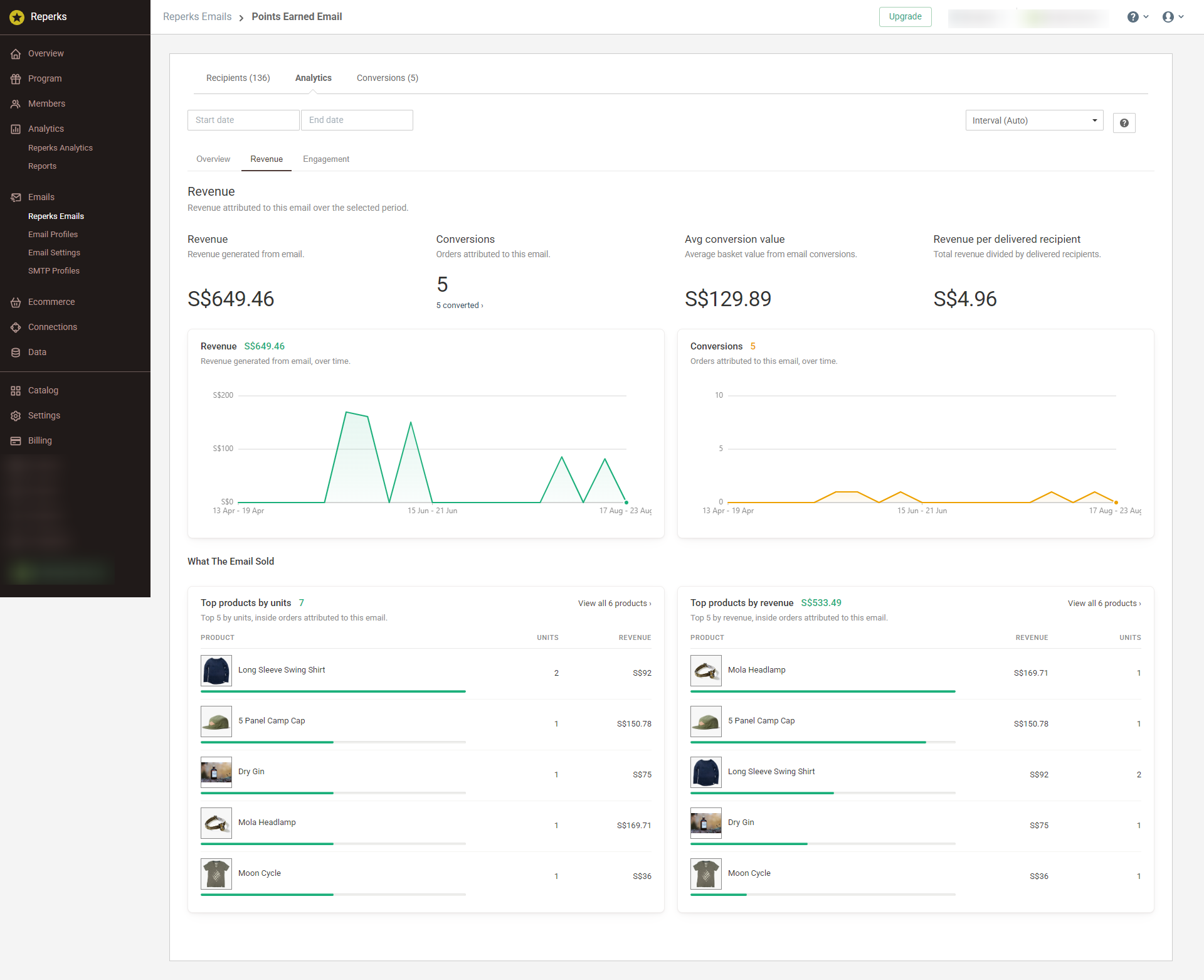
Email-level Revenue shows the attributed orders and value for that email, then the products inside those orders.
Revenue tells me whether the email was commercially useful.
The product breakdown gives me something I can use when I plan the next one.
Where did engagement break?
Finally, the email-level Engagement tab gets much more specific.
You still have Delivered, Opened, Clicked and Click-to-open rate.
But now you also get Top links by clicks.
For each link, the breakdown can show Clicks, Clickers, Orders and Revenue. That's much closer to the question I usually have after seeing a weak or strong Click rate: what were people actually clicking?
Then the same Delivery problems and complaints card sits beside it.
Having those on the same screen stops you from treating engagement as only a content problem.
Weak results can start in a lot of places - before the open, after it, or way down at one specific link nobody clicked.
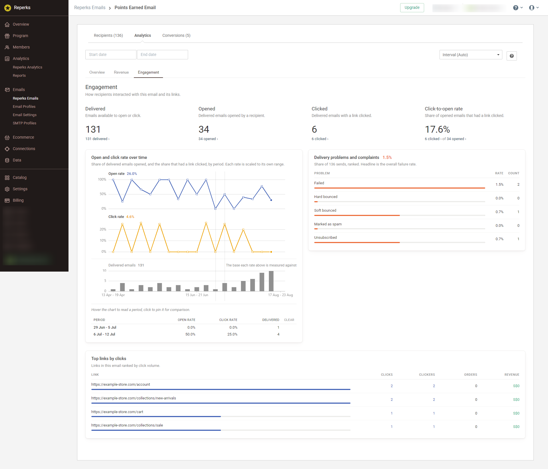
The email-level Engagement view combines open and click behavior, individual links, and delivery problems.
What I'd check first
Open Marketing Platform Analytics today and skip Open rate at first.
Check Delivery rate and Failure rate first, then open Delivery problems and complaints and make sure there isn't a bounce, spam or unsubscribe signal that needs attention.
Only then move down to Open rate, Click rate and Click-to-open rate.
After that comes the money: Attributed revenue, Conversions, and what those attributed orders actually contained.
If one of those account-wide numbers looks wrong, open the email itself and run through the same sequence again.
That's the order I want from email analytics: can it arrive, did anyone engage, did anyone act, and what was that action worth?
Subject lines matter. But they aren't the top of the funnel.