On this page
An ecommerce email template layout is not a pile of blocks. It is a reading order. On a phone, the reader should be able to understand the message, see the product or story that matters, find the primary action, and get the proof needed to act without decoding a desktop design that has collapsed into a long stack.
This guide uses 20 original ecommerce email examples to show that structure in practice. Each example is designed narrow first, then adapted for wider screens. The examples cover launches, promotions, product browsing, lifecycle messages, editorial emails, and post-purchase communication. The point is not to copy the styling. It is to see how different jobs change the order, density, and relationship between message, merchandise, proof, and CTA.
The examples are original teaching layouts, not merchant campaign screenshots. Later in the guide, real campaigns from Patagonia, Away, AllTrails × Allbirds, and Brooklinen are used as observed references, and RenderKu examples show how the same patterns appear inside a real ecommerce email-template workflow.
Start with the mobile reading path. Let desktop add space, columns, and scale later, but never let desktop change what the email means.
Choose the email job before you choose the layout
A layout becomes easier to design when the send has one primary job. A launch email needs a focal product. A collection email needs controlled browsing. A cart email needs continuity with the interrupted purchase. A newsletter may need one lead story and several smaller stories. An order confirmation needs service information before marketing.
Use the table below before opening the editor. If two rows seem equally important, the campaign may be trying to do two jobs at once.
Email job | What should dominate the first mobile screen | Typical product density | Primary action | Useful proof |
|---|---|---|---|---|
Single-product launch | Product promise and hero product | 1 focal product | View or shop the product | Rating, review, feature proof |
Collection or seasonal launch | Collection idea plus a small preview | 3 to 6 products across the full email | Shop the collection | Category cues, availability, material detail |
Promotion | Offer terms and what the offer applies to | Enough products to make the offer tangible | Shop the sale | Deadline or eligibility, if real |
Abandoned cart | The unfinished cart | Exact cart items | Return to cart | Delivery, returns, support |
Browse follow-up | The viewed category or product | 1 viewed item plus a few alternatives | Continue browsing | Relevant comparison cues |
Editorial or educational | The story or answer | Products only where they support the story | Read, learn, or shop the relevant item | Expertise, instructions, customer evidence |
Post-purchase | Order state or next service step | Usually none near the top | View order, track, get help | Order facts, delivery state, support |
This is the first place where ecommerce differs from generic email-layout advice. Products are not decoration. They are decision objects with images, names, prices, variants, ratings, and availability. A strong template decides which of those fields matter for this email instead of dumping a storefront card into every campaign.
Use one mobile-first skeleton, then change the middle

A useful default is: compact brand cue, clear message, focal product or story, primary action, relevant proof, optional secondary content, then utilities. That is not a mandatory sequence for every send. It is a clean starting point because it forces the important decisions into a single vertical path.
The middle of the template is where most variation belongs. A product launch may use one large product image and one CTA. A collection email may use a repeated product-card rhythm. A newsletter may alternate story blocks. An order confirmation may replace the entire merchandising middle with order details.
When a desktop version uses columns, decide the mobile order before building the row. An image beside copy is easy. A three-product grid is easy. The hard part is deciding what happens when those pieces become a sequence. If the mobile stack puts a supporting image above the message it supports, or separates a CTA from the proof needed to trust it, the desktop arrangement is hiding a structural problem.
Choose one-column or split layout by what must stay together

A single-column layout is the easiest mobile default because the visual order and source order are usually the same. It works especially well for a single offer, one featured product, a letter, a lifecycle message, or any email where the reader should move through one argument in sequence.
A split layout is useful when two pieces genuinely belong together: product image beside product copy, two products being compared, or a lead story with a supporting image. The mistake is using columns simply because desktop has empty horizontal space. Every column creates a future stacking decision.
Before using a split row, ask: if these two blocks become separate full-width sections, which one must appear first? If the answer is unclear, the row is probably combining unrelated content. If both need equal priority, use matching cards. If one supports the other, make the primary block visually dominant on desktop and preserve that order on mobile.
Relationship | Desktop treatment | Mobile treatment |
|---|---|---|
Image supports one message | Image beside copy | Keep image and copy adjacent; choose deliberate first element |
Two products are being compared | Balanced pair | Stack with identical field order |
One product is primary, one is secondary | Larger primary card plus smaller support card | Primary product first, secondary product later |
Proof supports one CTA | Proof beside or beneath CTA | Keep proof immediately after the CTA or claim |
Two unrelated promotions | Do not force into one row | Separate sections, or remove the weaker promotion |
This relationship test is more useful than memorizing a fixed number of columns. Email-client constraints matter, but the editorial structure comes first. If the relationship survives as a narrow stack, the desktop row is usually safe to build. If it only makes sense when viewed side by side, reconsider the content before adding more responsive tricks.
Product launches and promotions
These layouts have the clearest commercial intent, but they still need different structures. A launch needs focus. A sale needs offer clarity. A restock needs continuity with a prior product decision.
1. Single-product launch: one product, one reason, one next step

A single-product launch should feel unmistakably single-product. The first mobile screen needs the product name or promise, one dominant image, and enough context to explain why this item deserves attention. Resist the urge to introduce related products before the reader has processed the launch.
In the vignette, the CTA sits directly after the product promise and hero image. A compact rating line follows the CTA as decision support. That placement makes the proof answer the question created by the promise instead of becoming a separate decorative testimonial section.
On desktop, the product image can sit beside the message. On mobile, keep the message, image, CTA, and proof in that order. If the proof becomes more visually dominant than the product, reduce it. If a second product needs equal emphasis, this is no longer a single-product layout.
2. Collection launch: introduce the idea, then let products prove it

A collection launch has two jobs: establish the collection idea and make browsing feel easy. The opening should explain the unifying idea in one short message, then move quickly into a small product preview. The collection itself supplies the depth after the click.
The vignette uses three products, not twelve. Each card has only the fields that help someone decide whether to continue: product image, name, and price. The CTA belongs to the collection, so it sits above the first product row rather than being repeated as a loud button under every item.
On mobile, stack the products in the order you would want someone to browse them. If one piece is the visual anchor for the collection, give it a larger card first and make the remaining products subordinate. Equal card sizes imply equal priority.
3. Percentage sale: put the offer before the product grid

A sale email should not make the reader hunt for the actual offer. State the discount, scope, and genuine timing before the product grid. Products demonstrate what the sale includes; they should not obscure the rule.
The vignette gives the offer its own compact opening block, one primary CTA, then a three-product browse set. The deadline appears as a small support line near the CTA rather than as a second giant banner. That keeps urgency attached to the offer without allowing it to overpower the message.
On mobile, avoid stacking repeated discount badges on every product unless the prices genuinely differ. One clear promotion statement is usually easier to scan. If the campaign has important exclusions, link to or state them where the reader encounters the offer, not only in tiny footer copy.
4. Free-shipping promotion: make the threshold part of the decision

A shipping offer is useful only when the threshold is obvious. The layout should keep the amount and qualification rule close to the CTA, then show products or bundles that make the offer concrete.
The vignette does not pretend free shipping is a product feature. The offer is the headline, the CTA leads into a relevant shopping path, and the product strip simply gives the reader a sense of what could fit the purchase. A small “No code required” line answers a common execution question without becoming another banner.
On mobile, keep the threshold on one readable line when possible and avoid a dense legal block between the headline and CTA. If geographic restrictions matter, surface them before the reader shops rather than hiding them after the click.
5. Back-in-stock email: restore the exact interrupted decision

A back-in-stock email works best when it restores the decision the shopper already made. Do not reopen the entire catalog at the top. Show the specific product and variant, then make the path back to that item obvious.
The vignette puts the variant detail in the message, shows one product card, and uses a direct CTA. The availability note is factual rather than theatrical. It acknowledges that inventory is not reserved without inventing scarcity or using a countdown that the system cannot guarantee.
On mobile, keep the product image large enough to confirm recognition but do not let it push the variant name and CTA several screens apart. If you add alternatives, place them after the original item and label them as alternatives rather than making the reader wonder which product triggered the email.
6. Early-access launch: make access the benefit, not fake urgency

Early access is different from a normal launch because the timing itself is part of the value. The layout should make that benefit obvious without implying stock is reserved or that access is exclusive when anyone can already enter.
The vignette uses one short access statement, one CTA, and a two-product preview. The public-launch timing sits directly below the action so the reader understands what “early” means. There is no generic countdown and no exaggerated “last chance” language.
On mobile, put the access explanation before the product row. A beautiful collection grid without the access context looks like any other launch email. If the early-access link expires, test the destination and define what happens after expiry before sending.
Browse and merchandising layouts
These examples help the shopper choose. The email should reduce the catalog into a useful set, not reproduce the entire storefront.
7. Bestseller layout: give an undecided shopper a small starting set

A bestseller email is a browsing shortcut. Its job is not to claim every item is universally loved; it is to reduce the choice set for someone who wants a starting point. The layout should therefore feel edited, not exhaustive.
The vignette opens with a plain explanation, then shows three products with consistent card fields. The cards are visually equal because the email is offering a set of starting options rather than pushing one hero. The collection-level CTA appears before the cards, while the cards can use quieter product links.
On mobile, three desktop columns should become three clearly separated cards. Keep product names and prices attached to the correct image. If a ranking or bestseller claim comes from actual store data, keep that logic current. If it is merely a curated selection, call it “our picks” instead.
8. Product-comparison layout: compare one attribute at a time

A comparison email is useful when products are similar enough that shoppers need help distinguishing them. The layout should standardize the fields instead of writing a different marketing paragraph for every option.
The vignette uses three cards with the same information order: size, capacity cue, one differentiating feature, then price. That creates a visual table without forcing a dense HTML table into a narrow email. The primary CTA leads to the full comparison, while each card can have a simple product link.
On mobile, stack the cards and keep the field order identical. Do not put “best,” “most popular,” or “premium” badges on one card unless those labels are true and useful. A comparison layout loses trust when the supposedly neutral framework is really a disguised upsell.
9. Recommendation layout: keep personalization explainable

A recommendation email should make the relationship between the shopper and the products understandable. “Picked for you” is weak when the list looks random. A short reason such as recently browsed category, compatible product, or replenishment need makes the module feel intentional.
The vignette uses one sentence of context, then three compact product cards. Rating or review proof stays inside the product card instead of becoming a floating testimonial strip that could apply to anything. This is the same principle as the decision zone: proof belongs beside the decision it supports.
On mobile, show fewer recommendations before the first CTA. A desktop row can display three items comfortably, but three tall mobile cards can become a long scroll before the reader reaches any next step. Use the email to narrow choices, then let the storefront provide depth.
10. Gift-guide layout: organize by shopping shortcut, not by inventory

A gift guide needs an organizing rule the shopper can understand immediately. Price, recipient, occasion, or product type can all work. The layout should pick one rule for the first screen rather than presenting every taxonomy at once.
The vignette uses a price ceiling as the promise. The product row proves that useful options exist within it, and the CTA opens the matching collection. A secondary link can lead to other price bands later in the email, but the first screen keeps one decision path.
On mobile, avoid a mosaic of tiny gift thumbnails. Large enough cards help the shopper recognize the object without zooming. If the email uses several gift categories, separate them with clear headings so the vertical stack does not become one undifferentiated catalog.
Lifecycle layouts
Lifecycle messages begin with context the subscriber already created. The layout is strongest when it preserves that context instead of resetting every message into a generic promotion.
11. Welcome email: orient the shopper before asking for another action

A welcome email often tries to do too much because the relationship is new. The layout should orient first. Tell the subscriber what the store sells or what is useful to know, then give one clear place to begin.
The vignette uses a short welcome message and three lightweight shortcuts, not three equally loud promotional banners. The primary CTA leads to shopping. The fit and delivery links remain secondary because they reduce friction rather than compete for the main click.
On mobile, keep the welcome note brief. A long brand manifesto pushes the first useful action too far down the screen. If the signup included a promised discount, show the code or redemption path early and make the terms understandable before adding brand story.
12. Abandoned-cart layout: put the cart back together before selling anything else

An abandoned-cart email is a continuity message. The reader already chose products, so the layout should restore that context before recommending anything new. Show the actual cart items, then make the return path obvious.
The vignette keeps two cart items together, followed immediately by the CTA. A small support row answers delivery and returns questions below the action. That proof belongs here because it can resolve hesitation about the purchase. A generic five-star testimonial from another product would be less useful.
On mobile, avoid splitting one cart item across several visual zones. Image, name, variant, quantity, and price should stay together. If the cart contains many items, summarize the remaining count rather than forcing the email to reproduce the entire checkout page.
13. Browse-abandonment layout: reopen the category, not a fake cart

Browse abandonment is not cart abandonment. The shopper looked, but did not make a purchase commitment. The layout should therefore help comparison rather than pretend an item was almost bought.
The vignette identifies the viewed product and places two alternatives beside it. Every card uses the same comparison cues so the email adds value instead of merely repeating browsing history. The CTA opens the category comparison rather than a checkout.
On mobile, label the viewed item clearly if that context matters. Avoid language such as “you forgot this” when nothing was added to a cart. The tone and structure should match the actual behavior that triggered the message.
14. Winback layout: show what changed instead of repeating the old offer

A winback email needs a reason to return. “We miss you” can be warm, but the layout still needs something concrete to inspect. New products, a changed range, a replenishment need, or a genuine customer benefit gives the message substance.
The vignette leads with what changed and then shows three examples. The CTA opens the new collection. There is no automatic discount because a discount is not the only possible reason to re-engage, and repeated price incentives can train the email to feel interchangeable with every promotion.
On mobile, keep the “what changed” story compact and visual. If the winback is based on an earlier purchase, consider one relevant replenishment or complementary product rather than a broad new-arrivals grid.
15. Price-drop layout: make the changed price the focal proof

A price-drop email has unusually strong built-in context: the product and the change. The layout should not bury either one. Put the product, old price, new price, and action together so the reader can verify the reason for the message at a glance.
The vignette uses one product card and treats the price pair as proof. A broad sale banner would weaken the trigger because the email is not about every product. If the price can change again, do not promise permanence unless your pricing system guarantees it.
On mobile, keep the price change on the same card as the product name. Avoid placing the old price in a tiny caption far away from the new price. The reader should understand the change without scanning multiple sections.
Editorial and trust layouts
These layouts earn attention through useful content or evidence. Products still matter, but they should appear where they complete the story or decision.
16. Educational email: teach first, merchandise second

Educational ecommerce email works when the lesson is useful without a purchase. The structure should therefore let the teaching lead. Products can appear after the reader understands the problem, where they support the instruction rather than interrupt it.
The vignette uses a three-step mini guide before a small product pair. The CTA continues to the full article, not straight to checkout. That makes the email coherent even for a subscriber who already owns the relevant product.
A real Patagonia email, archived by Really Good Emails, uses this broad pattern: it teaches customers about washing technical shells, then combines the education with relevant rain-gear merchandising. The useful lesson is structural, not stylistic: when education is the promise, let the content earn the product placement.
17. Founder-note layout: make the letter the hero, not a decorative signature

A founder note can work when there is a specific reason to hear from the founder. The layout should feel like a readable letter with one supporting product, not a normal sale template with a cursive signature pasted above the CTA.
The vignette opens with a short note, highlights one concrete design change, then shows the relevant product. The CTA appears after the explanation because the story is supposed to create the reason to click. A secondary product carousel would dilute that relationship.
On mobile, use comfortable paragraph lengths and enough whitespace that the letter does not become a wall of text. If the note exceeds what someone can reasonably scan in email, excerpt it and continue the story on the site.
18. Review-led layout: attach customer proof to the exact product decision

A review email can become noisy when quotes, star graphics, badges, and product cards all compete. Keep the proof specific. If the reviews describe one product, show that product next to or immediately after them and make the CTA belong to the same decision.
The vignette uses three short review excerpts as one proof block, then one product card and CTA. It does not scatter unrelated testimonials across multiple products. That keeps the reader from wondering which claim applies to which item.
On mobile, shorter proof often works better visually because each quote gains height. Use one strong line from several reviews rather than reproducing long paragraphs. If review content is dynamically inserted, test missing names, long names, and unusually long review text before scheduling.
Post-purchase layouts
After purchase, service and relationship tasks usually outrank new merchandising. These layouts make that hierarchy visible.
19. Order-confirmation layout: service information must win the hierarchy

Order confirmation is where marketing discipline matters most. The customer has already bought. The layout should make the transaction easy to verify before introducing any optional recommendation or loyalty message.
The vignette puts order state, order number, item summary, totals, delivery information, and a view-order action first. Any promotional module belongs after those service blocks and should be visually quieter. If the customer needs support, that path should be easier to find than a cross-sell.
This is the same boundary covered in OnVoard’s separate order-confirmation guide: transactional clarity comes first, and marketing should not interfere with the information the customer opened the email to find.
20. Review-request layout: ask after the customer has enough context to answer

A review request should make the subject of the review obvious. Show the purchased product, ask one direct question, and give the review action a clear button. If a customer had a problem, support should remain accessible rather than forcing dissatisfaction into a public-review path.
The vignette keeps the product identity, review request, CTA, and support link within one compact block. It does not insert new recommendations before the review action because that would turn a feedback request into another promotion.
On mobile, avoid a long preamble about how valuable reviews are to the business. The customer already understands the ask. Use the space for product recognition, a clear action, and a support route if something went wrong.
Control product density on mobile

Product density is one of the biggest differences between a website and an email. A storefront can let the shopper filter, sort, and browse dozens of items. An email has to decide what deserves limited vertical attention before the click. That does not mean every campaign needs only one product. It means each additional product should have a reason to exist.
Use one focal product when the message is about a launch, a restock, a price change, a review request, or another event tied to one SKU. Use a small browse set when the message is about a collection, gift guide, recommendations, or a category comparison. Use a larger repeated grid only when browsing is itself the point of the email and the reader can still understand the grouping.
Mobile product pattern | Use it when | Keep on each card | Remove first when it gets crowded |
|---|---|---|---|
1 focal product | Launch, restock, price drop, review request | Image, name, decisive detail, price if relevant, CTA | Secondary badges, unrelated recommendations |
2 products | Comparison or paired launch | Same fields on both cards | Long descriptive copy |
3 to 4 products | Collection preview, recommendations, gift guide | Image, name, price or one decision cue | Multiple CTA buttons, repeated promo labels |
5+ products | Browsing is the actual email job | Consistent compact cards and clear section labels | Verbose descriptions, duplicated proof, oversized images |
The important word is consistent. When a mobile stack repeats cards, tiny inconsistencies become large visual interruptions. One card with a two-line name, one with a five-line name, one with a review badge, and one without can make a clean desktop row feel chaotic on a phone. Build the card against ugly data, not only the perfect sample product.
For recommendation emails, consider stopping the email after a small set and using the CTA to continue browsing on the storefront. The inbox is good at creating a reason to look. The storefront is better at giving the shopper twenty filters and fifty products.
Six mobile details that change the layout more than they seem
A tall hero image can consume the entire opening
Desktop makes a large image feel balanced because copy may sit beside it. On mobile the same image becomes a long vertical block. If the message appears below the image, the reader may need to scroll before learning why the email was sent. For campaigns where the message is more important than the atmosphere, put the headline or offer before the image, or crop the mobile image more aggressively.
Desktop navigation can turn into noise
A row of five or six navigation links looks small on a wide email. On a phone it can wrap, stack, or create tiny tap targets. Decide whether those links genuinely help the email job. A campaign that already has one strong CTA rarely needs to reproduce the whole website navigation above it.
Two-column product cards become long sequences
A two-column desktop card may place image on the left and product details on the right. On mobile, choose whether image or text comes first and keep the CTA attached to the decision. If every product becomes image → paragraph → specifications → review → button, three products can create a very long email. Compact the repeated card instead of merely stacking it.
Full-width buttons change visual weight
A modest desktop button can become a visually dominant full-width control on mobile. That can be useful for the primary action, but repeating the same heavy button after every small product makes the email feel like a stack of controls. Use one strong primary CTA and quieter product links or cards where appropriate.
Proof blocks get taller
A horizontal review strip or three-logo trust row can become several stacked blocks. If proof is relevant to the first decision, keep a concise version close to that decision. Move the extended review set later. The mobile layout should not force the reader through a wall of reassurance before reaching the product.
Footers can become half the email
Legal, preference, social, support, address, and navigation links add up quickly. Keep the footer complete, but group related utilities and avoid repeating navigation already available elsewhere. A long footer is less damaging than a confused opening, but it still affects the total reading experience and should be tested at real mobile width.
Turn the examples into a reusable layout system
The most scalable outcome is not twenty separate templates that drift apart. It is a small library of modules plus twenty proven arrangements. Keep the module styling consistent, then save the arrangement that matches each email job.
For example, the same product card can appear in a collection launch, recommendation email, gift guide, or winback. What changes is its priority and surrounding context. The same proof block can support a launch or abandoned cart, but the proof content should change with the decision. The same compact header and footer can remain stable across nearly every campaign.
When you save a layout, name it for the job rather than the visual style: “single-product launch,” “collection preview,” “cart recovery,” “education + products,” “review request.” That naming system makes future campaigns easier to choose correctly and reduces the temptation to use a pretty template for the wrong message.
Five real-world email layouts worth studying
Real campaign archives are useful when they are treated as references, not templates to copy. The examples below are selected because the archive exposes the campaign identity and, in several cases, separate desktop and mobile views. The structural observations are what matter. The original brand creative remains the brand’s.
Patagonia: “Running gear for winter’s worst”

Really Good Emails archives both desktop and mobile views of Patagonia’s “Running gear for winter’s worst” campaign. That makes it a useful study source for one of the hardest layout questions: what survives when a visually rich retail email narrows.
Use it to study continuity rather than surface style. Identify the first meaningful message, the first product or category cue, the first action, and how later merchandising repeats. Then compare whether the mobile version preserves the same hierarchy. That is the same test every original vignette in this guide uses.
Away: “Meet Chalet, our latest limited-edition collection”

Away’s limited-edition collection email is a useful collection-launch reference because Really Good Emails exposes a desktop view with a mobile comparison. Study how a collection identity can stay visually strong without requiring every product to compete in the opening.
For your own template, the transferable pattern is: establish the collection, give one clear collection-level action, then let selected products provide breadth. Do not turn the top of the email into a grid just because the collection contains many SKUs.
AllTrails × Allbirds: collaboration launch

The AllTrails × Allbirds launch archive is tagged as ecommerce, featured product, fashion, and product launch. It is worth studying as a collaboration layout because the email has to communicate both the product and the partnership without forcing two separate brand stories into the first screen.
The lesson for a collaboration vignette is to choose one shared proposition. Lead with what the collaboration produced, then use logos, imagery, or supporting copy to establish who made it. If the partnership explanation becomes longer than the product explanation, the hierarchy has probably flipped.
Brooklinen: “your deal ends tonight!”

Brooklinen’s “your deal ends tonight!” email is an example of a deadline-led promotion. The useful question is not whether to imitate the typography or imagery. It is whether the deadline, offer, eligible products, and CTA can be understood together without the reader hunting through the email.
That is why the sale vignette earlier keeps timing near the offer and CTA rather than creating a separate urgency module. Urgency is decision support. It should not become an unrelated visual event.
Patagonia: product education plus merchandising

Patagonia’s “It’s good to wash your shells” email is categorized as educational content, ecommerce, featured product, newsletter, promotion, and product recommendations. The archive describes an email that teaches shell care and also showcases rain gear.
This is a useful reminder that a commercial email does not have to begin with a product grid. When the useful content earns attention, merchandising can enter after the lesson and feel like a continuation rather than an interruption.
Design the mobile stack before the desktop row

The 20 examples above become much easier to build when every multi-column block has an explicit narrow-screen order. Write the order down before styling. Do not assume the email client will infer which column is primary.
Desktop pattern | Mobile order | Common failure |
|---|---|---|
Image left, copy right | Message → image → CTA, or image → message → CTA, chosen deliberately | Copy and CTA separate after stacking |
Three-product row | Product 1 → Product 2 → Product 3 | Cards become excessively tall before any collection-level CTA |
Two-card comparison | Option A fields → Option B fields | Fields appear in different order and comparison becomes harder |
Main content + proof sidebar | Message → CTA → relevant proof | Proof jumps above the promise it is meant to support |
Lead story + secondary stories | Lead story → lead CTA → secondary story 1 → secondary story 2 | A secondary thumbnail appears before the lead story on mobile |
Mailchimp’s responsive email references document the underlying mechanics: multi-column email layouts often need to become linear at smaller widths, and source order matters when moving or stacking content. Treat those mechanics as implementation constraints, not as the editorial decision. The editorial decision is still yours: which piece should the reader encounter first?
A good mobile stack also controls repetition. Three desktop product cards can become three long mobile cards. A desktop navigation row can wrap into several lines. A proof sidebar can become a full-width block that looks more important than the main message. Responsive layout is therefore not only about whether something fits. It is about whether the hierarchy still feels intentional after everything becomes vertical.
Keep the CTA and proof in the same decision zone

“Put proof near the CTA” is too abstract on its own, so use a stricter test: the claim, the proof that answers doubt about that claim, and the action that completes the decision should fit inside one visual neighborhood.
For a product launch, that neighborhood might be product promise → hero image → Shop product → rating. For a cart email, it might be cart summary → Return to cart → delivery and returns reassurance. For a price drop, it is product → old price/new price → View product. The proof changes because the doubt changes.
Decision | Weak proof placement | Stronger decision zone |
|---|---|---|
Buy one featured product | Generic testimonial far below the product | Product-specific rating or review directly beside the product CTA |
Return to an abandoned cart | Brand award above the cart | Delivery, returns, or support information below Return to cart |
Act on a price drop | Large lifestyle quote | Old price and current price on the same product card |
Shop a new collection | One unrelated product review | Collection material, fit, availability, or category cue near the collection CTA |
This also prevents proof inflation. An email does not become more persuasive by adding every badge, star, review, and guarantee available. Proof earns space when it resolves a decision the reader is actually making at that point in the layout.
Make the layout understandable before images and responsive extras
Images can carry emotion, product recognition, and merchandising detail, but essential meaning should not exist only inside an image. A subscriber who cannot see the hero immediately should still be able to understand the offer or purpose from live text. Buttons need readable labels. Product names should not depend on text burned into a product photo.
Responsive CSS should improve the layout rather than rescue a broken source order. Email clients vary in their support for HTML and CSS features, which is why client-support references such as Can I Email are useful during implementation. The safest editorial move is to keep the underlying content order coherent before any responsive enhancement runs.
Write the message in live text even when the hero image reinforces the same idea.
Give meaningful images alt text that helps when the image is unavailable.
Keep product identity, price, and CTA as structured content instead of flattening the whole card into one image.
Test long product names, missing review data, unusual aspect ratios, and absent optional blocks.
Check the email with images off and at a narrow viewport before judging the polished desktop version.
Study RenderKu templates built for ecommerce, not just inspiration
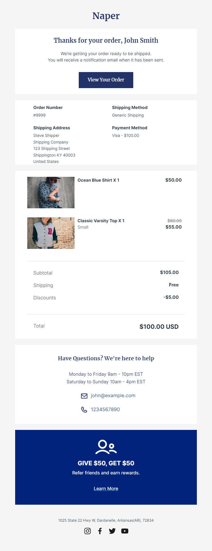
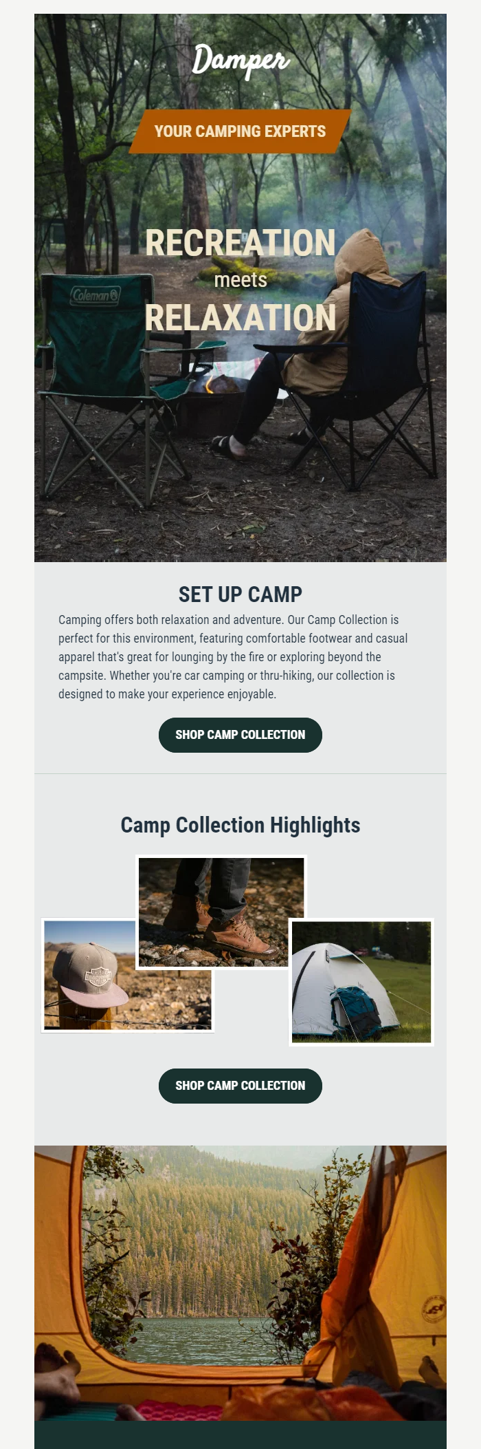
RenderKu is useful here because it is already an ecommerce email-template environment rather than a generic design gallery. Its current product pages describe 100+ pre-made templates, a drag-and-drop editor, Liquid support, and templates for ecommerce notifications as well as newsletters.
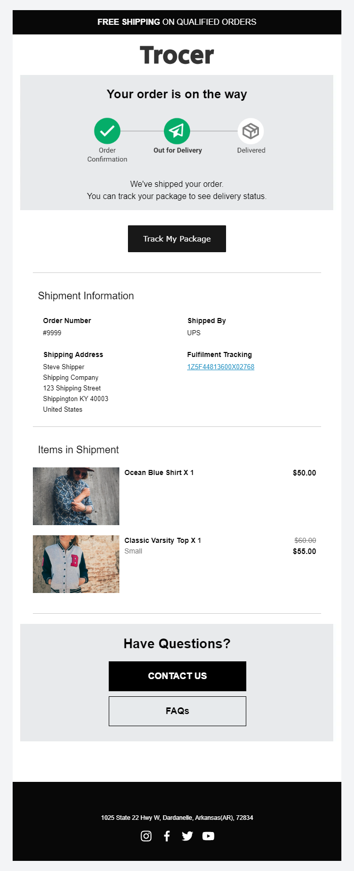
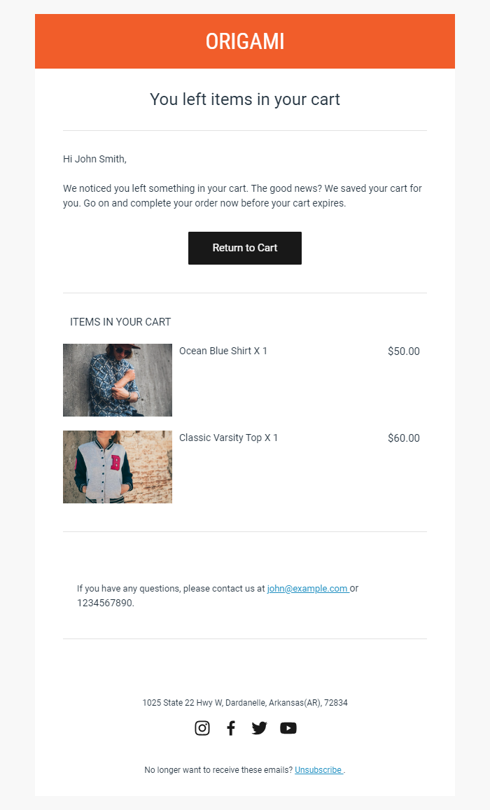
The RenderKu ecommerce notification documentation lists supported types including Order Confirmation, Shipping Confirmation, Order Delivered, Abandoned Checkout, customer account messages, and gift-card notifications. Those are good first-party sources for real template screenshots because the screenshots can demonstrate actual production layouts without borrowing another merchant’s creative.
The same editor can support different email jobs. An order confirmation should lead with order details, a shipping confirmation with delivery status, an abandoned-checkout email with a clear return to the cart, and a newsletter with the offer or collection. Compare these examples by what the reader needs first, not by which template looks best.
Build the same hierarchy in OnVoard
OnVoard’s current Marketing Platform documents drag-and-drop blocks, product lists pulled from the store catalog, Review and Star Rating blocks, and reusable brand styles. Those capabilities map naturally to the layouts in this guide because product and proof blocks can stay structured instead of being flattened into one large image.
Start with the message and primary action, then add only the ecommerce blocks that support the decision. A single-product launch may use one product block and one rating line. A collection email may use a product list. A review-led campaign may use Review and Star Rating blocks around one product. Brand styles should make those layouts feel related without forcing every campaign into the same content order.
The reusable asset is not one giant master template. It is a small set of proven modules: compact header, message block, product card, product list, CTA, proof block, service block, and footer. Assemble them according to the email job. That gives consistency without turning every send into the same email.
Run this layout QA before scheduling
Do the last review at mobile width first. The question is not “Does this look nice?” It is “Can someone understand why this email exists, what matters, and what to do next without repairing the hierarchy in their head?”
Read only the first mobile screen. Confirm the email’s purpose is obvious.
Hide the images. Confirm the offer, product identity, and primary action still make sense.
Trace the source order of every multi-column block and confirm the mobile stack preserves priority.
Check that the primary CTA belongs to the opening promise rather than to an unrelated secondary module.
Check that proof sits beside the decision it supports.
Count how many products appear before the first meaningful action. Reduce the count if browsing becomes a wall of cards.
Test the longest product name, highest price width, longest review, and missing optional data.
Check that sale rules, thresholds, deadlines, or access conditions are readable before the click when they materially affect the offer.
Check link targets for every button and product card, including dynamic products.
Check the email with a representative set of real clients and dark-mode conditions used by your audience.
Send a test to a phone and use it like a shopper: scroll, tap, go back, and scan again.
Remove one nonessential block. If the email becomes clearer, keep it removed.
The goal is not to make every ecommerce email look minimal. The goal is to make every section earn its place. A visually rich product launch can be long. A gift guide can show many products. A newsletter can carry several stories. But the mobile path should always reveal what is primary, what is supporting, and what action belongs to each decision.