
On this page
Default: treat an order confirmation as a service message first and a marketing surface second. The customer opens it with a small burst of uncertainty after spending money. They want to know whether the order went through, what they bought, what they were charged, where it is going, and what happens next. Put those answers ahead of everything else. If a recommendation, loyalty reminder, referral pitch, or sale banner pushes those answers down the page, the message is solving the wrong problem first.
The second rule is just as important: confirm only the state your system actually knows. “We received your order,” “your order is confirmed,” “payment authorized,” “payment received,” “ready for pickup,” and “shipped” describe different events. Your template might be named Order Confirmation, but the customer reads the words, not the internal template label. If your platform has only recorded the order and a later review can still reject it, say that. If payment is only authorized, do not casually call it captured. If the order is accepted but not packed, save shipment language for the shipping notification.
That gives you a practical hierarchy for the whole email: state first, order facts second, fulfillment expectations third, help fourth, optional merchandising last. This guide turns that hierarchy into a working layout, shows how the wording changes across 15 ecommerce situations, and gives you a concrete line for deciding when marketing has started to crowd out the transaction.
The confirmation has five jobs, in this order
Most order-confirmation advice starts with a checklist of blocks. That is useful, but it skips the harder decision: which information wins when everything cannot be equally prominent? A narrow mobile screen forces you to make that choice. The five-job stack below is the default I would use because it follows the questions customers usually need answered in sequence, without assuming every store has the same fulfillment model.
Priority | Job | What the customer should learn | What can go wrong |
|---|---|---|---|
1. State | Say what just happened | Whether the store received, accepted, paid, or otherwise recorded the order | The email claims more certainty than the underlying system event |
2. Order facts | Let the buyer audit the purchase | Order number, items, variants, quantities, discounts, shipping, tax or fees, and total | The customer cannot quickly spot a wrong item, address, quantity, or charge |
3. Fulfillment | Set the next expectation | Where the order is going, the current delivery or pickup expectation, and what update comes next | The email implies shipped, ready, or delivered before that state exists |
4. Help | Make correction possible | How to change, cancel, reply, or get support while action is still useful | The customer finds a problem but cannot tell what to do |
5. Optional marketing | Use remaining attention carefully | A small relevant recommendation, loyalty note, or content link only after the transaction is settled | The message starts to feel like an ad wearing an order number as a disguise |
This ordering does not make transactional email boring. It makes the brand work around the customer’s task instead of competing with it. You can still use strong typography, product imagery, tasteful illustration, or a warm brand voice. The constraint is simply that every decorative or commercial choice yields when it conflicts with verification.
If the customer has to scroll past an offer to discover whether the order actually went through, the hierarchy is backwards.
A useful way to review the design is to cover the bottom half of the email with your hand. What remains should still tell the customer what happened and identify the order. If the first screenful is mostly a campaign hero, a discount code, or a product grid, move those elements below the transactional core.
What every order confirmation email should include
The exact fields vary by business model, but the core is stable. Shopify’s current merchant guidance, for example, calls out the order number, customer information, order summary, cost breakdown, payment information, shipping information, and business contact information. The important part is not merely including those fields. It is deciding which ones need to be visible immediately, which can sit lower in the message, and which should disappear when they do not apply.
Element | Default treatment | Why it earns space |
|---|---|---|
Order state | Put it in the first screenful. | It tells the buyer what the message actually proves. |
Order number | Make it easy to copy or scan. | Support conversations often start here. |
Items and variants | Show product name, quantity, selected variant, and price. | The buyer can catch the wrong size, color, quantity, or item. |
Cost breakdown | Show subtotal, discounts, shipping, tax or fees, and total as applicable. | A single total is hard to audit when something looks wrong. |
Payment reference | Name the method or masked reference only when useful and accurate. | It reassures without exposing unnecessary payment data. |
Delivery or pickup details | Show destination or pickup location plus the current timing promise. | This answers the “what happens next?” question. |
Next update | Say what message comes next, such as a shipping or pickup-ready notice. | It stops the confirmation from being mistaken for a later fulfillment event. |
Support path | Provide a reply path, help link, or order-management route. | A confirmation is most valuable when the buyer spots a problem. |
Policy links | Link to relevant returns, changes, or cancellation details instead of pasting a policy wall. | The message stays scannable while details remain reachable. |
Promotion | Place it after the transactional content and keep it visually subordinate. | It is optional. The order facts are not. |
Do not show a field merely because your email editor has a block for it. An estimated delivery date is useful when the system can support it. A made-up precise date is worse than a truthful range or a clear statement that tracking will follow later. The same applies to stock status, tax invoices, pickup readiness, and payment language.
The most useful question for each block is: what decision or reassurance does this give the customer right now? If the answer is unclear, it may belong in another message or a help page instead. That test keeps confirmations shorter without making them incomplete. It also helps you avoid copying a generic template whose fields were designed for a different fulfillment model.
A strong confirmation also makes exceptions visible instead of hiding them inside generic text. If one item is backordered, if two products ship separately, if a signature is required, or if the customer has only a short cancellation window, that exception deserves more prominence than a standard brand footer. The point of the email is not visual consistency at all costs. The point is trustworthy order understanding.
Three real RenderKu order confirmation examples worth studying
A constructed specimen is useful when you need to isolate one rule, but order-confirmation design is visual enough that we should also look at real finished templates. RenderKu already has a dedicated Order Confirmation template gallery, so there is no reason to invent fake storefront screenshots for this part of the guide. The three examples below are owned RenderKu templates. They are not performance case studies, and they do not prove that one layout converts better than another. They are useful because the pixels let us inspect hierarchy, state communication, scanning order, and where optional marketing sits relative to the transaction.
Treat them as design references rather than recipes to copy blindly. The same visual shell can be correct for one store and misleading for another if the event wording, payment state, fulfillment promise, or support path is wrong. What matters here is how the layouts allocate attention after checkout.
Naper: complete the transaction before the referral block
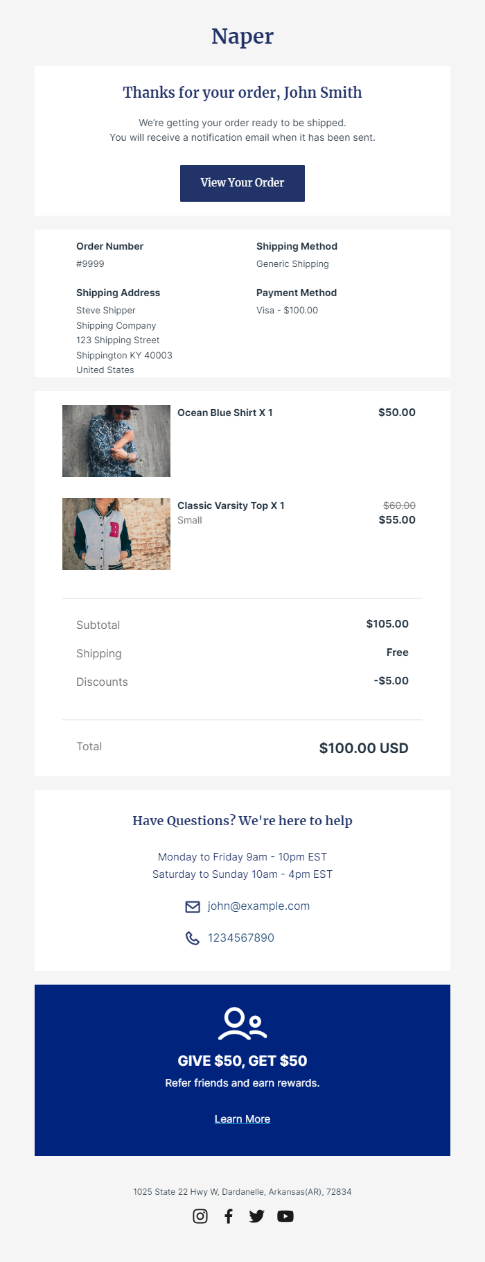
The Naper template is a strong example of transactional hierarchy because its first several sections are boring in the best possible way. It opens with a direct thank-you and a clear preparation state, then gives the buyer a View Your Order action. The next blocks expose the order number, shipping method, shipping address, payment method, item summary, discounts, shipping charge, and final total. A separate help section follows before the email asks for anything promotional.
The most interesting detail is the referral block near the bottom. It is visually strong, but it arrives only after the customer can verify the purchase and find help. That makes it a useful example for the marketing-boundary test later in this guide. The referral offer is not competing with the question “did my order go through?” because the transactional answer has already been delivered. If you want optional merchandising or loyalty content in a confirmation, this is the order of operations to preserve.
See the Naper Shopify order confirmation template in RenderKu.
Trocer: show the current stage without pretending future stages are complete
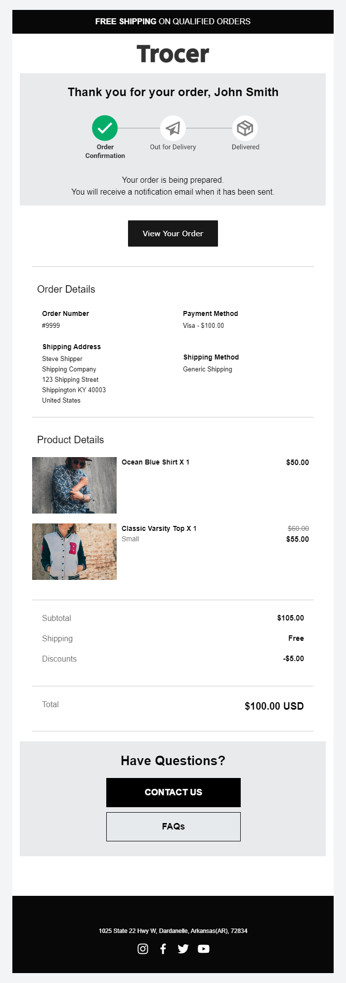
Trocer uses a visible status path near the top: Order Confirmation is active, while Out for Delivery and Delivered remain inactive. That is a useful visual pattern because it gives the customer a mental model for what comes next without saying those later events have already happened. The copy underneath reinforces the same state: the order is being prepared and another notification will arrive when it has been sent.
Below that, the design returns to ordinary receipt work: order number, payment method, shipping address, shipping method, products, discounts, shipping, total, and support. The lesson is not “always add a progress tracker.” The lesson is that a tracker only works when the active state is truthful and the future states are unmistakably future. If your system cannot reliably advance the tracker, plain text is safer than a beautiful timeline that gets stuck or jumps ahead.
See the Trocer Shopify order confirmation template in RenderKu.
Stripe Inspired: strong branding can still keep the receipt easy to scan
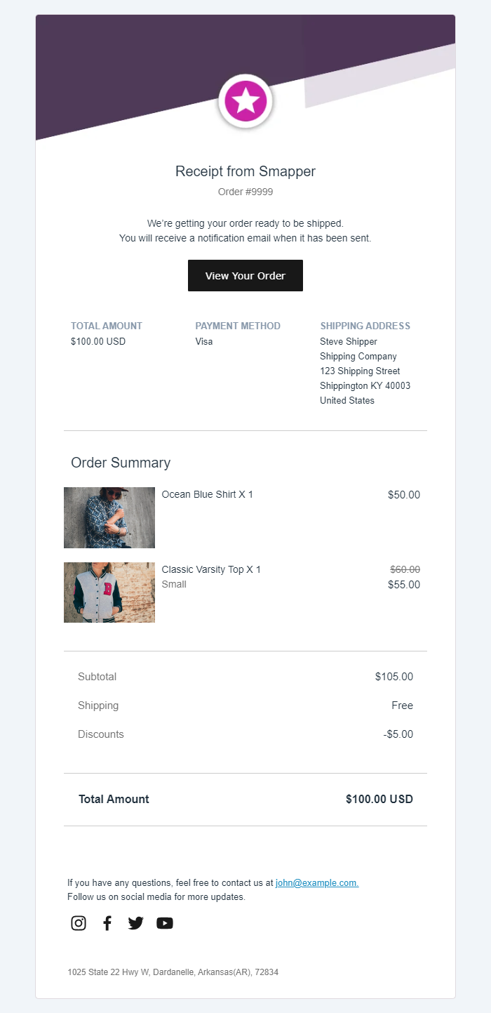
The Stripe Inspired template takes a more designed approach. A large angled brand shape and centered emblem create a distinct visual identity, but the message quickly moves into a compact receipt header, order number, preparation state, and View Your Order button. Total amount, payment method, and shipping address are grouped together before the product summary and totals.
That compression is useful when the store wants a polished branded notification without turning the email into a campaign. The risk is density. Three columns can look elegant on desktop and become cramped on narrow screens, so the mobile version has to collapse cleanly rather than simply shrink. The right review question is not whether the email looks “premium.” It is whether the buyer can still locate the order state, total, destination, and next action in a few seconds on a phone.
See the Stripe Inspired Shopify order confirmation template in RenderKu. The demo screenshot uses the store name “Snapper”; Stripe Inspired is the RenderKu template name.
Why use real RenderKu examples here? They show the design trade-offs this article is discussing with owned, inspectable pixels. The 15 scenario examples later in the guide solve a different problem: they show how copy and content change when the underlying order state or fulfillment model changes.
Use the order state, not the template name
The phrase “order confirmation” is often used as a catch-all for the first post-checkout email. Operationally, stores can reach different states at that moment. A card can be authorized but not captured. An order can be recorded but still need fraud, inventory, prescription, custom-production, or manual review. A pickup order can be accepted long before it is ready. A preorder can be valid even though fulfillment is weeks away.
Write the strongest statement that is already true, not the strongest statement you hope will become true. This is the simplest way to stop a friendly template from making an operational promise your systems have not earned yet.
System state | Safer customer wording | Do not imply yet |
|---|---|---|
Order record created | We received order | That the order has been accepted, paid, or allocated if those checks are still pending. |
Order accepted | Order | That the parcel has shipped or pickup is ready. |
Payment authorized | Payment was authorized for | That funds have been captured if your flow captures later. |
Payment captured | Payment of | That inventory has shipped. |
Preorder accepted | Your preorder for | A firm ship date unless you actually have one. |
Pickup order accepted | Your pickup order is confirmed. We will email you when it is ready. | That the customer should travel to the store now. |
Shipment handed to carrier | Your order has shipped. | That it has been delivered. |
This distinction matters even when customers never use words such as authorization or capture. You can translate internal states into plain language without flattening them. For example, “We received your order and are reviewing it” is clear to a buyer and still honest about a pending step. If your process usually completes that review quickly, tell the customer when they should expect the next update rather than pretending the update has already happened.
The exact legal meaning of “accepted” can depend on your terms and jurisdiction, so do not use this table as a contract-law shortcut. The implementation principle is narrower: bind copy to the event your commerce system can prove, and keep later states for later messages. That is both more accurate and easier to support.
Keep confirmation, shipping, pickup, and delivery messages separate
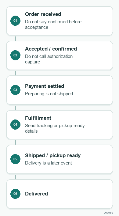
An order confirmation becomes easier to write when it is treated as one message in a sequence, not as the only post-purchase email. Each message should be triggered by a state change the system can actually observe. This keeps the first email focused and gives later updates a clear reason to exist.
Message | Send when | Primary job | Do not claim yet |
|---|---|---|---|
Order received | The store has recorded the order | Give the customer a durable order reference and explain the current state | Payment success, acceptance, fulfillment, shipment, or delivery unless those states are already true |
Order accepted or confirmed | The merchant or platform has accepted the order under the store workflow | Remove uncertainty that the order will proceed | Shipment or delivery |
Payment confirmation or receipt | The payment system has recorded the relevant successful payment state | Confirm the payment event and show the applicable payment record | Fulfillment or shipment |
Shipping confirmation | The order has entered the store’s defined shipped state | Give tracking and set delivery expectations | Delivery |
Pickup ready | The order is actually ready at the pickup location | Tell the customer where and how to collect it | That it was ready earlier than the operational event |
Delivery confirmation | The carrier or fulfillment system has recorded delivery | Close the delivery loop and point to help if something is wrong | That the customer personally received or inspected the parcel unless you truly know that |
This separation also improves exception handling. A delayed payment review, split shipment, backordered item, address problem, or pickup delay can be communicated in the message that owns that state instead of forcing the original confirmation to predict every possible path.
For merchants, the practical design rule is simple: define the event that earns each message before writing the copy. If the event is only “order record created,” the email should sound like an acknowledgement. If the platform has already captured payment and accepted the order, stronger confirmation language is appropriate. The wording should follow the event model, not the other way around.
Keeping these messages separate also prevents a common support problem: customers treating the first confirmation as proof that a later event already happened. If “your order is on the way” appears before a carrier event exists, the copy creates an expectation the operations system cannot support. Save shipment language for the shipment message, delivery language for the delivery message, and pickup-ready language for the readiness event.
15 order confirmation examples for common ecommerce situations
The examples below are deliberately constructed, not screenshots of named brands. That lets us isolate the information hierarchy and wording choice without pretending a fictional design is observed evidence. Start with the quick matrix to find the closest situation, then use the fuller example underneath to see what actually changes.
Situation | Opening | Critical difference |
|---|---|---|
1. Standard paid physical order | Order | Complete purchase audit plus shipping expectation. |
2. Pending review | We received order | The order exists, but acceptance is still conditional. |
3. Authorized, capture later | Your order is recorded and payment was authorized. | Authorization and capture stay separate. |
4. Preorder | Your preorder for | Release timing matters more than ordinary delivery timing. |
5. Backorder | Your order is confirmed. One item is on backorder. | The exception must be visible immediately. |
6. Split fulfillment | Order | Items need to be grouped by parcel or fulfillment group. |
7. Local pickup | Your pickup order is confirmed. | Confirmed is not the same as ready for collection. |
8. Digital product | Your order is confirmed. Your download is ready. | Access instructions become part of fulfillment. |
9. Subscription first order | Your first | Current order and recurring commitment both need clarity. |
10. Gift order | Your gift order is confirmed. | Verification should not spoil the recipient experience. |
11. Signature required | Order | Delivery constraint deserves prominent placement. |
12. Marketplace or multi-seller | Your marketplace order is confirmed. | One checkout may hide multiple fulfillment owners. |
13. Invoice follows separately | Order | Do not label the confirmation as a formal invoice when it is not one. |
14. International order | Your international order is confirmed. | Destination, carrier, duties, and timing need careful wording. |
15. Change window | Order | The correction path is time-sensitive. |
1. Standard paid physical order
Use the conventional “confirmed” opening when the order has been accepted and the relevant payment state is settled for your workflow. The first screen should show the confirmation state, order number, and a compact summary of what happens next. Under that, make the order easy to audit: product names, variants, quantities, prices, discount, shipping, tax or fees, total, shipping address, and delivery expectation.
A useful opening is: Order [[ORDER_NUMBER]] is confirmed. Then add one plain sentence such as “We’re preparing your items and will send tracking when the order ships.” That sentence prevents the customer from reading the confirmation as a shipping notice. If your system has a reliable delivery estimate, show it. If it does not, promise the next update instead of inventing a date.
For this scenario, merchandising can sit below the complete transaction. A genuinely relevant accessory is reasonable, but the customer should be able to ignore that entire block and still have a complete record of the purchase.
2. Order received, review still pending
Some businesses create the order record before they decide whether the order can proceed. Fraud review, prescription verification, inventory checks, custom-production approval, or manual account review can all create this state. In that case, the phrase “order confirmed” is too strong.
Use wording such as We received order [[ORDER_NUMBER]]. Follow it immediately with the pending step: “We’re reviewing the order and will update you by [[TIME_OR_WINDOW]].” Keep the item and payment information visible so the buyer can verify what they submitted, but avoid language that implies the order is already accepted or headed to fulfillment.
The trade-off is emotional: “received” sounds less reassuring than “confirmed.” That is acceptable. The way to restore reassurance is not to overstate the state. It is to explain what is happening, how long it usually takes in your operation, and what the customer needs to do, if anything.
3. Payment authorized, capture later
Authorize-now, capture-later flows are common enough that the email should not flatten them into “paid” unless the funds have actually been captured under your system. The customer usually does not need a payments lecture, but the copy should still describe the real event.
A practical opening is: Your order is recorded and payment was authorized for [[AMOUNT]]. If capture happens when the order ships or when a manual review clears, state that in plain language. Keep the order total and payment method reference nearby so the customer can reconcile the authorization they may see with the order they just placed.
Avoid loading this email with processor terminology. The goal is not to teach authorization mechanics. The goal is to prevent a mismatch between what the email says and what the customer sees in their bank or card account.
4. Preorder
A preorder confirmation needs a different center of gravity. The buyer already knows the item will not ship immediately, so the message should make the release or fulfillment expectation easy to find. Use Your preorder for [[PRODUCT_NAME]] is confirmed when that state is true, then show the current release window, charging policy, and how schedule changes will be communicated.
If you only know “ships in November,” say that. Do not turn an estimated release into a precise delivery date because the template looks better with one. If the customer is charged now, say so. If payment will be captured closer to release, say that instead. If the preorder contains multiple items with different release windows, group them so the customer can see whether they will ship together or separately.
The main marketing temptation here is to fill the long wait with cross-sells. Keep the confirmation itself focused. You can build a separate preorder nurture sequence later; the receipt should first make the commitment and timeline unmistakable.
5. Backorder accepted
A backorder is not a footnote when it changes when part of the order will arrive. The confirmation should identify the affected item close to the item list and explain whether available items ship immediately, wait for the backordered item, or follow another store rule.
A clear pattern is: Your order is confirmed. [[PRODUCT_NAME]] is currently backordered. Then give the best supported availability window and the next update the customer should expect. If the buyer can cancel or substitute the delayed item, link that action near the exception rather than burying it in a generic support footer.
The message will be slightly longer than a standard confirmation. That is the right trade. Hiding the exception to preserve a clean template produces more uncertainty, not a better experience.
6. Split fulfillment
When an order will arrive in more than one parcel, the confirmation should show that structure before tracking exists. Otherwise customers often interpret the first shipment as an incomplete order. Group products by fulfillment group or expected shipment, then explain that each group may receive its own tracking message.
A useful opening is Order [[ORDER_NUMBER]] is confirmed in two shipments. Under the summary, label the groups in language the customer understands, such as “Ships first” and “Ships later,” or by warehouse, seller, or delivery method when those distinctions matter.
Do not guess parcel counts if the split is not actually known yet. If the system only knows that items may ship separately, state that conditionally. The confirmation should reflect the operational certainty you have at send time.
7. Local pickup
The most important distinction in pickup email is the difference between accepted and ready. A customer who sees “pickup confirmed” may reasonably assume they can head to the store unless the copy clearly tells them otherwise.
Use Your pickup order is confirmed. We’ll email you again when it is ready. Show the pickup location, opening hours when they are stable enough to be useful, the name or order number the customer should bring, and any identity requirements that genuinely apply. Keep the “wait for the ready message” instruction close to the top.
The ready-for-pickup email can then do a different job: directions, collection instructions, deadline, curbside details, or a pickup code. Keeping those responsibilities separate makes both messages shorter and harder to misread.
8. Digital product
For a digital product, access is fulfillment. The order confirmation should therefore move the download, license, activation, or account-access instructions above generic account links and far above unrelated promotion. If access is immediate, say so. If the purchase requires a processing step, do not show a dead or premature access button.
A useful opening is Your order is confirmed. Your download is ready. Under that, provide the secure access route, any expiry or device rules that matter, and a support path if the link fails. Keep product name, amount, and purchase record available for later reference.
Because the customer can complete the entire product experience from this email, promotional clutter is especially costly. Every extra banner competes directly with the thing they just paid to use.
9. Subscription first order
A subscription confirmation has to explain two commitments without blending them together: the current shipment or service and the recurring arrangement. Start with the current transaction, then show the next billing or order date, frequency, recurring amount when appropriate, and a direct management route.
A clear opening is Your first [[PRODUCT_NAME]] order is confirmed. The recurring details should appear close enough that the buyer cannot mistake the purchase for a one-off order. Do not rely on a tiny footer to explain the ongoing commitment. At the same time, do not let subscription settings push the actual first-order details below the fold.
If the next charge date can move based on fulfillment or trial behavior, avoid false precision. Explain the rule the customer needs and link to the account area where the current schedule can be checked.
10. Gift order
Gift orders have two audiences: the purchaser who needs verification and the recipient who may eventually see the package or a separate gift notification. The confirmation should make the destination and gift options easy for the purchaser to verify without exposing details that could spoil the gift.
Use Your gift order is confirmed. Show the recipient name or destination as appropriate, the gift message if the buyer needs to proof it, and the items being sent. Keep buyer payment details in the purchaser’s confirmation, not in recipient-facing communication. If a gift receipt or no-price packing slip is part of the service, state that only when the system actually supports it.
The central trade-off is privacy versus verification. Give the purchaser enough detail to catch a wrong address or message while keeping the recipient experience separate.
11. High-ticket order with signature required
When delivery requires a signature, age check, appointment, or another handoff constraint, that condition deserves first-class placement. It directly affects whether the customer can receive the order successfully.
A useful opening is Order [[ORDER_NUMBER]] is confirmed. A signature will be required at delivery. Follow with the delivery address, the best available timing information, and the carrier or support path the customer will use later. If the delivery constraint cannot be changed, say that plainly. If it can be changed after shipment, explain when that option becomes available.
Do not use the confirmation to bury the constraint under premium-brand imagery. For expensive orders, reassurance comes from precise handling and support information, not from making the email look like an advertisement.
12. Marketplace or multi-seller order
A single marketplace checkout can hide several seller and fulfillment relationships. The confirmation should show the overall order first, then group items by the party responsible for fulfillment or support when that distinction changes what the customer should expect.
Use Your marketplace order is confirmed. Then separate seller groups, shipment timing, return or support ownership, and any seller-specific contact route that the platform actually exposes. The buyer should not need to discover only after a problem that one item follows a different process.
The challenge is information density. Do not copy every seller policy into the email. Use a clear group structure and link to order details for rules that are too long to scan inside the confirmation.
13. Tax invoice follows separately
An order confirmation, payment receipt, and tax invoice are not automatically the same document. If your store or jurisdiction issues a formal invoice separately, name that distinction rather than calling every post-checkout email a receipt or invoice because the template library uses that label.
A clean pattern is Order [[ORDER_NUMBER]] is confirmed. Then state: “Your tax invoice will be available in [[LOCATION]] / sent separately when [[EVENT]].” Keep the order total and payment information the customer needs for verification, but do not add invoice wording or tax-document claims the message does not satisfy.
This scenario is a good reminder that transactional email labels should follow the actual document and process, not whatever sounds most official.
14. International order
International confirmations need extra care because shipping method, destination, currency, customs, duties, taxes, and delivery timing can all introduce uncertainty. Show the destination and selected shipping method clearly, then include only the customs or duty information your store can state accurately.
Use Your international order is confirmed. If duties are prepaid, collected on delivery, or handled under another supported arrangement, explain that fact in the terms your checkout already uses. If you cannot know the final carrier timeline at confirmation, promise the tracking update rather than displaying a falsely precise arrival date.
Avoid turning the email into a legal wall. Put the order record and next steps first, then link to the fuller international shipping policy for edge-case details.
15. Short change or cancellation window
If the customer genuinely has only a short period to change an address, cancel, or edit the order, the confirmation is the right place to surface that window. Put the deadline close to the shipping address and item summary because those are the details the customer is most likely to notice are wrong.
A useful opening is Order [[ORDER_NUMBER]] is confirmed. Changes are available until [[TIME]]. Follow it with one obvious action path. Do not manufacture urgency with a fake countdown or a deadline your operations team will ignore. If changes are not self-service, tell the customer exactly how to contact support before the cutoff.
This is one of the few cases where a secondary action can deserve unusually high visual weight. The reason is not marketing. It is because the usefulness of the action expires.
Across all fifteen situations, the durable pattern is the same: the email never guesses. It makes the current state easy to verify, surfaces the exception that actually changes the customer’s next action, and reserves later events for later notifications. The visual design can vary widely, but that operational discipline should not.
Where marketing should stop
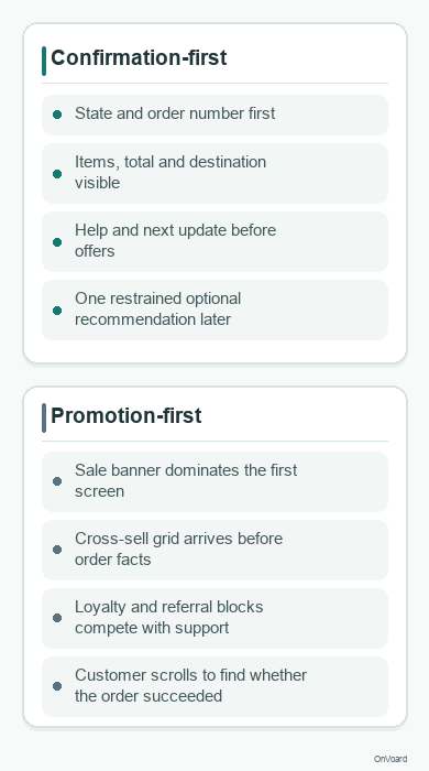
Order confirmations attract attention because customers are actively looking for them. That makes the space commercially tempting. It does not mean every available pixel should be monetized. The confirmation earned attention because of the transaction, so optional marketing should use whatever attention remains after the service job is complete.
There are two separate reasons to keep promotion restrained. The first is product design: an offer that competes with the order summary makes the email worse at its primary job. The second can be legal classification. OnVoard’s transactional email glossary summarizes the operational distinction, and in the United States the FTC’s CAN-SPAM guidance says the primary purpose of a mixed message matters. The FTC points to what the subject line communicates and whether the transactional content appears mainly at the beginning; for mixed content it also discusses placement, proportion, and visual emphasis.
That is U.S.-specific guidance, not a universal rule for every country. Other laws, consent rules, platform policies, or contractual promises can apply. If the classification materially changes your compliance obligations, have your legal or compliance owner review the actual message and the jurisdictions you serve.
For day-to-day email design, use this three-part editorial test before adding promotion:
Remove the promotion mentally. Is the confirmation complete without it? If not, you have mixed a service requirement with a sales block.
Look only at the first screenful. Can the buyer confirm state, order identity, and the most important next-step information before any offer demands attention?
Compare visual weight. Is a discount banner, product grid, loyalty pitch, or referral block louder than the transaction it sits under? If yes, reduce it or move it.
A small recommendation after the order facts can be reasonable when it genuinely helps. A replacement filter for the appliance just purchased, care guidance, or an accessory that solves an obvious setup need is easier to justify than a generic sale banner. Even then, the confirmation should not pretend the recommendation is part of the order.
The same rule applies to loyalty points, referral credits, social-follow prompts, and review requests. They are not automatically bad. They are secondary jobs. If the customer must process them before they can verify the purchase, the hierarchy is wrong. If the email needs three separate promotional modules to justify its existence, move those modules into later lifecycle messages that actually own a marketing objective.
Do not use a fixed percentage such as “85% transactional” as a legal formula. Visual proportions can be a useful design heuristic, but they are not a universal compliance safe harbor. The safer operational test is whether the message still clearly reads and functions as the transaction communication that caused it to be sent.
A mobile-first layout that customers can scan quickly
Do not design the desktop email first and hope the stack behaves on mobile. The confirmation is a verification task, so reading order matters more than ornamental symmetry. Start from the narrow layout and decide what the customer must see before they scroll.
State and order number. Put the current status and order identifier at the top. The customer should not need to interpret a hero image to learn whether checkout worked.
Items and money. Keep product name, variant, quantity, and price together. Put the total where it is easy to distinguish from subtotal, tax, shipping, and discounts.
Destination and timing. Show where the order is going or where it will be collected, plus the current delivery or pickup expectation.
Next event. Say what notification comes next. “We’ll email tracking when the parcel ships” is more useful than a vague “we’ll keep you updated.”
Correction and support path. Put the action near the details a customer may need to correct.
Optional secondary content. Only after the transaction is settled should the email move into recommendations, loyalty, social, content, or referral ideas.
On narrow screens, avoid multi-column layouts that force the eye to jump between price, quantity, and item details. A two-column desktop receipt often becomes easier to audit when it collapses into one deliberate sequence on mobile. A thumbnail can sit beside a short product name, but long variant names and price breakdowns usually need room to breathe.
If you use images, make sure the email still answers the verification questions when images are blocked. Product thumbnails can help recognition, but the product name, selected variant, quantity, and price should not depend on pixels loading. The same applies to a branded status graphic. If “confirmed” exists only inside an image, the message becomes ambiguous the moment that asset fails.
Also test the ugly orders, not only the perfect one-item fixture. Use long product names, multiple variants, discounts, enough line items to wrap, a long address, an international destination, and a realistic support footer. The narrow screen is where fragile hierarchy becomes obvious.
Subject line and preview text should confirm, not tease
A promotional campaign can use curiosity. An order confirmation should reduce uncertainty. Put the order state in plain language, and add the order number when your support workflow benefits from it.
Situation | Subject line | Preview text |
|---|---|---|
Standard accepted order | Order | Review your items, total, delivery details, and next update. |
Received but pending review | We received order | We are reviewing it now and will send the next update by |
Preorder | Preorder | Release timing, payment details, and what happens before shipping. |
Pickup | Pickup order | We will email you again when it is ready to collect. |
Split shipment | Order | See which items are expected in each shipment. |
Avoid turning the subject into an offer such as “Order confirmed + 20% off your next purchase.” Even before legal questions, it changes the first read from reassurance to promotion. The discount can wait until the transaction has been made clear inside the email.
Preview text is useful for the next question the customer will ask. If the subject confirms the order, the preview can mention delivery details, pending review, pickup readiness, or the fact that tracking comes later. Do not waste it repeating the subject word for word unless the inbox behavior of your sending platform leaves you no better option.
If your workflow sends a weaker “order received” message before a stronger “confirmed” message, make that distinction visible in the subject lines too. Customers often search their inbox later using status words. Clear language helps them find the right record without opening several nearly identical messages.
Brand the email without hiding the receipt
Transactional does not mean visually generic. Typography, spacing, color, illustration, product imagery, and voice can all make the confirmation feel like your store. The constraint is hierarchy, not personality.
The most useful design work is usually unglamorous: increase contrast around the total, keep the order number easy to find, make variant labels readable, separate shipping and billing details, use enough spacing between item groups, and give support links descriptive labels. Those choices help the customer do the job they came to do.
Brand voice works best when it clarifies rather than performs. A short warm line such as “Thanks, we’ve got it” can sit beside a precise status line. The status should not be replaced by a clever phrase whose meaning depends on tone. The same applies to icons: a check mark can reinforce “confirmed,” but it should not be the only signal.
For Shopify merchants who want to restyle notification emails, OnVoard’s companion app RenderKu has notification-email templates including order-confirmation designs. Treat the template as the visual shell, then keep your store’s real order-state logic and required fields as the authority.
What to test before you send it
A beautiful confirmation can still fail because the wrong event fired, a merge field went blank, the total is hard to audit, or the mobile stack hides the support path. Run the following checks against real test orders that represent your edge cases.
Trigger: Does the email send on the event you think it does, and only once for that event?
State wording: Does the first sentence claim only what the trigger proves?
Order identity: Is the order number correct and easy to copy?
Items: Test multiple quantities, variants, discounts, bundles, and long product names.
Money: Verify subtotal, discounts, shipping, tax or fees, total, currency, and payment wording.
Destination: Test shipping, billing, pickup, digital-only, and no-shipping orders as relevant.
Timing: Check that estimates, preorder windows, pickup states, and next-update promises are populated from authoritative data.
Support: Click every order-management, help, change, cancellation, and reply path.
Images off: The confirmation should remain understandable without remote images.
Mobile: Read it at a narrow width without zooming. Order state, total, destination, and support should remain easy to find.
Long content: Use an order with enough line items to expose spacing and scanning problems.
Promotion: Confirm that removing the promo block would leave a complete service message and that the promo does not dominate the beginning.
Edge states: Exercise pending review, preorder, backorder, split shipment, and pickup if your store supports them.
Jurisdiction and policy: If promotional content changes your compliance analysis, verify the actual rule set that applies to your recipients rather than relying on a generic transactional label.
The final check is simple: open the message like a customer who just spent money and is slightly worried. Can you prove what happened, verify the order, understand what happens next, and fix a mistake without hunting? If yes, the confirmation is doing its job. Any marketing you keep after that has earned its place.