On this page
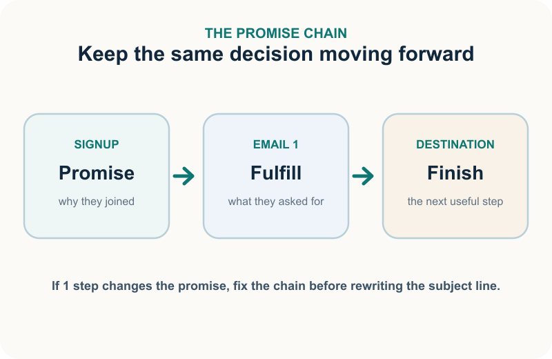
A welcome email has one job before it has any other: keep the promise that got the email address.
Match the inbox to the exchange: deliver a promised code, show the skin quiz result, or confirm early access. A warm hello matters, but it doesn't settle the small debt created at signup.
That's why we don't start a welcome email with a brand-history template and work backward. We start with the moment immediately before the inbox. The signup promise, Email 1 and the page after the click should feel like one uninterrupted action.
This guide covers 3 real welcome emails and the decision each one gets right, then gives you 6 complete templates written as finished copy, 12 subject line and preheader pairs, and a 3-email flow that still makes sense after someone buys. The examples show what brands sent, not how those emails performed.
The short version is simple:
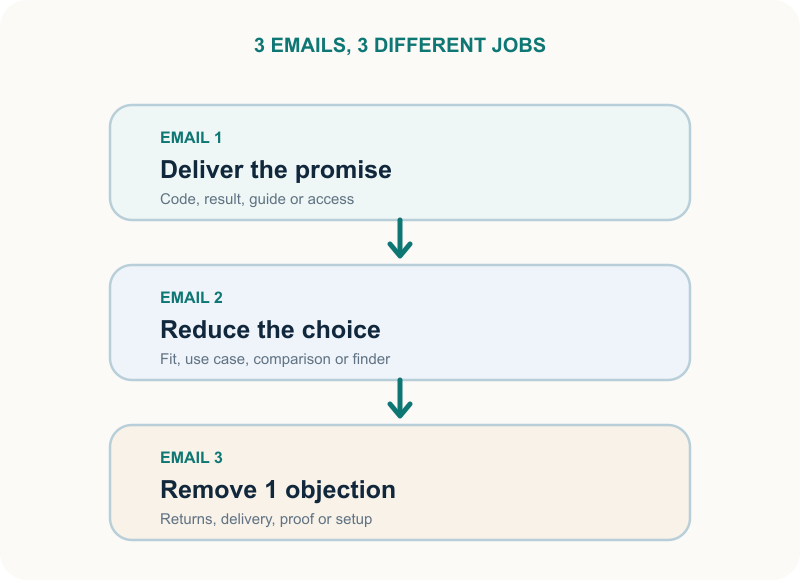
Email 1 keeps the promise. It confirms why the person signed up and gives them one matching next step.
Email 2 reduces choice. It helps a non-buyer find a product, use case or starting point.
Email 3 removes one objection. It answers the doubt still stopping the purchase.
A purchase changes the route. A customer should not keep receiving a first-purchase argument.
What a welcome email is really for in ecommerce
A welcome email is the first marketing message you send after someone joins your list and becomes eligible to receive it. That definition is accurate and not very useful.
The practical definition is better: a welcome email closes the loop on a signup and opens the next useful decision.
Those 2 parts belong together. Closing the loop creates recognition. The subscriber sees the thing they just asked for and knows the email is legitimate. Opening the next decision creates momentum. It gives them a sensible place to go without making them decode your store from the navigation.
The next decision depends on what happened at signup. Match a discount subscriber with the code and a curated place to use it. Return a quiz subscriber to the saved result and fitting products, and give an editorial reader the promised guide. Someone who subscribed during checkout already needs help using or understanding the purchase.
Your database may call all of these people subscribers; their state says what the welcome should do.
This is where generic welcome advice goes wrong. It treats every new email address as the same kind of person and drafts one sequence for all of them.
We use 4 questions before writing:
What did this person just do? Name the form, quiz, checkout, account or page.
What did we promise in exchange? Quote the promise exactly.
What is true about the person now? Subscriber, unconfirmed contact, prospect, first-time customer or returning customer are not interchangeable.
What is the smallest useful next decision? Redeem, view a result, choose a starting product, learn how it works or manage preferences.
If you can't answer those questions, the copy isn't the first problem. The trigger and data contract are.
Promise-first beats brand-first
Brand story has a place in a welcome flow. It just doesn't get to stand in front of something you explicitly promised.
Imagine a popup that says, “Get free shipping on your first order.” The subscriber opens Email 1 to a full founder letter, with the shipping code buried 3 screens down. Excellent writing can't rescue that order because the promised object is still hidden.
Reverse the order. Put the code, terms and shopping path first. Then tell the part of the story that helps the person choose. The story becomes relevant instead of ceremonial.
We'd use the same rule for a non-discount signup. If the form says, “Find your routine,” Email 1 should show the routine. If it says, “Get the buying guide,” Email 1 should link to the guide. “Welcome to the family” isn't a substitute for either one.
What belongs in Email 1
Email 1 should be complete even if the subscriber never receives another message. A series is useful, but it can't be an excuse to defer the original promise.
The reliable order is:
Recognition. Use a sender name, subject and opening that connect to the signup moment.
Promise delivery. Put the code, result, resource or access near the top.
Terms that change the decision. State expiry, exclusions or minimum spend if they exist. Don't hide a condition until checkout.
One primary path. Link to the collection, result, guide or account screen that finishes the job.
A short reason to choose you. Add the product distinction or brand belief that matters at this moment.
Expectations and control. Say what kind of email follows and make preferences or unsubscribe easy to find.
The primary call to action should continue the promise. “Use your code” can lead to a curated first-order collection, while “See your routine” should return to the saved result. If the button says “Choose your starter set,” its destination must actually help someone choose.
Don't send a promise-specific button to the homepage unless the homepage is genuinely the best destination. Homepages restart decisions. A good welcome click removes one.
Keep Email 1 narrow, not empty
Narrow doesn't mean a logo, one sentence and a button. It means every block serves the same next decision.
A curated product grid may help someone use the promise, while a short founder note earns space only when it explains why the promised product exists. Reviews belong when they answer the doubt most likely to stop that first purchase. None of those blocks belongs merely because the email template has an empty slot.
Our test is to read each block as a question:
Does this help the subscriber recognize the promise?
Does this help them use what was promised?
Does this reduce the next choice?
Does this remove a relevant doubt?
If the answer is no, move the block to a later email or remove it.
Welcome email examples from real businesses
Here are 3 observed welcome emails and the decision worth borrowing from each. They show what each brand sent, which is useful for layout and order but says nothing about how the email performed.
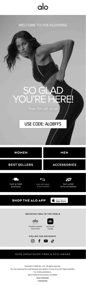
Example 1: Alo Yoga makes the discount impossible to miss
Source: Shopify Blog
Alo Yoga is a clean example of a discount-first welcome because the above-the-fold decision is obvious. The code is large, the incentive is immediate, and the CTA points toward shopping instead of making the reader hunt for the next step.
What this example shows visually:
the promised value is visible immediately;
the code sits in the main visual hierarchy, not inside fine print;
the product/category CTAs come after the promise, not before it.
Decision to borrow: if your signup promised a first-order incentive, the subscriber should not have to scroll through a founder essay to locate it. The offer, its basic condition, and the first useful place to use it should appear in the first screen or very close to it.
Do not copy blindly: a large code alone does not save the experience if the landing page resets the decision or shows many ineligible products.
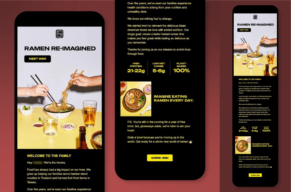
Example 2: Immi confirms the signup event, then uses the rest of the email to sell the brand
Source: Shopify Blog
Immi is valuable because the email does 2 jobs in the right order. It first reassures the subscriber that the promised sweepstakes entry really happened. Then it uses the rest of the layout to explain what makes the product interesting: the brand story, the nutritional differentiators, and the product imagery.
What this example shows visually:
the email remembers what the form promised;
bold product imagery and brand identity are used after recognition is settled;
key differentiators are presented in large, scannable blocks rather than long paragraphs.
Decision to borrow: if a signup offers entry, early access, a waitlist slot, or another specific event, confirm that event right away. Once the subscriber knows the signup worked, the rest of the space can sell the product and the brand.
Why this matters: many brands do the opposite. They use a promise to collect the email address, then send a generic brand intro that makes the form feel like bait. Immi's structure shows how to avoid that.
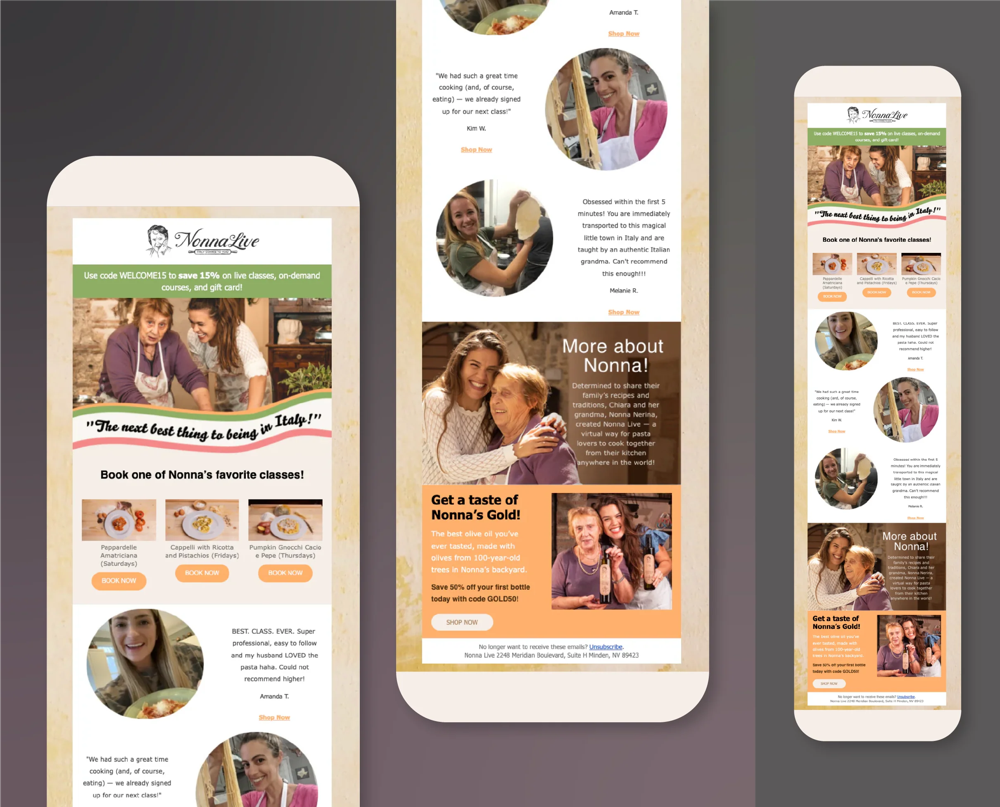
Example 3: Nonna Live pairs the welcome discount with high-emotion product imagery
Source: Shopify Blog
Nonna Live shows that a welcome email can deliver an offer without feeling generic. The email uses a visible discount, but it also fills the rest of the message with appetizing imagery, social proof, and personality. The visual message is not only "here is 15% off." It is also "this is what you are joining."
What this example shows visually:
strong imagery keeps the email emotionally warm rather than coupon-only;
testimonials and experience photos support the purchase or booking decision;
the CTA remains tied to the primary product experience.
Decision to borrow: when your brand has a strong emotional or experiential hook, your welcome email can combine the promised offer with a quick visual case for why the experience matters. The key is still order: settle the signup promise first, then use photography and proof to deepen desire.
A quick pattern table from the observed examples
Brand | What the email visibly leads with | Why it works | Best for |
|---|---|---|---|
Alo Yoga | Code + shopping CTA | Immediate clarity for a first-order offer | Discount signup |
Immi | Event confirmation + brand differentiation | Reassures the signup worked, then sells the product | Sweepstakes, waitlist, special-event signup |
Nonna Live | Discount + imagery + social proof | Blends promotion with emotional context | Experience-led or lifestyle-led brands |
6 complete welcome email templates
Each template is written as finished copy for an example store, so you can see what complete looks like before you adapt it. Fields in double brackets, such as [[FIRST_NAME]] and [[DISCOUNT_CODE]], are filled in by your email platform. Everything else is copy to rewrite in your own brand's words.
The fastest way to write a weak welcome email is to start from a favorite format instead of the signup. Start from what the form promised, then pick the template that keeps that promise:
Signup or situation | Email 1 should | Email 2 should | Start with |
|---|---|---|---|
“Get 10% off your first order” | Deliver the code and show where it applies | Curate the first products worth buying | Template 1 |
“Take the skin quiz” | Return the result and the recommendation | Explain why the recommendation fits | Template 2 |
“Get early access” or “Join for updates” | Confirm what you'll send and show the best starting point | Send one useful buying-help message | Template 3 |
A product that needs fitting, sizing or comparing | Narrow the choice to 2 questions | Add proof, policy or setup detail | Template 4 |
The reason the brand exists changes the purchase | Explain the one product decision behind it | Help the reader choose a size, version or starting product | Template 5 |
A customer subscribes during checkout | Shift to setup or use guidance | Support care or a related choice | Template 6 |
Template 1: deliver the signup discount
Use when: a popup or form promises a first-order discount. Example store: Harbor Roast, a small-batch coffee roaster that gives new subscribers a discount on their first order.
Subject: Your 10% code is inside
Preheader: Use it on any full-price bag this week.
Hi
[[FIRST_NAME]],Here's the 10% off we promised:
[[DISCOUNT_CODE]]It works on any full-price coffee until Sunday at midnight. Subscriptions and gift cards aren't included.
Not sure where to start? The Starter Trio is three 250g bags from light to dark, so you can find your roast before you commit to a full bag.
Button: Shop the Starter Trio
We roast every Monday and ship within 2 days. You'll get one email a week at most: new roasts, brewing tips and the occasional offer. You can change that or unsubscribe any time.
Customize: the offer, its expiry and exclusions, the starting collection, the line about what makes you different, and the email frequency you actually send. Delete the exclusions line if your offer has none. The button should open the starting collection with the code terms repeated, not the homepage.
Exit rule: stop first-purchase offers after an order.
Why it works: no searching. The subscriber can find, understand and use the promised code straight away, and the brand line only arrives once the promise is settled.
Template 2: return a quiz or finder result
Use when: signup happens after a quiz, size finder, routine builder or product selector. Example store: Fern & Field skincare, after its 2-minute skin quiz.
Subject: Your skin quiz result is ready
Preheader: Start with the Barrier Kit and see why it fits.
Hi
[[FIRST_NAME]],You told us your skin feels tight by midday and reacts to fragrance. That points to one starting point: the Barrier Kit.
It's a fragrance-free cleanser, serum and moisturizer. We'd start there and hold off on exfoliating acids until you know how your skin handles the new routine.
Button: See my full result
Your result page shows how to use each step, morning and night, and which answer would change our recommendation. If an answer was wrong, retake the quiz. We'd rather update your result than have you buy the wrong routine.
Customize: the quiz answers that decided the result, the recommended product, and the choice to avoid for now. The button must open the saved result, not a generic category.
Exit rule: after a purchase, move later education to onboarding for the product they bought and stop “choose your product” emails.
Why it works: it respects the exchange. They gave you useful answers and got a useful result back.
Template 3: welcome a browser without a discount
Use when: the form promises updates, useful content or early access, not money off. Example store: Trailhead Supply, an outdoor gear shop with a fortnightly gear guide.
Subject: You're on the Trailhead gear guide list
Preheader: What we send, and the best place to start.
Hi
[[FIRST_NAME]],You're in. Every other Thursday we send one gear guide: what we'd pack for a real trip and what we'd leave at home. Sale emails only go out when there's a sale worth your time, never more than twice a month.
New to hiking? Start with the Day Hike Checklist. It covers the 10 things worth carrying on any trail, so you can see what you already own before you buy anything.
Button: Read the Day Hike Checklist
Trailhead started because most beginner kits are full of gear nobody uses. We'd rather sell you 3 things you need than 12 you don't.
Want fewer emails or different topics? Update your preferences:
[[PREFERENCES_URL]]
Customize: the promise, word for word from your signup form, your sending schedule, your beginner resource and the reason your store exists.
Exit rule: keep follow-ups inside the permission the form described. A newsletter signup is not consent for unrelated channels.
Why it works: it doesn't invent a discount to make up for a vague welcome. The subscription itself has clear value.
Template 4: teach a high-consideration product
Use when: the product needs fit, compatibility, sizing, ingredients, materials or a new routine before purchase. Example store: Upright Desk Co., which sells standing desks.
Subject: Choosing your first standing desk
Preheader: It comes down to your height and your setup.
Hi
[[FIRST_NAME]],Welcome to Upright. If you're choosing your first desk, ignore most of the catalog for a minute and answer two questions. How tall are you? Do you work on one screen or two?
If you're under 188 cm (6 ft 2 in) and use one screen, the Essential 48 is the right start. If you're taller, or you run two monitors, choose the Tall 60: it raises higher, and the wider top keeps both screens at eye level.
If you need a desk for a corner or an L-shaped setup, neither is right yet. Reply with your measurements and we'll help you choose.
Button: Compare the two desks
We built the comparison around fit, not around the desk we most want to sell. The right first desk is the one you'll actually stand at.
Customize: the 2 deciding questions for your category, the 2 products they point to, and your “neither fits” route to a person or a guide.
Exit rule: after purchase, replace the comparison with setup and care guidance for the item they bought.
Why it works: it lowers the risk of choosing wrong before it asks for a purchase. That matters more than another product grid when an item is expensive or hard to return.
Template 5: tell the short founder or origin story
Use when: the reason the business exists genuinely changes how a shopper judges the product. Example store: Linen & Loom, a bedding brand.
Subject: Why we made our Everyday Sheets
Preheader: Maya on the problem we refused to live with.
Hi
[[FIRST_NAME]],I started Linen & Loom after my third set of expensive sheets pilled within a year. Every option asked me to choose between soft on day one and still decent in year three.
So we built the Everyday Sheets around one decision: long-staple cotton, woven more tightly than most sheets at the price. For you, that means sheets that get softer with washing instead of wearing thin.
They're not our coolest sheets. If you sleep hot, the Linen Set is the better first buy.
Button: See how the Everyday Sheets are made
Thanks for letting us into your inbox. Next week I'll send a short guide to choosing your size and weave, whether or not you buy.
Maya, founder of Linen & Loom
Customize: the founder's name, the moment that started the business, the product decision it led to, and the limitation with its better alternative.
Exit rule: only sign it from the founder if the founder wrote or approved it. Otherwise use the brand voice.
Why it works: the story earns attention by explaining a product decision. Biography without a consequence belongs on the About page.
Template 6: welcome someone who already purchased
Use when: the person became a customer before the next subscriber email, or subscribed during checkout. Example store: Harbor Roast again, after a first grinder order.
Subject: Your grinder is on the way. Start here.
Preheader: Setup, your first grind and who to ask.
Hi
[[FIRST_NAME]],Thanks for your order. You've already bought, so we'll skip the new-customer pitch and help you get a great first cup.
Before it arrives: keep a bag of beans roasted in the last month. Older beans make the grind hard to judge.
On day one: start at setting 15 for pour-over and brew one cup. Go finer if it tastes sour, coarser if it tastes bitter.
If something feels off: reply to this email. Someone on our team answers within one business day.
Button: Watch the setup guide
Order and shipping updates come separately. If you've said yes to marketing emails, we'll also send brewing tips and new roasts, and we'll only suggest a refill or accessory when it's useful.
Customize: the product, its first 3 setup steps, your support route and your response time.
Exit rule: keep order and shipping messages in the transactional path. Marketing consent and transactional necessity are different things.
Why it works: it recognizes the state change. The welcome continues, but its job moves from first-purchase persuasion to customer success.
12 welcome email subject lines with preheaders
If you want a second pass on the inbox line, run the pair through OnVoard's Subject Line Tester after the body and promise are settled.
The subject reconnects the inbox to the signup; the preheader finishes that thought without echoing it.
Subject: Your welcome code is inside Preheader: Use it on any full-price bag this week.
Subject: You’re in the running Preheader: Your entry is confirmed. Here’s what happens next.
Subject: Your skin quiz result is ready Preheader: See the routine built from your answers.
Subject: You’re on the gear guide list Preheader: What we send, and the best place to begin.
Subject: New here? Start with 2 questions Preheader: They narrow the catalog to the right first desk.
Subject: Why we made our Everyday Sheets Preheader: The trade-off we refused to accept.
Subject: Your first coffee, simplified Preheader: Pick by how you brew instead of browsing every roast.
Subject: The best place to use your code Preheader: These picks qualify and suit a first order.
Subject: Before you choose a standing desk Preheader: Check your height and your setup first.
Subject: Skip the catalog Preheader: Start with the kit built for weekend hikes.
Subject: Your grinder setup starts here Preheader: You’ve already ordered. Here’s the useful next step.
Subject: Light roast or dark? Preheader: Answer one question and we’ll show you where to start.
Borrow the pattern, not the wording: the subject names what the subscriber asked for, and the preheader adds where or how to use it.
Avoid hiding the promise behind empty curiosity. “We have a surprise” is weaker than naming the code a person requested. Avoid false personal replies, fake urgency and “last chance” language when no deadline exists. Recognition is a better first-email advantage than suspense.
Test the subject and preheader as a pair
We'd test the idea, not punctuation.
"Your 10% code is inside" versus "Your 10% code is inside!" is barely a different hypothesis. A more useful test changes the reason to open while leaving the rest of the email stable.
For a discount signup, that might be:
Reward-first: Your 10% code is inside
Decision-first: Start with our best first-order picks
For a quiz signup:
Result-first: Your skin quiz result is ready
Outcome-first: Start with the routine built from your answers
The preheader should make the subject more useful rather than repeat it. If the subject names the reward, the preheader can clarify where to use it. If the subject names the result, the preheader can explain what the result helps decide.
When volume is too small for a useful experiment, we'd rather pick the clearest pair and move on than call random noise a winner.
A 3-email welcome flow with distinct jobs
3 emails are a useful starting structure because each can solve a different decision. The count isn't sacred, and a considered purchase may justify more than a simple store needs. Start with the jobs, then decide how many sends they require.
Email 1: deliver and direct
Send Email 1 when the person becomes eligible to receive it, after any required confirmation step. It should confirm the signup, deliver the promised value and lead to one destination.
If the promise is a time-sensitive code, delay destroys the experience. If the promise is a guide or quiz result, timing still matters because recognition fades. The exact send behavior must follow your consent and system rules, but the editorial principle is stable: do not make the subscriber wonder whether the form worked.
Email 2: reduce the product decision
Email 2 is not a reminder that Email 1 existed. Give it a separate job.
Email 2 can curate a broad catalog by use case or teach the deciding specification for a technical product. It can also explain a quiz result or show how one hero product fits into the customer's life.
Send it only to people who are still eligible and have not crossed the purchase state that makes it irrelevant. A delay followed by an unconditional send is not a flow. It is a queue that ignores what happened while it waited.
Email 3: remove the next objection
Choose one doubt that plausibly remains after the subscriber understands the product. Fit, returns, shipping, materials, compatibility, care and setup are stronger topics than a second brand introduction.
Match proof to the doubt: a plain policy for returns, measurements or a finder for fit, and specifications or sourcing detail for materials. A wall of unrelated reviews can't answer all 3.
If there is no distinct third job, stop at 2 emails. Repetition is not a welcome strategy.
Pick Email 2 and Email 3 from the unresolved question
The next email should answer whatever still stands between the subscriber and a confident purchase. The calendar only decides when it goes out.
What still seems unresolved | What we'd send next | What we would not assume |
|---|---|---|
Which product is right? | Comparison, finder, fit help | That a bigger discount fixes choice |
Will this work for me? | Compatibility, dimensions, ingredients, use-case guidance | That another bestseller grid answers it |
Can I trust the purchase? | Specific proof, warranty, returns, policy detail | That generic praise removes the doubt |
When will it arrive? | Delivery timing and location-specific guidance | That urgency matters more than certainty |
Is the price worth it? | Value explanation, bundle math, or a deliberate offer | That education alone changes price sensitivity |
I forgot | A simple reminder with the original value intact | That fake scarcity is required |
I already bought | Stop or switch to customer messaging | That the welcome calendar still owns the contact |
The rule is simple: answer the hesitation you can actually identify before paying to solve a different one.
A discount can be the right answer. We'd still treat it as a cost, not decoration. If the subscriber was going to buy anyway, the discount may mostly reduce the order value. If it changes the decision for someone who would otherwise leave, it did a different job.
Timing follows the decision
We would send the first eligible message promptly, then place enough time before the next message for the person to act and for purchase state to update. The gap is an operational choice, not a universal benchmark.
Start with a day between Email 1 and Email 2, then another one or 2 days before Email 3 if your buying cycle supports it. Treat those as initial settings. A store selling an urgent replenishment has a different clock from one selling considered furniture.
More important than the exact delay is what happens after it. Re-check eligibility and purchase state before each send.
Change the sequence for the kind of purchase
The jobs can stay consistent while the evidence changes.
For a simple, low-consideration product, keep the sequence tight. Email 1 delivers the promise, Email 2 gives a useful starting point, and Email 3 can remind the subscriber about a real offer or show one strong use case.
For a high-consideration purchase, slow down. Email 2 should reduce the risk of choosing wrong. Email 3 can add proof, policy, setup detail or a comparison. A bigger discount can be less useful than making the decision understandable.
For a replenishable product, don't turn the welcome sequence into a replenishment flow. Once the person buys, hand the next job to the lifecycle that actually fits the customer.
For an existing customer who newly opts into marketing, the right welcome may be only 1 message: confirm what the emails add, show what is new or useful, and get out of the way.
Branch by subscriber state and customer state
The welcome flow should not ask only, “How long has it been?” It should ask, “What is true now?”
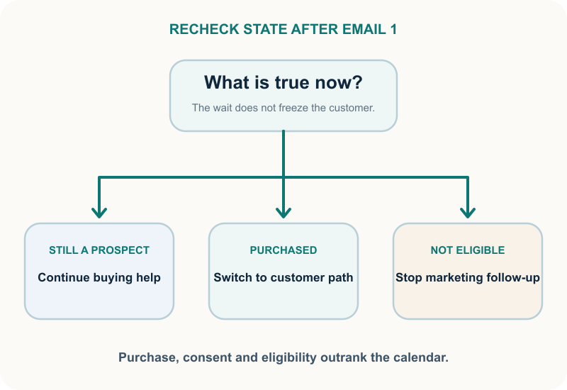
At minimum, distinguish these states:
Eligible subscriber, no purchase: continue with product selection and objection handling.
Customer after Email 1: leave the first-purchase path and enter appropriate customer onboarding.
Unconfirmed contact: wait for the required confirmation. Do not send marketing simply because the welcome delay ended.
Unsubscribed or otherwise ineligible contact: stop promotional follow-ups.
Returning customer who joins another form: do not reset them to a first-order story without checking customer state.
The purchase-after-Email-1 branch is the one teams most often miss. It creates the awkward inbox sequence where a receipt arrives, then a welcome message asks the same person to place a first order.
The fix is not softer copy. It is a branch before Email 2.
Keep transactional and marketing jobs separate
An order confirmation, shipping notice or account message may need to send for a transaction. The welcome series described here is marketing. The rules and permissions that govern it are not interchangeable.
Keep the customer onboarding path useful and product-specific, but do not treat a purchase as permission for every unrelated campaign. The exact legal and platform implementation depends on where you operate and how consent was collected. Record the source, wording, timestamp and channel required by your system. Get qualified legal advice for the jurisdictions you serve.
Re-entry should be a decision, not an accident
A person can join through a footer form, a popup, a quiz and checkout over time. If each event starts the same workflow, they may receive Email 1 repeatedly.
Choose a re-entry rule before launch:
never re-enter the generic welcome after completion;
re-enter only when the new signup promise is materially different;
route an existing customer to the customer version;
suppress a repeated incentive when the offer is genuinely first-order only.
Deduplication by email address is necessary but not sufficient. One contact can still create several meaningful events. The workflow must decide which event deserves a message.
Test the awkward cases before launch
The happy path is easy: a new address submits one form, receives Email 1 and buys later. Production problems live outside that path.
Run these cases with controlled test contacts:
New subscriber, no purchase. Confirm the promise, destination and full prospect sequence.
Purchase after Email 1. Confirm Email 2 and Email 3 stop, then verify the customer route.
Existing customer signs up. Confirm no first-purchase claim appears.
Double opt-in pending. Confirm the marketing welcome waits for the required confirmation.
Unsubscribe during the delay. Confirm later marketing messages do not send.
Same address uses 2 forms. Confirm the chosen re-entry rule and promise-specific message.
Offer is ineligible. Confirm exclusions are visible before the click and the destination does not feature ineligible products.
Missing first name or quiz result. Confirm the fallback is grammatical and useful.
Mobile inbox with images blocked. Confirm the promise, code and primary action still make sense.
Purchase or consent data arrives late. Confirm the branch waits or handles the lag without sending the wrong message.
Check that the code works at checkout and every product in the destination is actually eligible, then work through links, personalization fallbacks, plain-text content, dark mode, button tap size, alt text, the sender name and reply routing. Read the whole inbox sequence in time order. Individual emails can pass QA while the sequence contradicts itself.
The pass condition is not “all emails sent.” It is “each test contact received only the messages appropriate to its state.”
One more pass helps. Have someone who didn't build the flow walk through it as a new subscriber.
Measure decisions, not only opens
Opens are useful diagnostics and weak business conclusions on their own. Privacy features, image loading and inbox behavior can affect how they are recorded. Use clicks and downstream outcomes to understand where the chain breaks, and interpret every metric in context.
Map the flow to decisions:
Promise recognition: delivery, code use, result-page visits or resource access.
Product choice: clicks into the curated collection, comparison or recommendation.
Objection resolution: visits to fit, shipping, returns or how-to content, followed by the intended next action.
Business outcome: first purchase, attributable revenue, margin where available, unsubscribe and complaint signals.
Set up that reporting before launch: separate people who bought before Email 2 from those who didn't, and put offer use, first purchases, unsubscribes and complaints side by side.
Do not turn a high open rate into proof that the welcome flow caused purchases. Do not turn a click into proof that the destination completed the job. Inspect the whole path.
Test Email 2 incrementally
If you want to know whether Email 2 adds value, do not compare a complete welcome flow with no welcome at all. Email 1 is the promise delivery. Withholding it changes the subscriber experience and answers a different question.
Give every eligible participant the same Email 1. After the same delay, exclude purchasers and ineligible contacts, then randomly split the remaining group:
Control: no Email 2 during the test window.
Treatment: the proposed Email 2.
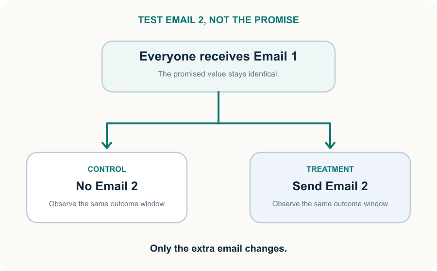
Keep other eligible program messages equal and use the same outcome window. Compare incremental first purchases and revenue, then examine unsubscribes and complaints as guardrails. Decide the minimum effect worth acting on before reading the result.
This design tests whether the second message adds value after you keep the promise.
That tells you more than comparing recipients of a welcome sequence with a control group whose signup was ignored.
Troubleshooting a welcome flow
When results disappoint, find the decision that broke before rewriting anything. Start from the symptom:
Delivered, but the promise is barely used: the offer is hard to find or the terms are unclear. Move it above everything else and use the form's exact wording.
Promise used, but few product views: the button restarts the decision. Point it at the curated collection, saved result or comparison instead of the homepage.
Product views, but weak first purchases: fit, price, shipping, trust or checkout is the real objection. Give Email 3 that one doubt.
Email 2 gets clicks but no extra purchases: it may be redirecting orders that would have happened anyway. Run the Email 2 test above before adding more emails.
Customers still get first-order emails: order data reaches the workflow too late, or the purchase check is missing. Check how fast orders arrive and add the check before every prospect email.
A quiz welcome feels disconnected: the result wasn't saved or referenced. Save it, name the deciding answer, and send a useful fallback when personalization fails.
Purchases are strong but unsubscribes climb: cadence, expectations or eligibility are off. Compare what you send with what Email 1 said you would.
The unit of repair is the decision that failed, not whichever paragraph is easiest to edit.
Running the welcome flow in OnVoard
OnVoard includes Welcome Series as a pre-built Marketing Platform workflow. The workflow builder supports Trigger, Email, Notification, Delay, Wait, Filter and Branch steps, so the practical structure in this guide maps to the product without inventing a separate system.
We would build it as a starting playbook, then adapt it to the actual signup source:
Trigger from the eligible subscription event.
Send Email 1 with the exact promise for that source.
Wait long enough for the subscriber to act and for state to update.
Filter or branch on current eligibility and purchase state.
Send buying help only to the remaining non-buyers.
Route purchasers to the appropriate customer workflow.
Start from the Welcome Series playbook rather than a blank workflow, adapt each step to your signup source, and run the test contacts above through every branch before you switch it on.
The product can supply the steps. The important part is still the decision design: what was promised, what became true, and what message is useful now.
Welcome email FAQ
Should every welcome email include a discount?
No. Include a discount when the signup promised one or when it is a deliberate part of the offer. A quiz result, buying guide, early-access confirmation or useful brand introduction can be a stronger promise. Do not add a coupon merely because the welcome template has a coupon block.
How many welcome emails should I send?
As many as there are distinct jobs. A practical start is 3 emails: deliver the promise, help the subscriber choose, then answer one objection. Stop at 2 if the last one would only repeat.
When should the first welcome email send?
Send it promptly once the contact is eligible. If your process requires confirmation, the marketing welcome should respect that state. The promise should not be delayed after eligibility, but a timer does not override consent.
How should double opt-in affect the flow?
Treat unconfirmed as its own state. Send only what your consent process allows before confirmation, then deliver the promised welcome once the subscriber confirms. The confirmation request is not the welcome email.
Should I show real customer reviews in Email 1?
Use a review when it answers the doubt attached to the first decision, and quote it accurately with permission or under your approved usage policy. A large carousel of praise can distract from the promised code or result. Put proof where the objection appears.
Should I use a plain-text welcome email or a designed one?
Use the format that serves the promise and brand. A code, quiz result or product comparison may need clear visual hierarchy; a genuine founder note may work better in a simpler format. In either case, keep essential text readable when images don't load and test the actual mobile inbox.
Build the promise chain first
A welcome email is not a greeting slot. It is the first proof that your signup promise meant something.
Start at the form. Write down what the person gave, what you promised and what became true, and build Email 1 from that before you write anything else.
Then test the awkward contacts, not only the happy one.
When the promise, the message and the destination agree, the welcome feels simple because the decision is simple.